BrewDog
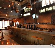
The client wanted to transform this former car repair workshop into the first BrewDog outlet in South America. The bar uses some of the brand style developed by CM Design Consultants for it’s UK bars, but adding new design surprises such as the blue neon, “LOVE HOPS – LIVE THE DREAM”, and sourcing where possible local materials and suppliers.
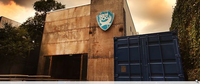
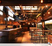
As consistent with BrewDog brand philosophy, the building was paired back and the superb architectural factory and industrial elements were all retained. These included concrete columns, steel profiled roof and the concrete floor complete with the original yellow painted parking spaces. A row of windows at high level was introduced to provide more natural daylight. Some items such as the original 1950’s tyre compressor was retained in its original concrete column position.
Finishes include polished concrete bar top, reclaimed timber, and reclaimed brick.
This is a project that that feels genuinely authentic. It's almost anti-design in that it’s not slick but urban and distressed. Influenced by the rough-and-ready sensibility of pop-ups and featuring the original architectural building features. The exterior features a raw concrete stair tower, and the remainder of the frontage was clad with rusting steel sheets. Strip the building back to basics, retain any original features and weave the interior design scheme around this framework. Dare to be different, break the rules, look at things differently and strive to become leaders not followers.
Back to Interiors and exhibitions
Browse by Category
Building Archive
- Buildings Archive 2024
- Buildings Archive 2023
- Buildings Archive 2022
- Buildings Archive 2021
- Buildings Archive 2020
- Buildings Archive 2019
- Buildings Archive 2018
- Buildings Archive 2017
- Buildings Archive 2016
- Buildings Archive 2015
- Buildings Archive 2014
- Buildings Archive 2013
- Buildings Archive 2012
- Buildings Archive 2011
- Buildings Archive 2010
- Buildings Archive 2009
- Buildings Archive 2008
- Buildings Archive 2007
- Buildings Archive 2006
Submit
Search
Features & Reports
For more information from the industry visit our Features & Reports section.


