Dalmarnock Station
Dalmarnock Station has been re-invented as part of the Commonwealth Games works leading up to 2014.A new public entrance and ticket hall lead to 2 new stairways and an enhanced platform experience. The project has a range of funders and stakeholder which include Network Rail,
First Scotrail, Glasgow City Council, SPT and Clyde Gateway. The work also forms a major part of Clyde Gateways ongoing transformation of the east end and is closely linked to the new Dalmarnock Cross opposite.Our challenge has been to enhance the travelling experience within a new station that contributes positively to the wider architectural heritage of Dalmarnock.
The presence of the original riveted beams and sandstone masonry at Dalmarnock Station gifts the new works a visible history. These relics help ground the new development, anchoring it specifically to Dalmarnock. Even the successive, more modest layers of built form from the 20th Century remind us that the station is representative of its time and that a further veneer of built form in 2013 will allow a station building to emerge rich in contrasts and exceeding the span of a single lifetime.
Our intention is to retain and expose the textures of the 19th and 20th centuries in order that an architecture may emerge where successive layers are contrasted with the next in order that each can hold their original integrity and inform the other. The addition of a 21st century layer will allow us to contrast the past with the present, and chart the lineage of the station in visible historical strata.
The new station design has an overarching strategy of three key strands that are used to inform the main aims of enhancing user experience and a making of place;
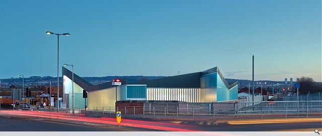
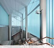
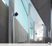
The new station enclosure is seen as a diaphanous, translucent skin, uncommon in this location and representing a delicate counterpoint to the familiar textures of the original masonry. The new skin is orientated to maximise the internal environments relationship to the rail line and provide enhanced levels of natural light. The secondary function of the new skin is to form threshold spaces - entrances at the interfaces with the outside world. Folds in the external surface have come to define entry from Dalmarnock Road and the emerging Dalmarnock Cross.
Diurnally, internal movement is reported to the outside world via animated shadows while nocturnally the entire facade is transformed into an illuminated canvas that provides a worthy backdrop to the emerging public space at a new Dalmarnock Cross
For the new station environment we hope to relate both old and new elements under a ‘table cloth’ roof of undulating dark anthra zinc. The parallel rail line geometries set out by the glass facade are reinforced within the roofscape as a series of narrow folded planes capturing the stations built elements on both sides of the line in a form more able to communicate to the city itself.
The roofscape is therefore conceived as designed set of ridges and valleys that reinforce the themes of the station interior. High fold lines suggest entrances and interfaces with the public worlds whereas low fold lines suggest the internal worlds’ connection to the railway. Designed to be ‘cut’ from a larger template, the roofscape is seen as a quiet memory of grander station architecture whilst being appropriate to the scale and form of Dalmarnock Station.
Stairways are designed in acid etched concrete to transmit a sense of heaviness or permanence.. Main floor surfaces, both internal and external, are designed in concrete to help invoke a sense of scale appropriate to that
of an important public building
PROJECT:
Dalmarnock Station
LOCATION:
Glasgow
CLIENT:
Network Rail
ARCHITECT:
Atkins
STRUCTURAL ENGINEER:
Atkins
SERVICES ENGINEER:
Atkins
PROJECT MANAGER:
Network Rail
Suppliers:
Main Contractor:
C. Spenser
Photographer:
Andrew Lee
Back to Infrastructure, Urban Design and Landscape
Browse by Category
Building Archive
- Buildings Archive 2024
- Buildings Archive 2023
- Buildings Archive 2022
- Buildings Archive 2021
- Buildings Archive 2020
- Buildings Archive 2019
- Buildings Archive 2018
- Buildings Archive 2017
- Buildings Archive 2016
- Buildings Archive 2015
- Buildings Archive 2014
- Buildings Archive 2013
- Buildings Archive 2012
- Buildings Archive 2011
- Buildings Archive 2010
- Buildings Archive 2009
- Buildings Archive 2008
- Buildings Archive 2007
- Buildings Archive 2006
Submit
Search
Features & Reports
For more information from the industry visit our Features & Reports section.


