Dr Susan Weber Furniture Galleries
The Furniture Galleries is an 840sqm permanent exhibition space at the V&A museum. The project completed at the end of 2012 and provides a dedicated space for the display of over 250 objects from 500 years of furniture and fabrication techniques.
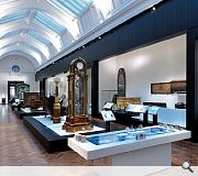
One of the key challenges of the brief stems from the layout and proportions of the existing gallery space. The 70m long x 12m wide floor-plate can be entered at either end, and so the content needed to be legible in both directions. However it was the sheer range and quantum of content that present-
ed the biggest challenge to the design team. With over 250 objects on display of varying period, scale and materiality, developing a solution that would allow all elements to sit well together was the primary requirement of the brief.
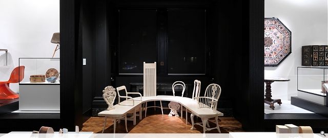
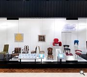
The arrangement of objects within the space has been given a tripartite hierarchy to aid legibility. A chronological experience creates a spine to the exhibition along the centre of the gallery and charts key shifts in design from the 1500’s to present day. Around the perimeter walls, objects are divided into sections each addressing a distinct manufacturing technique: Turning, Gilding, Japanning, Digital Fabrication and so on. To provide buffering between each display a series of framed openings or ‘portals’ are inserted along the length of the gallery. The portals focus on an individual furniture maker including the work of Thomas Chippendale, Eileen Gray and Frank Lloyd Wright.
A multitude of timber species are shown alongside coloured plastics, glass, metal and may other finishes. In response to this a monochrome solution was developed to create aholistic backdrop to the exhibition. Ebonised oak strip has been used throughout to form the plinths, portals and frieze. To contrast this, white Corian linings are used for display space, cabinet linings and plinth tops. The approach to the existing space was thematic as well as architecturally driven. The ‘portals’ follow the height, width and thickness of the existing black marble door architraves at either end of the gallery. This allows them to be read a perceptual ‘doorway’ inviting the visitor to enter the world of the maker. To limit captioning, digital touch labels were introduced within bespoke housings. At the centre of the gallery 2 interactive ‘work benches’ allow visitors to explore materials and their production processes.
PROJECT:
Dr Susan Weber Furniture Galleries
LOCATION:
V&A Museum, London
CLIENT:
V&A Museum
ARCHITECT:
NORD Architecture
STRUCTURAL ENGINEER:
Buro Happold
SERVICES ENGINEER:
Buro Happold
QUANTITY SURVEYOR:
Northcroft
Suppliers:
Main Contractor:
Beck Interior
Photographer:
Charles Hosea
Back to Sport and Leisure
Browse by Category
Building Archive
- Buildings Archive 2024
- Buildings Archive 2023
- Buildings Archive 2022
- Buildings Archive 2021
- Buildings Archive 2020
- Buildings Archive 2019
- Buildings Archive 2018
- Buildings Archive 2017
- Buildings Archive 2016
- Buildings Archive 2015
- Buildings Archive 2014
- Buildings Archive 2013
- Buildings Archive 2012
- Buildings Archive 2011
- Buildings Archive 2010
- Buildings Archive 2009
- Buildings Archive 2008
- Buildings Archive 2007
- Buildings Archive 2006
Submit
Search
Features & Reports
For more information from the industry visit our Features & Reports section.


