Dundee House
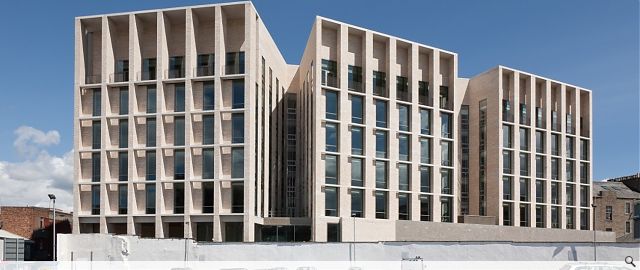
Dundee House is a rich layering of interwoven narratives that attempt to create a building that is a product of its brief yet is firmly grounded in the City of Dundee. The building responds to a very particular site, boldly retaining an historic industrial building while adding an uncompromising contemporary structure. The building meets a demanding operational brief yet creates an inspiring place to work. The building addresses the idea of Civics and the role of serving Dundee’s citizens through an architectural exploration of open public space and through acting as a civic marker in the city.
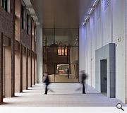
The Dundee Council Offices is a collaboration between the old stone DC Thomson comic printing building with the much larger new administration and public services building. The new building uses the old building as its front door, realising a lofty loggia thereby providing an opportunity for the citizens of Dundee to engage with the building through a new venue for civic life, imagine a coffee shop, a florist, Christmas recitals by primary schools, art events and installations.
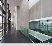
Inside, the new building has been designed to help the council adopt modern methods of working and provides seven storeys of modern sustainable office space. The large floor plates are designed to enable cross discipline working between departments. While at the same time the external and internal light wells allow departmental organisation to form smaller working groups. Breakout areas also animate and enliven the large plans at key points.
A great deal of emphasis was placed on material selection and detail. A public building has to last, it has to be durable yet it needs to be attractive and approachable. The selected materials will improve with age from the quite beautiful brick that gives a clue to the site’s industrial past to the finely engineered glazing that has an eye on the future.
The drawings and photographs attempt to give a flavour of the design process for Dundee City Council’s new Dundee House headquarters. Illustrations however can only hint at the wealth of creative ideas and processes that were worked through in the development of the building, many discarded, some adopted. It has been a thoroughly imaginative and productive if demanding process that has resulted in a building of great strength and dignity.
The photographs of the completed building illustrate the success of a carefully selected material palette. They also show how the design gives the city a building that has presence and gravitas in the townscape without being bombastic or monumental.
Images taken by Dave Morris.
Back to Retail/Commercial/Industrial
Browse by Category
Building Archive
- Buildings Archive 2024
- Buildings Archive 2023
- Buildings Archive 2022
- Buildings Archive 2021
- Buildings Archive 2020
- Buildings Archive 2019
- Buildings Archive 2018
- Buildings Archive 2017
- Buildings Archive 2016
- Buildings Archive 2015
- Buildings Archive 2014
- Buildings Archive 2013
- Buildings Archive 2012
- Buildings Archive 2011
- Buildings Archive 2010
- Buildings Archive 2009
- Buildings Archive 2008
- Buildings Archive 2007
- Buildings Archive 2006
Submit
Search
Features & Reports
For more information from the industry visit our Features & Reports section.


