ThreeSixty Architecture
This is the new home of Threesixty Architecture in Glasgow.
We had outgrown our previous studio and had identified that we wanted to be in the vibrant merchant City area of Glasgow in one space and on one floor. When the top floor of the Garment Factory became available we immediately knew it was right for us. We were familiar with the quality of the space and, in particular, the serrated roofscape with roof lights was a true studio space with no equal in Glasgow.
At 8,500sqft, it was significantly larger than our requirements, but this has led to some wonderful opportunities to really explore how we could reflect and support our culture and values in the interior design and encourage design collaboration.
The design response is unique to us and, as a result, rich in our story, complete with parts of our projects decorating key positions and the inclusion of elegant backdrops to our poster collections. Given the scale of the space, it was important to bring all our experience to bear to ensure we controlled the budget and we managed to achieve something quite special for £30sq.ft, well below a standard fit-out cost.
All staff were engaged in the briefing and design process and certain principles were enshrined from the beginning:
Visibility: take our visitors and clients on a journey through the heart of the studio and maintain visibility with the team – not shuffled off to a boardroom next to reception.
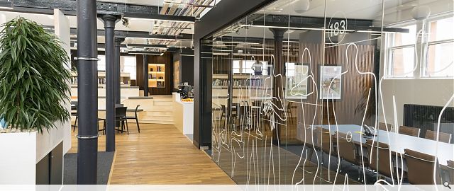
Respectful: we inherited a stunning industrial space with exposed cast iron structure, brickwork and huge windows with stunning long views on all sides – our design celebrates these features and doesn’t compete even down to the bespoke designed collars and conduits held onto the columns.
Human Scale: it’s a big space and we have worked hard to break the studio up by manipulating the floor plane, using dark tones and introducing textured walls to pull the space in and create intimacy.
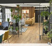
Timeless: a key image from the start was Don Drapers apartment in Mad Men. This wasn’t about creating a pastiche stage set but more about capturing the elegance and warmth of mid-century modernism with hints of Eames and elements of Aalto (e.g. poplar timber strip walls). We wanted timelessness, not ball pits and slides.
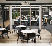
Sociable: we are a sociable and culturally diverse group and we like to party. It was key to design a space that could adapt to host events and the hub space is both an auditorium for a lecture, a café and a night club (with a great sound system and club lighting).
Creative: care is taken throughout to showcase our wares and our creativity with the open placement of our well equipped
Back to Interiors and exhibitions
- Buildings Archive 2024
- Buildings Archive 2023
- Buildings Archive 2022
- Buildings Archive 2021
- Buildings Archive 2020
- Buildings Archive 2019
- Buildings Archive 2018
- Buildings Archive 2017
- Buildings Archive 2016
- Buildings Archive 2015
- Buildings Archive 2014
- Buildings Archive 2013
- Buildings Archive 2012
- Buildings Archive 2011
- Buildings Archive 2010
- Buildings Archive 2009
- Buildings Archive 2008
- Buildings Archive 2007
- Buildings Archive 2006


