Kilsyth Health Centre
The smallest of three simultaneously constructed health centres for NHS Lanarkshire, accommodating a single large GP practice and NHS Community
The new centre is constructed adjacent to the local swimming pool, with which it shares a service yard and an extended car park – a small but welcome step towards appropriate co-location of public services.
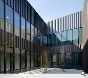
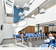
From the outset we sought to create an architecture that looks for simplicity and rationalism; a design that embodies constructive and diagrammatic logic and avoids unnecessary formal gestures and resources. The architectural idea is to create an impressive, brightly lit, social space within the heart of the building that the entire community of building users engage with. All of the buildings spaces are gathered around the central space. The architecture is governed by the idea of achieving an enclosed form, with two planted courtyards adjacent to the waiting and entrance areas.
The linear plan provides efficiency and economy of movement and services, and this economic footprint is particularly suited to the site.
The patient journey is simple, clear and precise: you enter, arrive at the reception in central space and are directed to the relevant, adjacent waiting area. You orientate yourself towards the courtyards and towards the department you are visiting. The diagram, orientation and way-finding are logical and easily understood. There are views to the outside at the ends of all corridors. External factors have influenced the design, massing and placement on the site and how the hard and soft landscaping is designed. The design of the building reacts to the pedestrian routes, the traffic routes and the topography of the site.
The closed geometry emerges from the requirements of the brief, providing efficiency and economy of movement and services.
Most patients visiting health centres are heading for a clear destination, such as the GP practice or NHS clinical accommodation, and they will learn rapidly to find their way. Clear wayfinding is achieved by the excellent visibility up through the atrium and the orientation provided by the consistent placing of waiting areas and vertical circulation at the centre of the plan.
Rooms with differing functions have been standardised to a size and proportion which makes them all suitable as potential consulting/examination rooms, enabling the precise use of each room to evolve over time. This basic room caters for around 23 separate briefed functions.
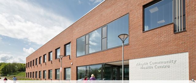
NHS Lanarkshire identified a desire to form a common identity shared by their three new health centres, giving NHSL an identifiable presence in Wishaw, Kilsyth and East Kilbride. This identity relies on the use of good quality materials, with crisp, yet robust detailing.
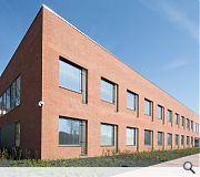
Externally, the building nestles in against a wooded embankment, its linear form following the contours. The strong red brick contrasts well against the darkness of the trees. The simple nature of the basic form is continued with generous square windows repeated throughout, lightened by white grillage over tall opening vents.
PROJECT:
Kilsyth Health Centre
LOCATION:
Airdrie Road
CLIENT:
NHS Lanarkshire
ARCHITECT:
Reiach & Hall
STRUCTURAL ENGINEER:
AECOM
SERVICES ENGINEER:
Hulley & Kirkwood
QUANTITY SURVEYOR:
Currie & Brown
Suppliers:
Main Contractor:
Graham
Back to Health
Browse by Category
Building Archive
- Buildings Archive 2024
- Buildings Archive 2023
- Buildings Archive 2022
- Buildings Archive 2021
- Buildings Archive 2020
- Buildings Archive 2019
- Buildings Archive 2018
- Buildings Archive 2017
- Buildings Archive 2016
- Buildings Archive 2015
- Buildings Archive 2014
- Buildings Archive 2013
- Buildings Archive 2012
- Buildings Archive 2011
- Buildings Archive 2010
- Buildings Archive 2009
- Buildings Archive 2008
- Buildings Archive 2007
- Buildings Archive 2006
Submit
Search
Features & Reports
For more information from the industry visit our Features & Reports section.


