East Kilbride Health Centre
A major health centre accommodating seven GP practices, NHS clinical services and NHS office accommodation.
The new centre is adjacent to the original Hunter Health Centre, whose site is now taken up by a dedicated car park. Thus, connections into the community which are so important for such a facility are preserved.
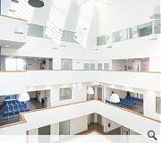
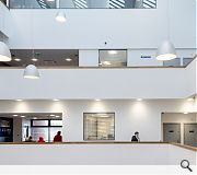
We sought to create an architecture of simplicity and rationalism; a design that embodies constructive and diagrammatic logic and avoids unnecessary formal gestures and resources. The architectural idea was to create an impressive, brightly lit, social space within the heart of the building that the entire community of building users engage with. All of the building’s spaces are gathered around the central space - an enclosed atrium, with views out.
The square geometry and the atrium emerge from the requirements of the brief. They provide efficiency and economy of movement and services. This economic tight footprint is particularly suited to the site. The building user has less far to move if the building is vertically orientated - the patient journey is always kept to a minimum. The vertical circulation ensures there is no need for users to travel through one department to get to another. The square plan allows for economic ratio of external envelope to floor area and an efficient gross-net ratio of floor area.
Within the schedules of accommodation each GP practice and NHS department has a space allocation reflecting its present size. In the longer term the size and number of practices/departments may change, and the closed nature of the plan makes it possible for the physical boundaries between territories to be amended with little or no impact on the building itself.
Most patients visiting health centres are heading for a clear destination, such as a specific GP practice or NHS clinical accommodation, and they will learn rapidly to find their way. Clear wayfinding is achieved by the excellent visibility up through the atrium and the orientation provided by the coloured stair core in one corner. Segregation of staff and service routes away from patient areas has been provided via double circulation routes.
Rooms with differing functions have been standardised to a size and proportion which makes them all suitable as potential consulting/examination rooms, enabling the precise use of each room to evolve over time. This basic room caters for around 23 separate briefed functions.
NHS Lanarkshire identified a desire to form a common identity shared by their three new health centres, giving NHSL an identifiable presence in Wishaw, Kilsyth and East Kilbride. This identity relies on the use of good quality materials, with crisp, yet robust detailing.
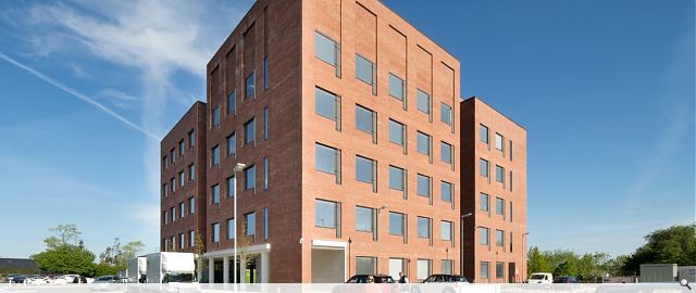
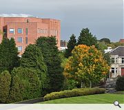
A powerful statement was required from this skyline building adjacent to the brutalist Civic Centre. This is provided by the cube form, in a strong red brick, with generous square windows repeated throughout, lightened by white grillage over tall opening vents and softened by the introduction of curved screen walls at roof level.
PROJECT:
East Kilbride Health Centre
LOCATION:
East Kilbride
CLIENT:
NHS Lanarkshire
ARCHITECT:
Reiach & Hall
STRUCTURAL ENGINEER:
AECOM
SERVICES ENGINEER:
Hulley & Kirkwood
QUANTITY SURVEYOR:
Currie & Brown
Suppliers:
Main Contractor:
Graham
Back to Health
Browse by Category
Building Archive
- Buildings Archive 2024
- Buildings Archive 2023
- Buildings Archive 2022
- Buildings Archive 2021
- Buildings Archive 2020
- Buildings Archive 2019
- Buildings Archive 2018
- Buildings Archive 2017
- Buildings Archive 2016
- Buildings Archive 2015
- Buildings Archive 2014
- Buildings Archive 2013
- Buildings Archive 2012
- Buildings Archive 2011
- Buildings Archive 2010
- Buildings Archive 2009
- Buildings Archive 2008
- Buildings Archive 2007
- Buildings Archive 2006
Submit
Search
Features & Reports
For more information from the industry visit our Features & Reports section.


