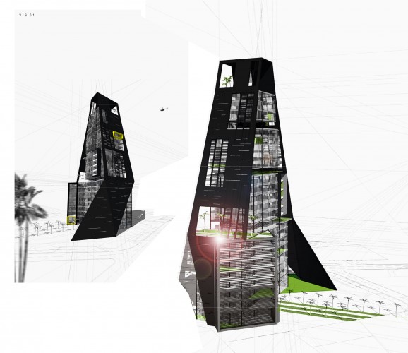
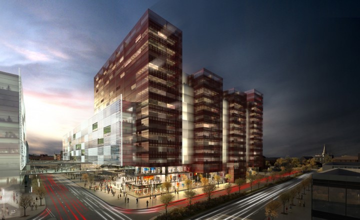
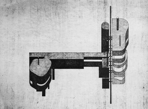
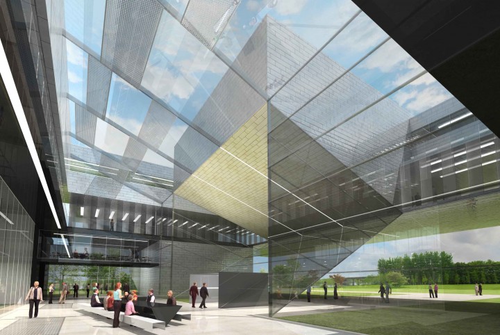
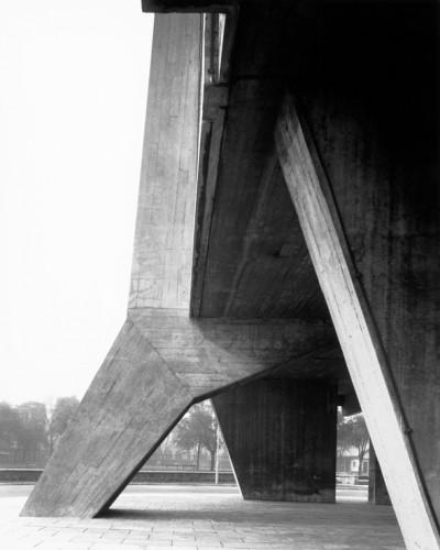
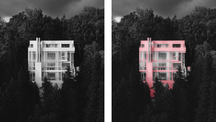
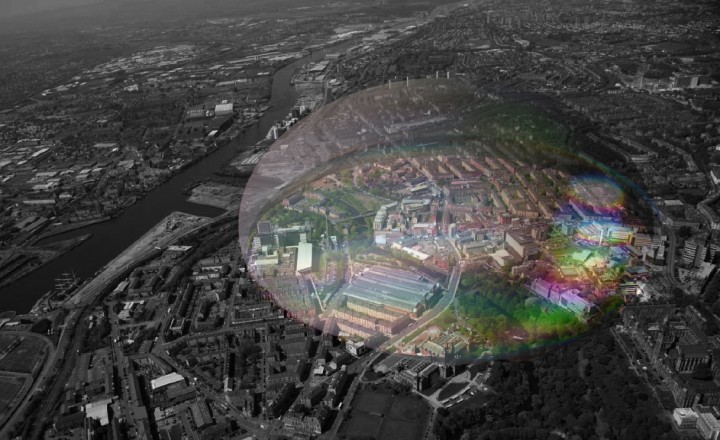
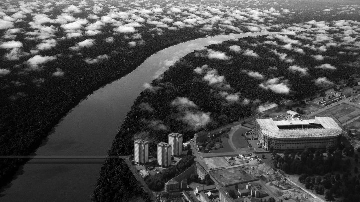
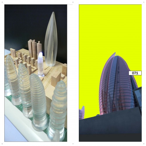
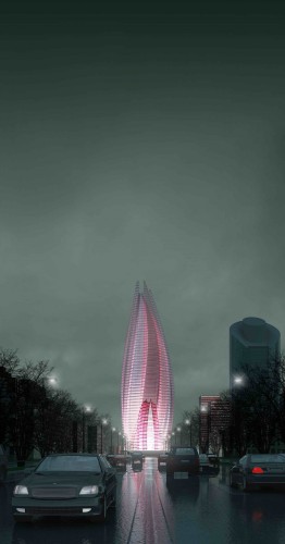
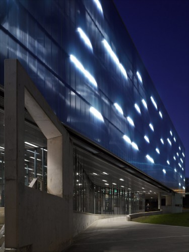
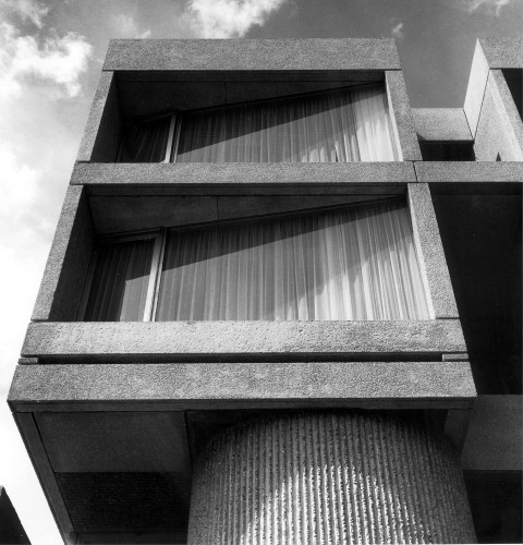
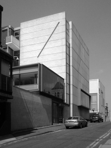
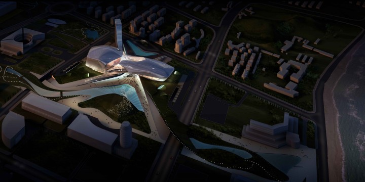
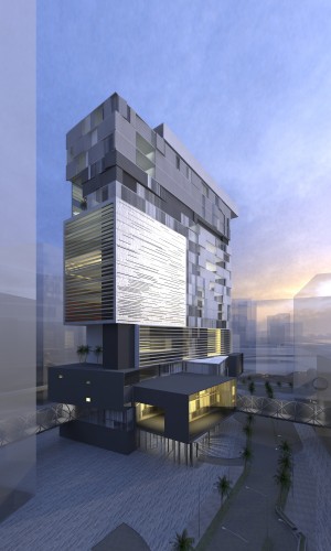
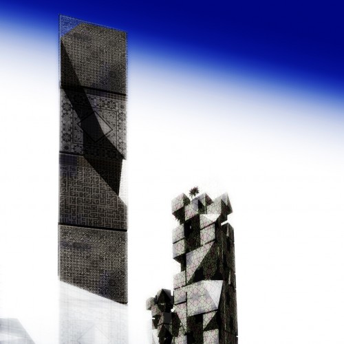
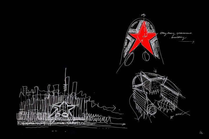
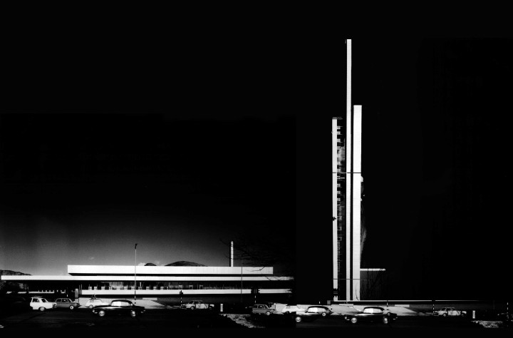
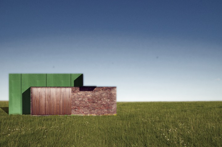
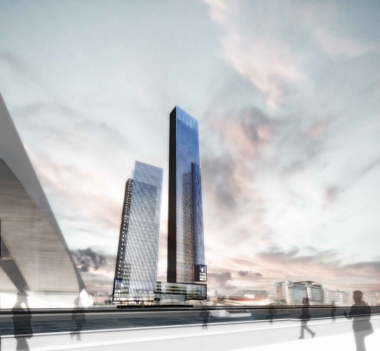
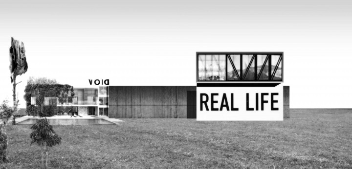
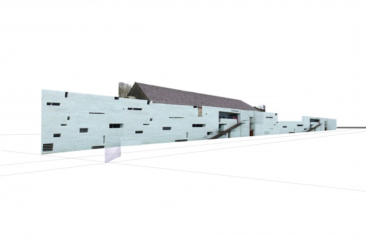
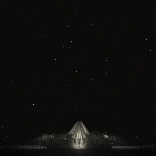
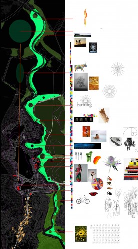
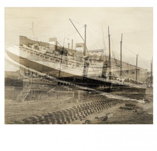
Saudi projects ...
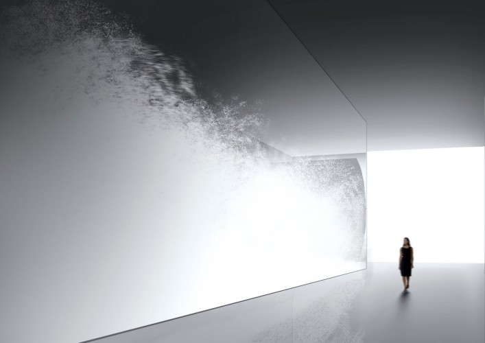
Artwork that captures white feathers in a giant glass tank ... blowing them around to create different movements
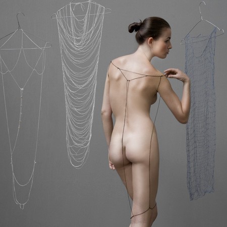
Minimal fashion dress by young designer Lisa Klappe
Intense and complicated
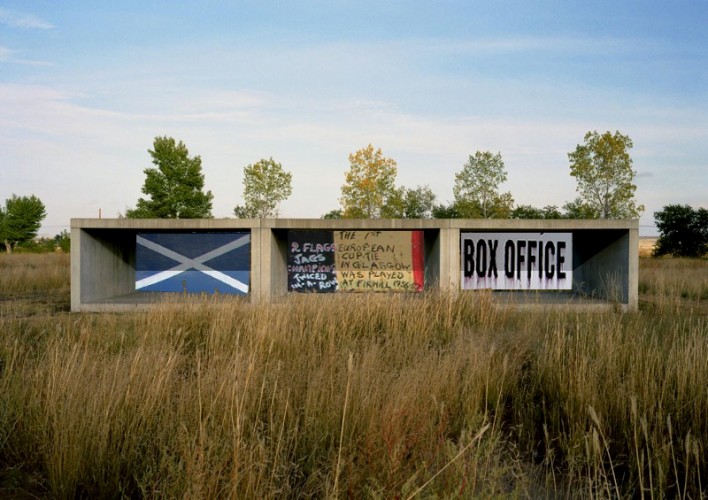
Poster for show that opened our new gallery for the Modern Institute in Glasgow.
Great work.
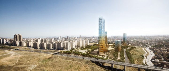
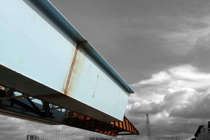
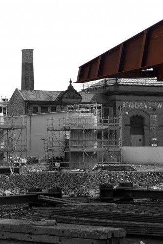
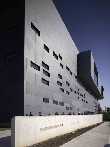
Our project currently under construction in Turkey ...
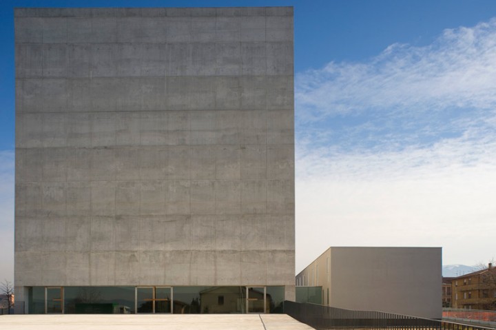
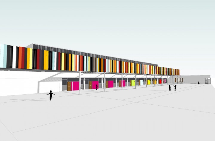
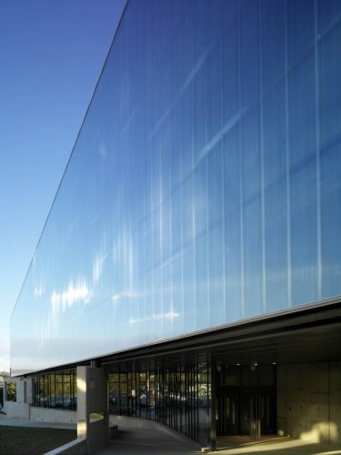
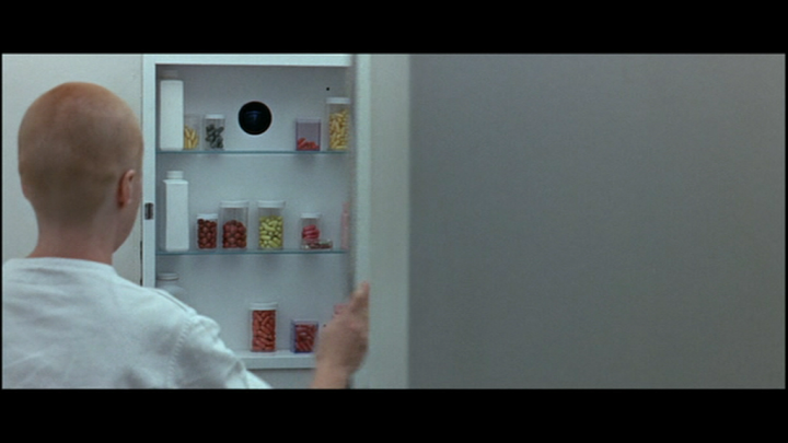
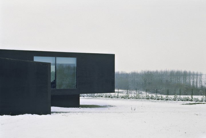
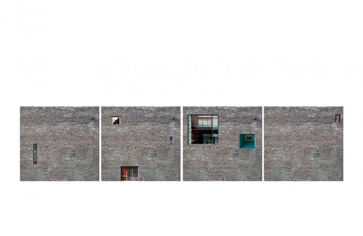
Grey on the outside ...
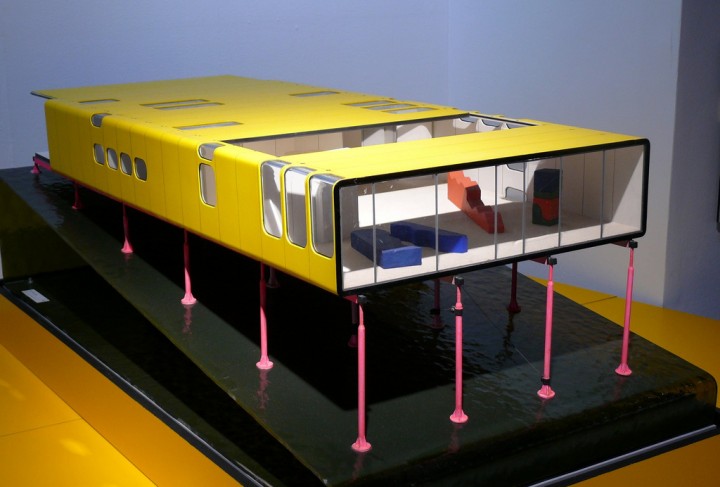
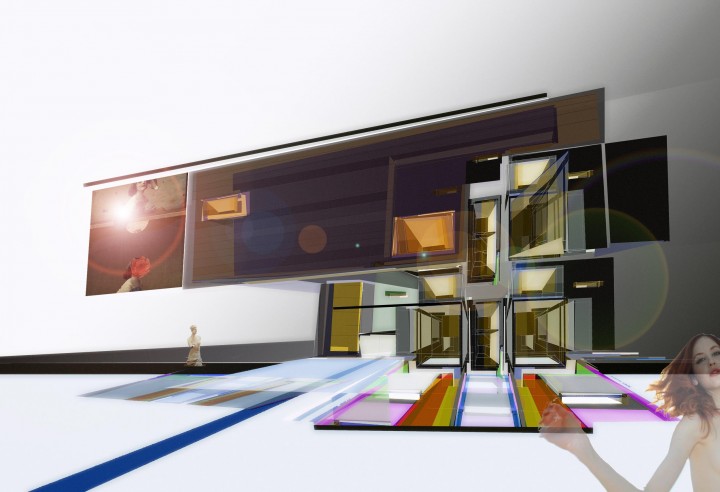
Colourful on the inside ...
Unbelievable Tramway Gallery installation by Christopher Buchel.
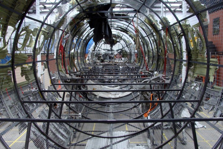
In short as I understand ... the artist bought a 747 ... took it to a quarry in Germany ... blew it up and reconstructed it in the Tramway. Brilliant.
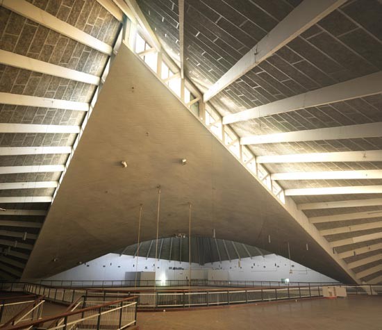
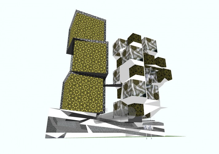
structure we are considering for middle east client ...
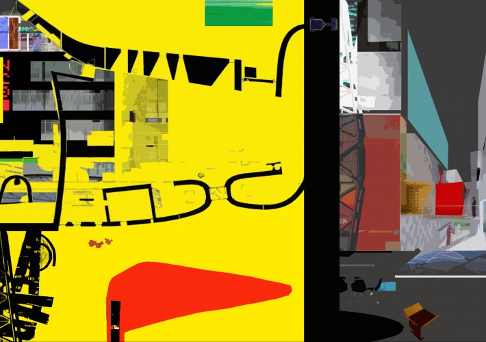
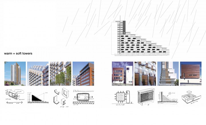
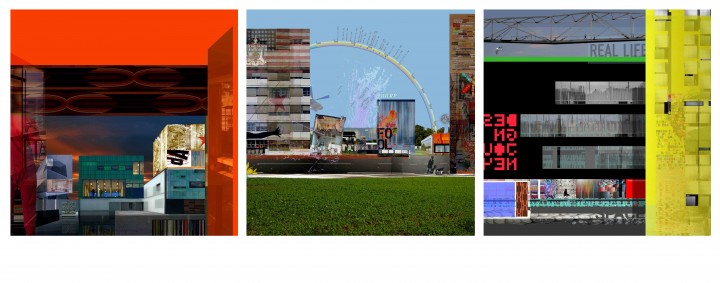
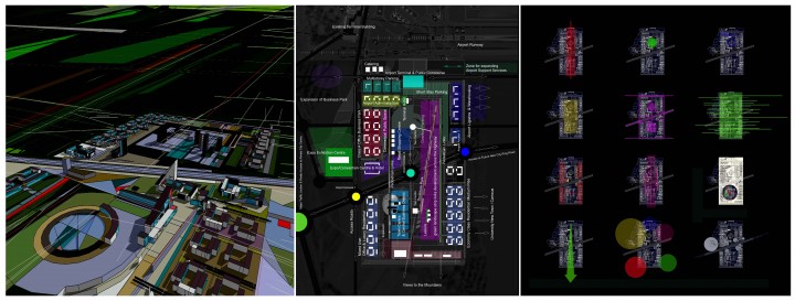
overlaying different text graphics ...
just making patterns ...
again not sure why ...
...........................
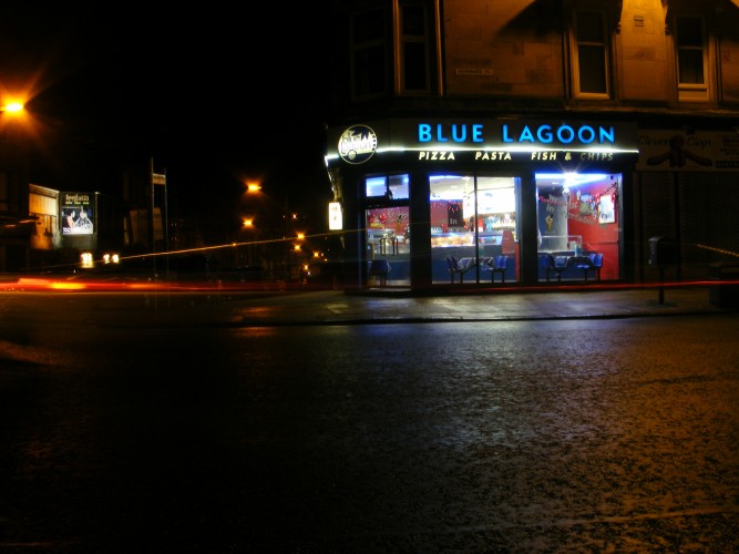
............. caught with open exposure
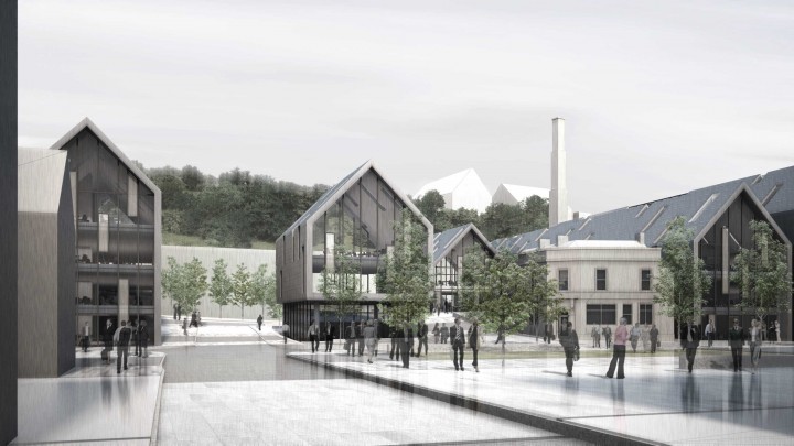
Proposal for new faculty building at Ulster University led by my dear colleague Paul Rodgers ...
... teams contextual proposals for local authority offices in Whitehaven
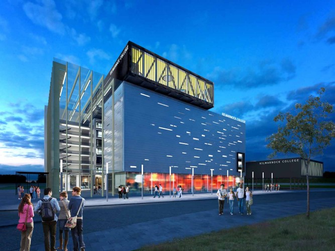
... missed out to BDP to at Kilamrnock College recently
... a sketch visual of one of our options that
... considered putting the games hall on top of the building
... lovely client team
... good luck guys
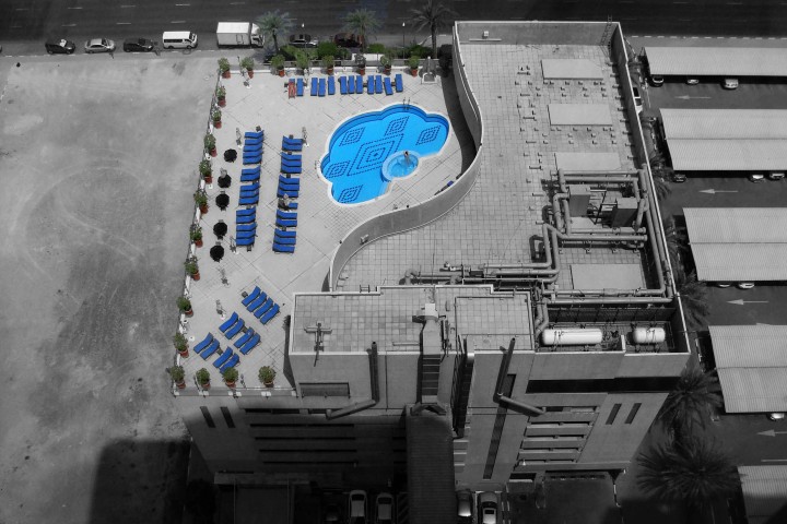
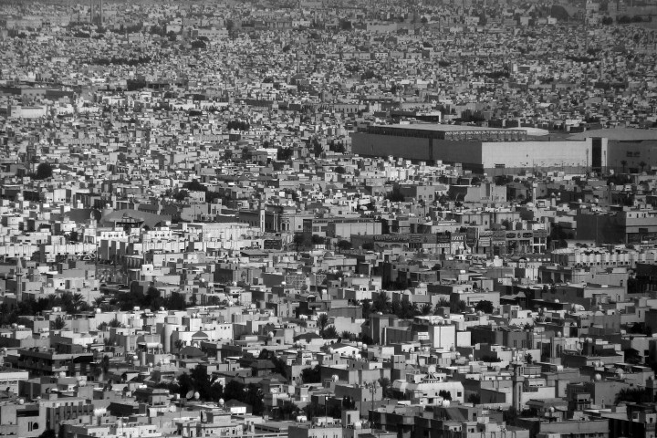
Took this photo from my taxi on the way back to the airport ...
... spending time in Saudi certainly challenges your cultural sensibilities
I could spend days with my kids on the beach making castles ...
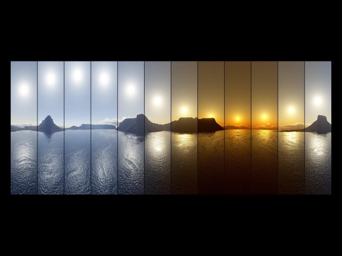
View of the sun moving across the sky and not setting ...
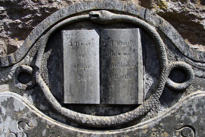
... photo of a stange headstone carving and inscription I cam across in a an old graveyard near York.
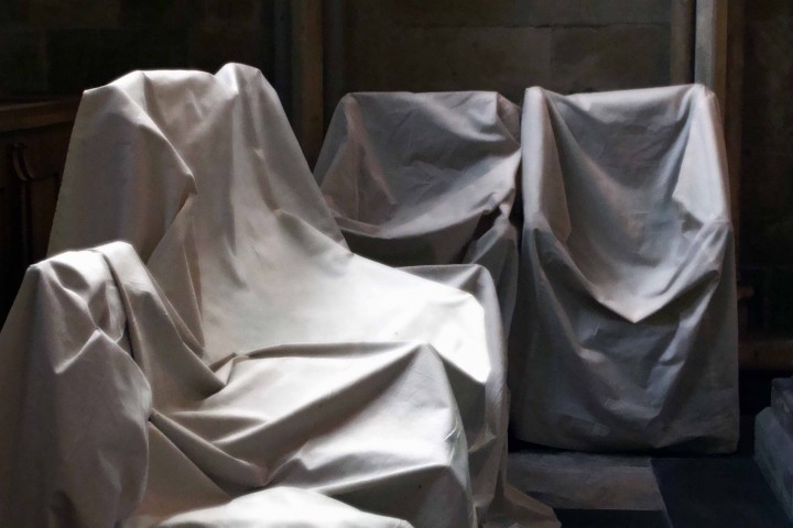
I took this photo of a set of chairs in an old church that were covered by cloth ... reminded me of the paintings by the artist Alison Watt
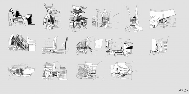
I found these sketches in my note pad recently ... prepared very early on in the Parliament skectch design stage when working with Enric Miralles. I personally had very limited time with Enric but I did engage with him and the team at the early concept stages. I sketched these little doodles trying to understand the nature of the spaces that Enrics models where describing.
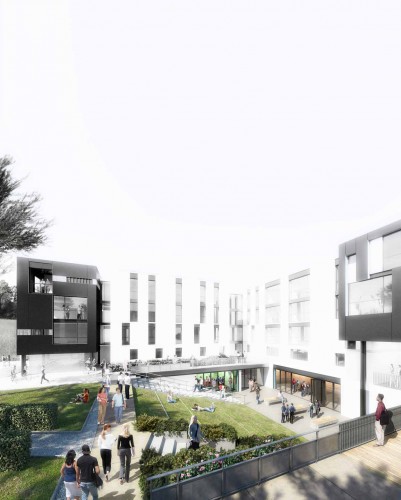
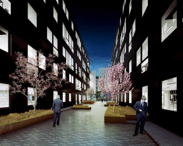
... this image shows part of a residential courtyard space for a proposal that we are working on with Heriot Watt University ... Internally the courtyards are complex whilst the external perimeter elevations are intentionally very plain. We hope the drama of passing from outwith to inside will be dramatic.
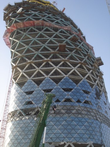
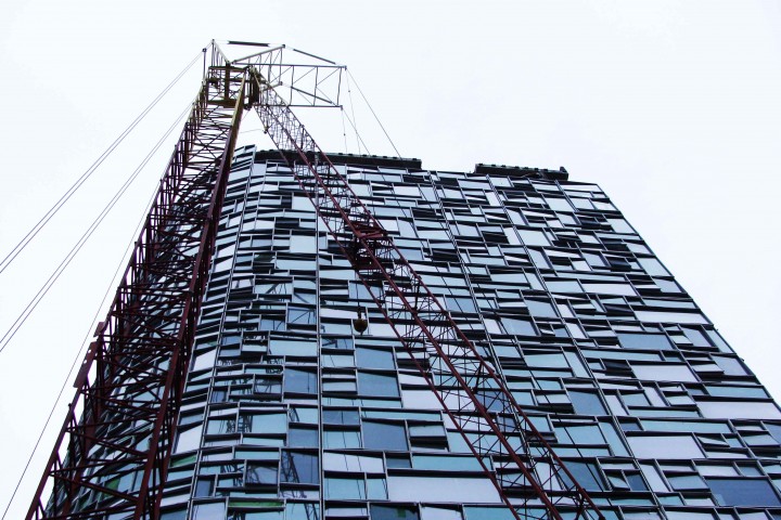
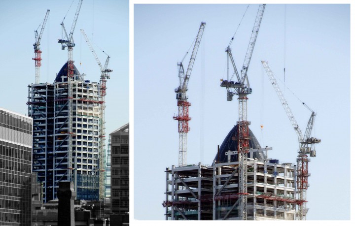
A construction photo of our leaning tower at the Capital Gate site in Abu Dhabi just prior to its completion. Project has been highly succesful and looks great. Understand the project is in the Guiness book of records for the tower that leans the most ... mmm
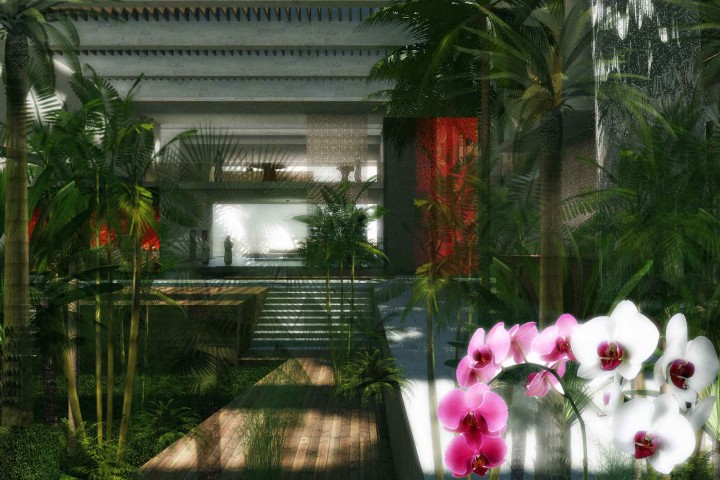
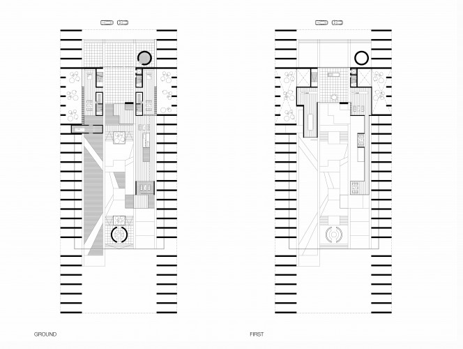
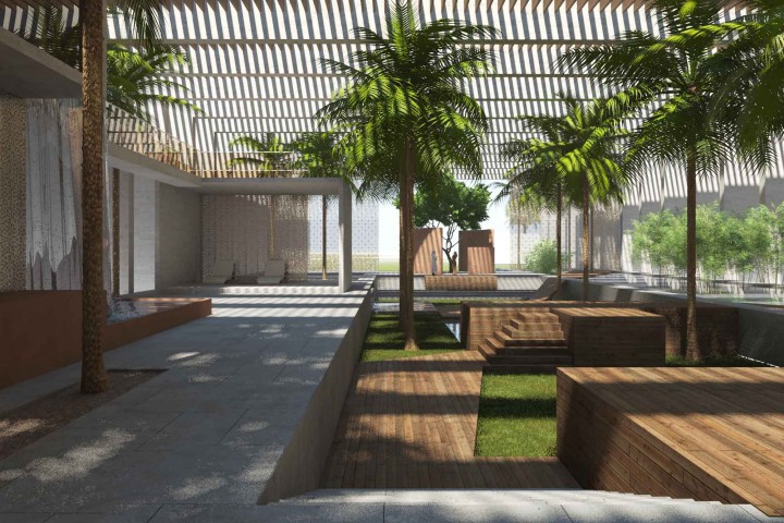
The design of a contemporary tropical garden house for client in the Middle East I am presently working on with the team ...
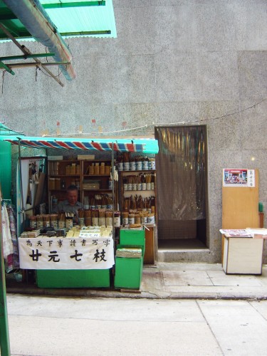
Took this photo in Hong Kong of a man selling small brushes and ink. The stall ... a beautifully neat and compact display of implements and materials for drawing and writing.
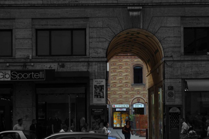
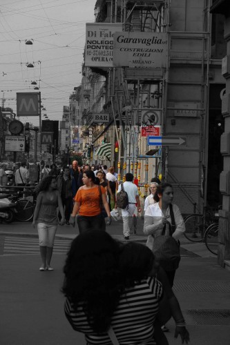
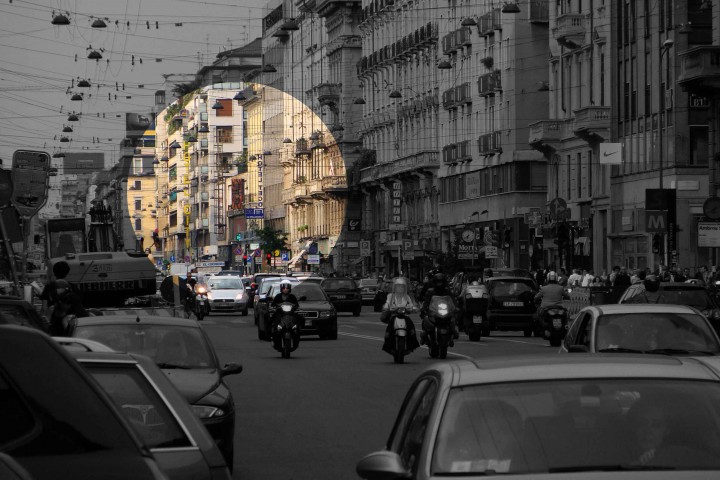
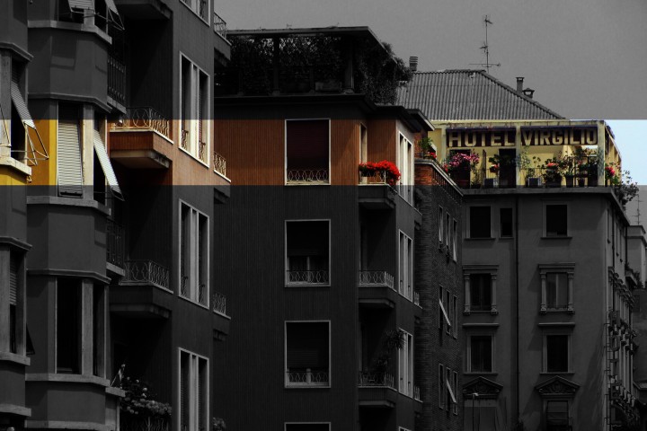
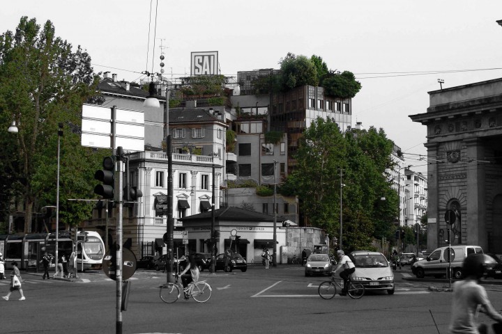
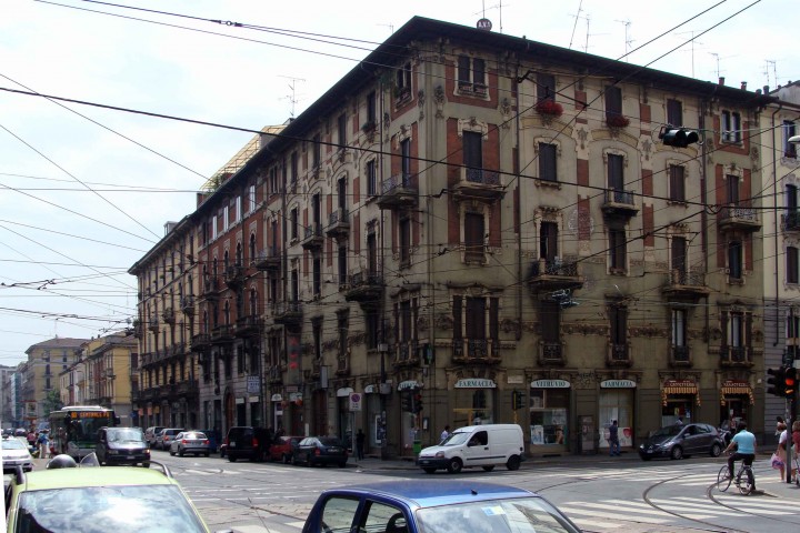
My photos of Milan street life where very busy ... its obviously a busy place ... I tried therefore to select details within the street scene to change the way the image is seen.
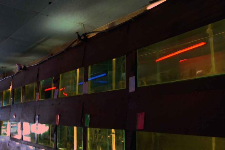
... Jean Nouvel's exotic fish shop in Glasgows Trongate ... honest
was in Milan last week ... meeting a new client to discuss a proposed luxury villa ... potentially an amazing project.
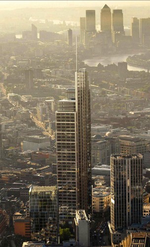
KPF have delivered an elegant new tower ...
Great Fuksas project ...
We discussed with Mr Fuksas collaborating on the Haymarket site in Edinburgh ... lovely man ...
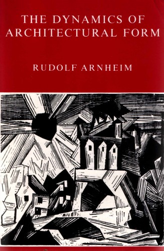
the dynamics of architectural form ...
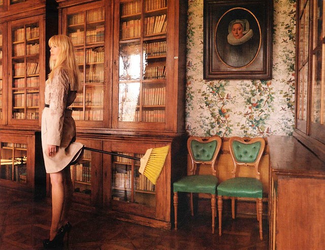
... she wore blue velvet ...
Inspired by the late Jan Kaplicky or was it the other way about?
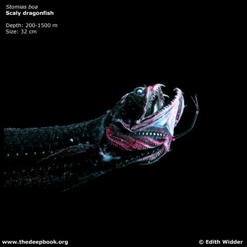
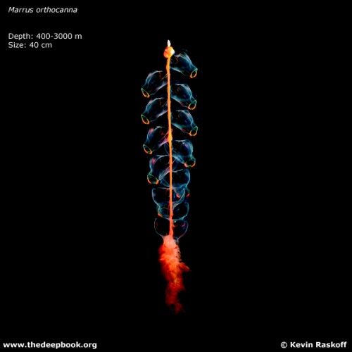
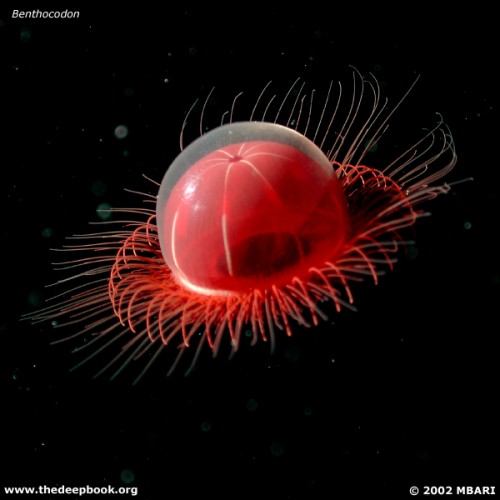
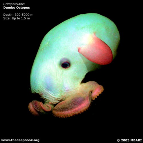
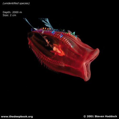
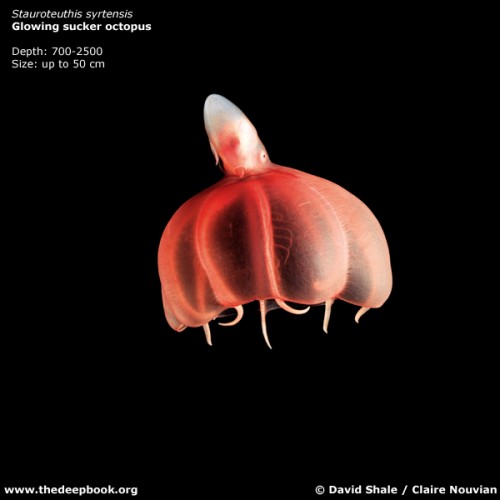
Astonishing deep water creatures
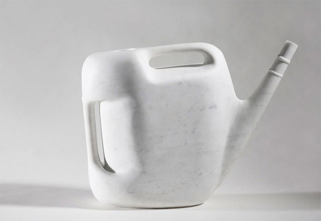
This canister is made of white marble ... Alexander Seton
Rhinos ... would love to design an enclosure for these guys.
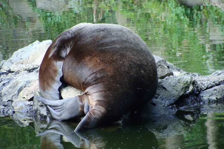
Sea Lion ... snoring
Edinburgh zoo ... very hot day
Trip to the zoo is always an inspiration
by appointment only ....
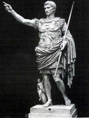
what is the significance of his staff and what is he pointing at?
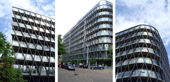
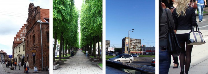
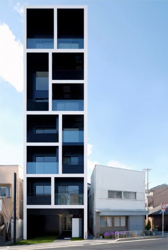
A very contemporary apartment building in Kaunas that I just happened to come across ...
... much new architecture across the Baltic States is of a high standard despite the economies being devastated ...
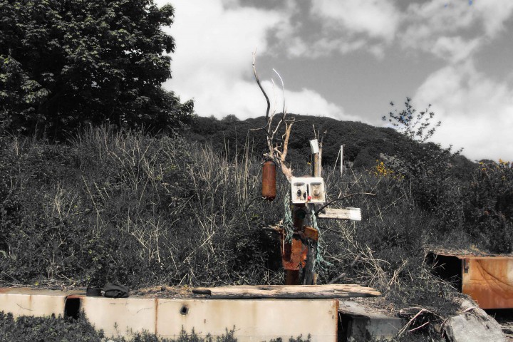
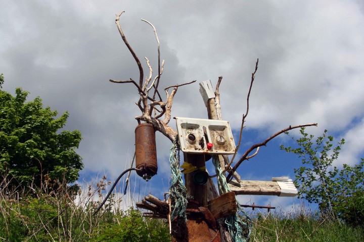
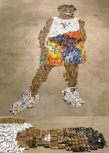
Made another random man out of junk ... my kids disowned me ... in time they will understand
... just liked the colour and the light
Andy Wen and I ... in the most incredible gallery space in Beijing ...
Chinese contemporary art is dark beautiful poetic tragic hopeful ...
Full of surprise.
... mixed use tower project that we are currently working on through to scheme design stage.
Engineered ...
... my colleague Adrians vision for the foyer within Galway's Engineering Faculty
Alan Dickson who heads Rural design with his partner is a star! The Skye based practice are a lovely couple who deserve even greater success. Alan and I worked together on the Tron before he was wrestled away to work on the Parliament Chamber. Not long after Alan upped stakes and took of the the Islands never to look back!
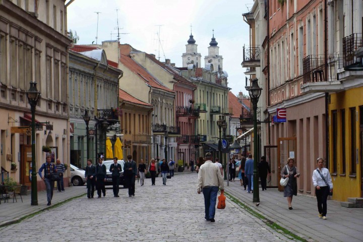
Was in Kaunas this week in Lithuania to meet with a potential client. Both the people and the City's character where a delight. Hoping there might be a project for us to consider there. Hard shift travelling to keep our team busy.
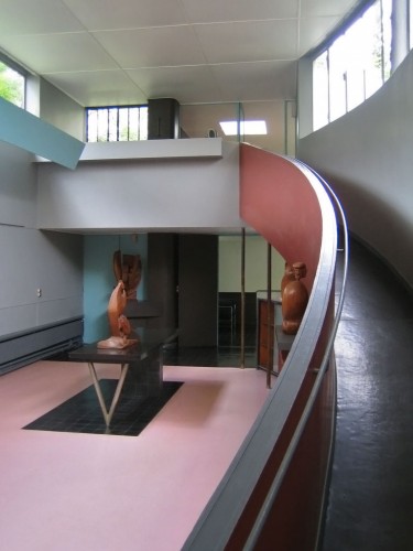
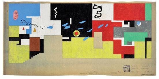
Corbs colour schemes are always interesting
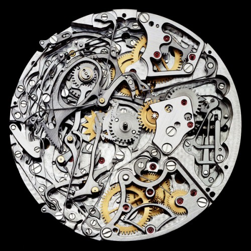
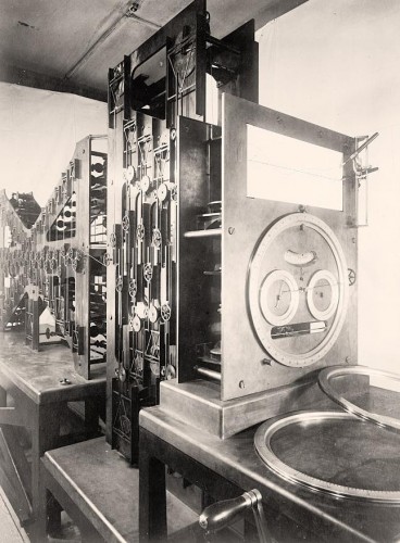
beautiful photograph I found showing the inside workings of a watch
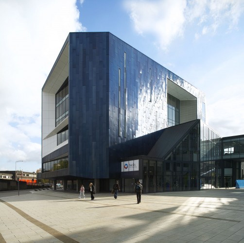
RMJM's new learning resourse building for Buckinghamshire University ...
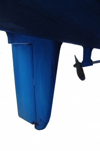
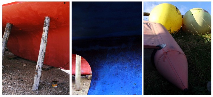
Took this photo of the 'fin' beneath an old boat ... loved the shape and the colour
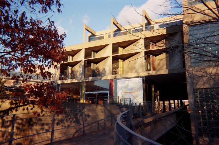
... managed to visit Corbs Carpenter Centre whilst doing some teaching at Harvard.
Was researching reflecting pools .... selection of political, cultural and religious reflections
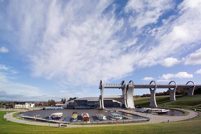
When I led the design for the Falkirk Wheel experience I never thought that it would be realised. I thought at the time that it would be to much of challenge. British Waterways proved me wrong.
I concieved the entire masterplan with help from a very young team (me included) ... very simply we had to demonstrate how we could create a functional and thin aqueduct channel, how to locate the visitor space, create a new basin and carefully work with the existing site levels. The boatlift itself is was subject to an internal design competiition where we brainstormed different options until the client chose the '5 cog' option. Some of the alternative boat lifts that where rejected where all interesting...
Timber frame revealed
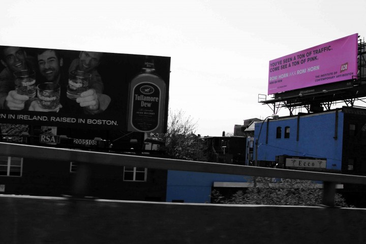
Institute of Contemporary Art Boston ...
Industrial baroque ...
Was in Boston last week doing some teaching at Harvard ... had time to walk around the city and remind myself of the varied architecture ... from the tenements of Beaconhill to the Boston Institute of Contemporary Art at the docklands.
Dreaming of this space ... (Need £350k to complete)
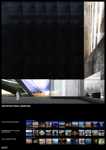
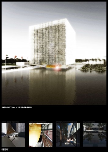
.... teams design proposal for the FNC Assembly Building in Abu Dhabi or UAE Parliament in other words.
Really enjoyed working on this competition entry.
simple but colourful ...
rough but with some photoshop ...
Project presently making really good progress on site ... team really enjoying watching it come out of the ground.
RMJM's Beijing Convention Centre in full swing ...
It's yellow so I like it.
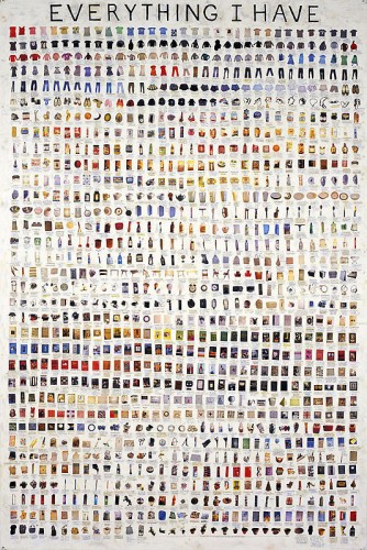
This guys Simon Evans detailed everything he owns ...
Kind of cool and pointless ...
astonishing cantilever and sculptural expression ...
... interesting Paris based design practice
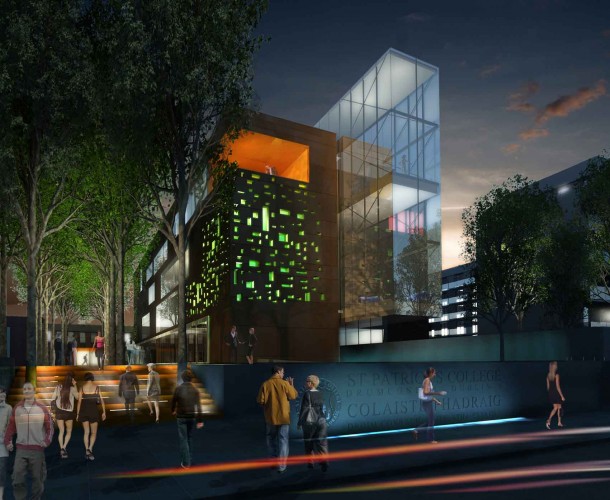
Image of our St.Patrick's library project which is on site in Dublin.
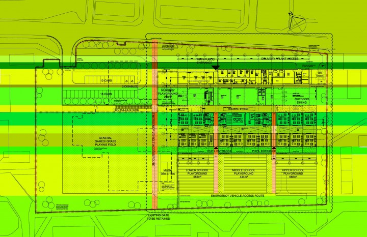
We developed a beautiful plan and section diagram that relates to the historic gardens and context. Team and client are excited about the buildings potential.
... still fresh
.... pre Star Wars film made by George Lucas featuring Robert Duvall. A classic aesthetic.
I found this rough collage that my colleague Ricky knocked up when we were working on Robbie Coltranes house. A fantastic project completed when I was at McGurn Logan Duncan and Opfers. I was the young project architect on the job. Robbie was as you might imagine a seriously funny and cool client.
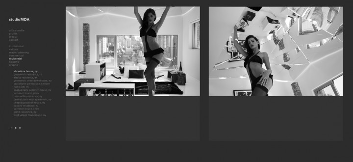
This is an extract from the website of New York architect Marcus Delany ...
My colleague Alistair met with him last week ...
This is his model girlfriend... in one of his completed penthouse projects ...
Think that is probably his tie she has on?
The architectural detailing in the apartment includes ... Swarovski crystal embedded velvet restraints.
Presently his clients include Madonna and Sean Connery.
We are hoping to collaborate with him on a project in the U.S.
The Cowgate Library proposal Edinburgh. Proposal that Nick Blair and I did some time ago ... model still looks great.
at the time we described it like the Pompiduo with a duffel coat on.
Settlement follows 'circular' topography ...
..................................................................................................................................?
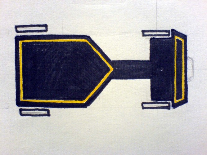
My Dad designed and made me this bogie exactly as per the drawing in 1972 for my 5th birthday. It has been an obvious inspiration for me!
... which I borrow from time to time
Museum of Scotland is still a great big beautiful pudding ... for me it is better deconstructed into bits. I took this photo of the rear elevation which is fantastically figurative, perverse and poetic. Would have loved for Gordon Benson to have built the nearby Cowgate Library project which would have been a more singular architecture. Nick Blair and I came third place in the Cowgate competition. Both of us straight out of university. When we were shortlisted we tried like hell to win ... all the more tough given we were up against Gordon who had been our Professor the year previous.
I did this sketch about 10 years ago ... for some reason it still seems relevant to me ... like a little visual manifesto
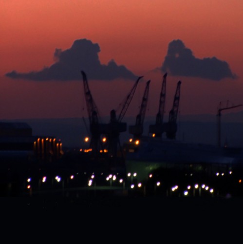
The sun going down on Govan's cranes ... view from my window
This should work ... as suggested by David Shrigley
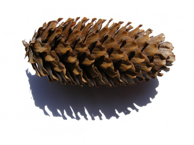
I took this photo of a simple pinecone to remind me of natures inherent beauty and architecture ...
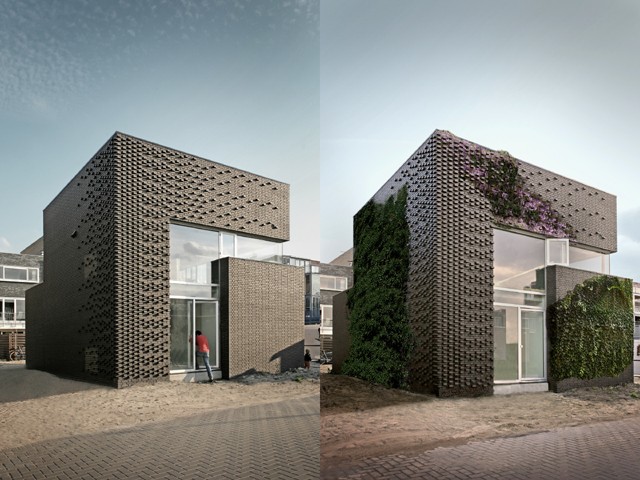
Interesting detached house with unusual brick detailing to encourage planting to grow across the elevation.
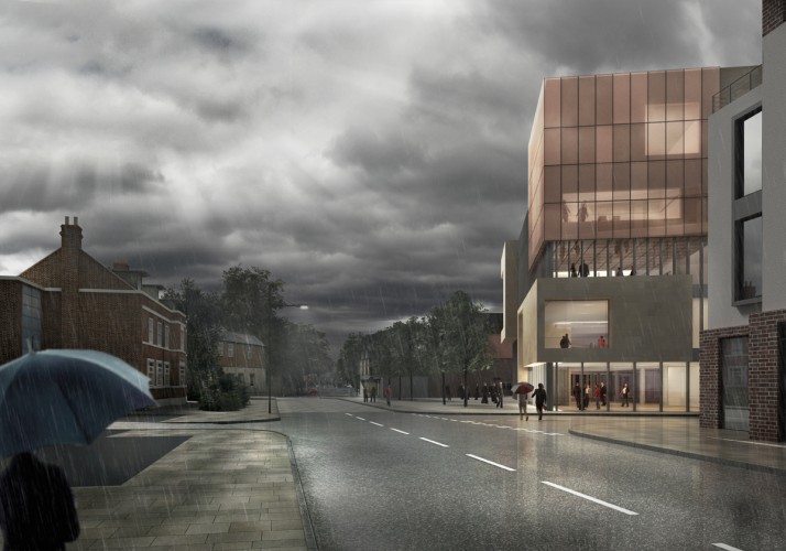
... our visualisation team try a selection of views with real weather.
... our education teams work in Libya.
The plan inspired by the arabic medina ...
Whenever you need to be reminded that form follows form ....
RIBA has an incredible collection of Henk Snoek photos of classic modernist buildings taken throughout the UK.
... by Tezuka Architects ... brilliantly simple and cheap.
Drinking alchol in Riyadh is not recommended ...
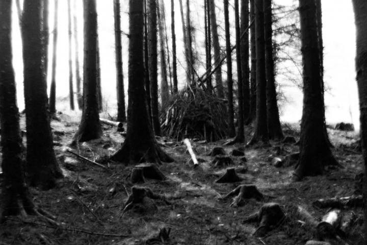
My son and I made this wigwam at the weekend in a forrest somewhere that we will never find again ...
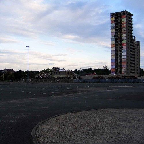
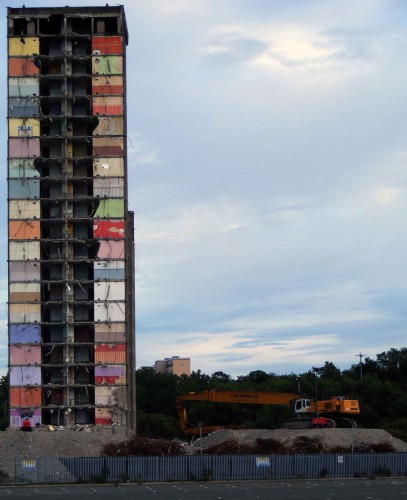
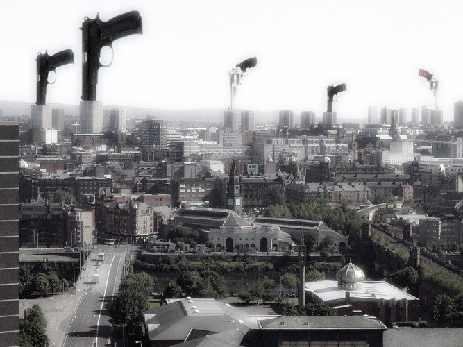
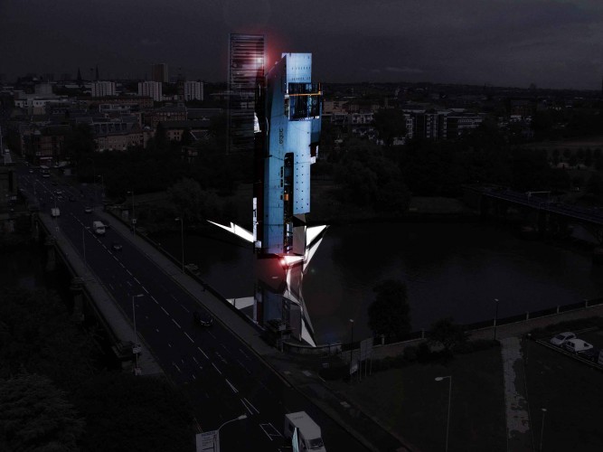
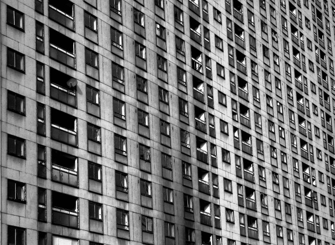
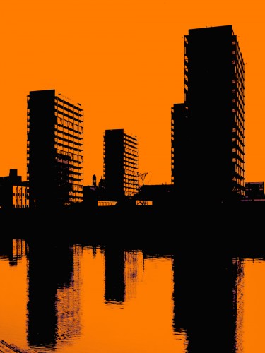
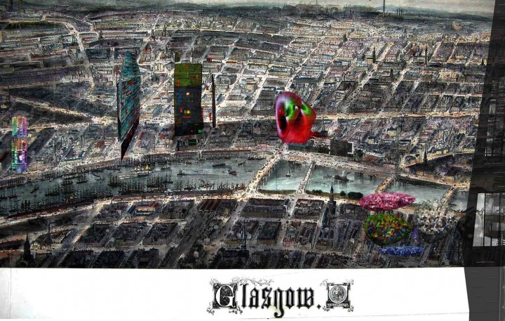
From some perspectives Glasgow's skyline is dominated by high blocks. The Glasgow Housing Association is doing its best to reconsider the potential of these buildings. Many of them as most will be aware are also scheduled for demolition.
Not as you have seen it before ...
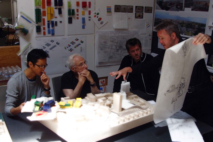
Frank Gehry, Edwin Chan and my colleague Paul Rodgers and I working on the Glasgow Super Campus project in L.A. back in October last year. I am explaining the potential of Cathedral Street and the prospect that the new campus might develop an almost medieval morphology of interlinked spaces and buildings that allow the City to the South to link with the more isolated community in the North.
Note ... Edwin is one of Franks key design directors and a remarkable architect and designer in his own right. A fantastic and generous individual who is 100% commited to the art in architecture. Edwin was the project director for Bilbao and many of Gerhy's other seminal projects. It is wonderful to see them working together in their remarkable and vast studio surrounded by 100's of thousands of models.
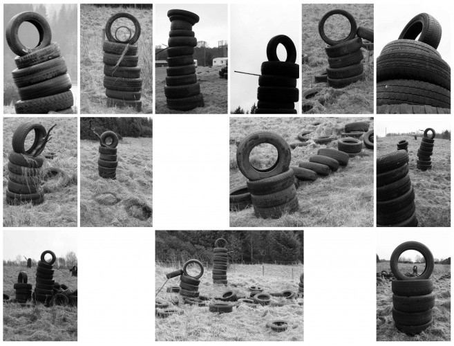
I made these tyre people ... not sure why
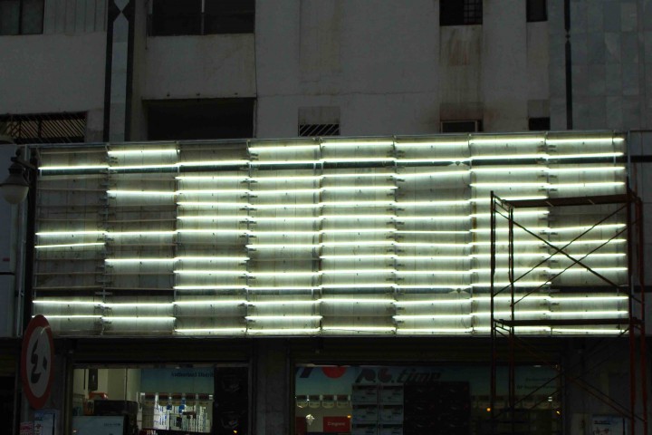
Abondoned shopfront in Riyadh ...
Since a small bot the Red Road flats have always made me stop and stare. Their sheer scale is staggering.
(photo by Doug Stallan)
Photograph by Douglas Stallan ... (my pop)
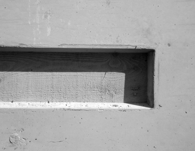
Very simply a detail showing a slot feature which we cast into a concrete wall in one of our Newcastle College projects ...
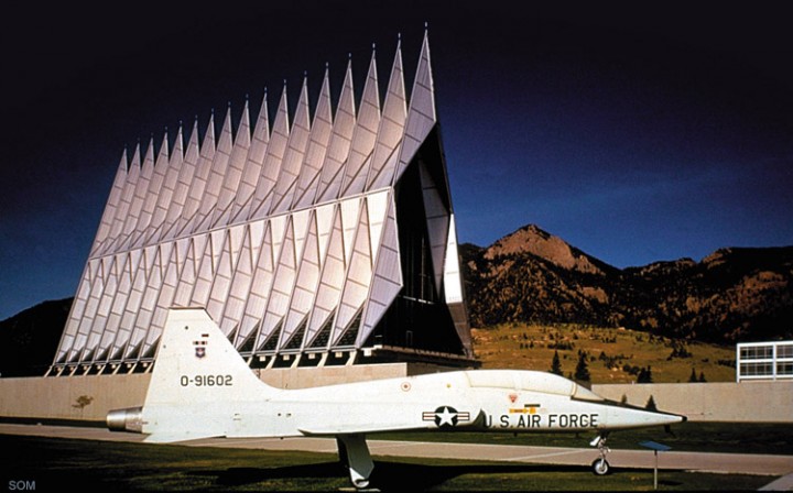
An elegant and aerodynamic church building obviously inspired by its siting in a U.S. airbase.
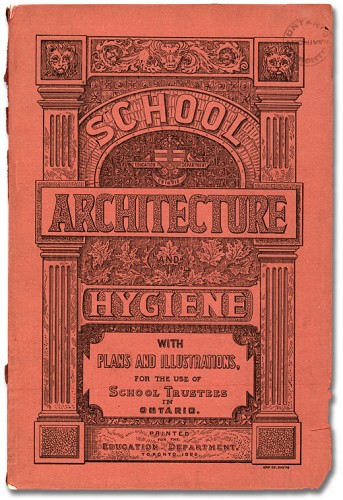
Hygiene an important consideration ... in 1895
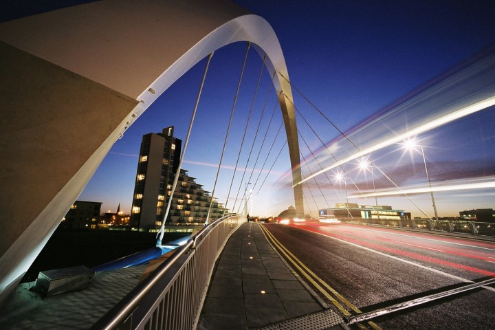
We designed this building on a minimal budget. Our team still consider this project to a successful building that contributes to the context of the squnity bridge. The project is what we would term 'industrial' housing and certainly has not got the refinement of a Richard Murphy residential extension.
Compared to what the developer threatened to construct prior to our involvement; i.e. same as previous phase, we believe we have given something to the River front. I have two friends who live in the building and they love its space, light and views ... its robust detailing and metal facade!
We never did get a design award for this scheme as the year we submitted it was extensions galore. I would challenge anyone to do better through the design build process.
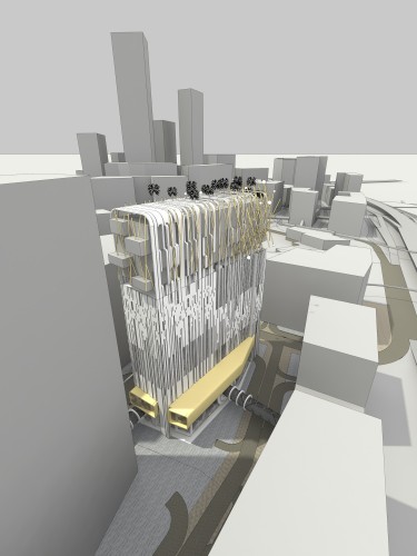
Sketch Up remains a software package with greta potential. Most of our team enjoy working in 3D courtesy of this graphic package. This is a visual of our 'Superblock' project named Event Horizon.
Seminal project by Foreign Office Architecture ...
Sad to hear that the practice is splitting ...
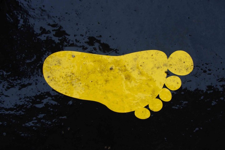
funny footprints in Glasgow's Trongate ...
It is still astonishes me the whole process of construction.
On North Glasgow College we managed to record the entire process on a time lapse video ...
Working on a tower project within a masterplan context designed by the Danish practice Henning Larsen. Interesting design led practice who are working internationally. Wonder if they are lambasted within Denmark for trying to promote Danish design internationally and providing opportunities for young Danes to work and experience new cultures and locations across the world?
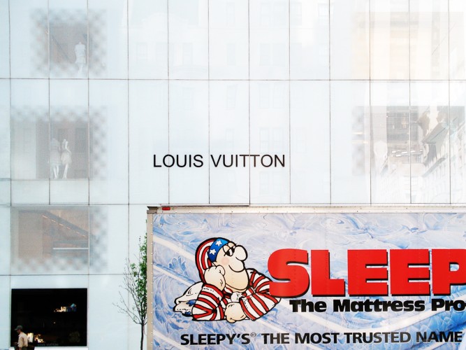
Took this 'brand busting' photo in New York ...
... an image from a recent masterplan proposal we prepared for a small part of Adrossan Harbour. An extremely challenging context.
Would be great to see coastal towns like Adrossan find new purpose and confidence.
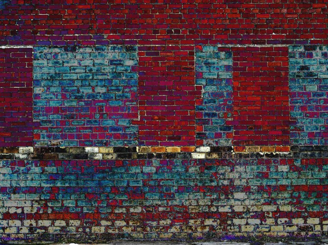
I took this picture of a brick wall in Kinning Park
... our serviced apartment proposal at Brown Street in Glasgow looks at creating a new throughway east west across one of the Broomielaw's super blocks. Trying to look forward and encourage greater pedestrian movement in the location running parallel to the river.
Douglas Gordon has had astonishing success and critical acclaim internationally. His retrospective show at MOMA in New York a couple of years back was a definite highlight. Fantastic for a graduates of GSA. Just a thought ... wouldn't be wonderful if emergent architectural practices had a similar infrastructure to the Gallery network internationally that serves the visual arts community?
Our Hong Kong team modeling ... a new hotel proposal ... I think.
We have been talking to Joshua Prince-Ramus and his design practice REX who are based in New York about design collaborations. Joshua was the project architect an lead designer for OMA's Seattle library project. We recently submitted with him for the Birmingham library project although were unsuccessful. Joshua has an interesting practice and is certainly someone who I am sure will have greater international success over time.
great colours ...
Very simply
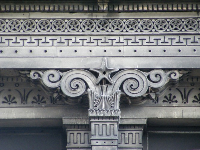
... a beautiful detail of Alexander Thomson's Eygptian Halls in Union Street Glasgow.
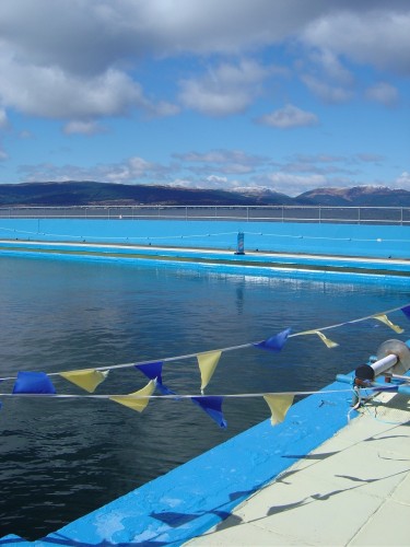
A picture I took of the outdoor swimming pool at Gourock with the hills in the background
... a beautiful space.
Martin Boyce has a solo show in Dundee currently ... Martin is a extraordinary artist ... definetely worth reviewing his work.
The Tron Theatre Box office which was a space that we worked on with artists Richard Wright who has just won the Turner Prize, Andy Miller and Kenny Hunter has been dismantled and reconfigured for an alternative use. The Tron Theatre project which is now just over 10 years old was designed prior to the onset of people booking theatre tickets online. The theatre just never envisaged that the box office would in time become redundant! The volume is reasonably flexibly however and is being used by the Theatre as additional education and workshop space. (Some people might remember prior to the Trons capital lottery award that this space was a historic vent shaft for the railway that runs under Argyle Street.)
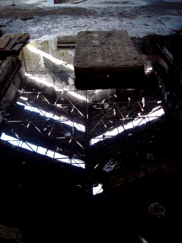
... the environment around Mackintosh's Scotland Street School is bleak ... though this photo of a matress looked rather beautiful I thought ... bit like the Richard Wilson Oil installation in the former Sattchi Gallery.
Recently completed project by our Cambridge team ... a beautifully detailed robust box.
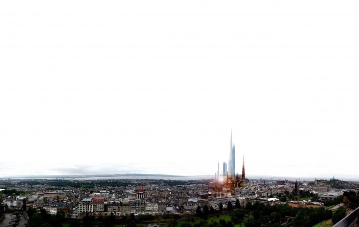
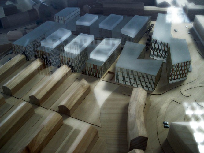
Model of RMJM / Nord proposal for Haymarket ...
Our Music Performing Arts & Media Academy in Newcastle at night ...
RMJM's Czech embassy building in London ...
Our surreal proposal for the new Grand Qingdao Theatre ...
This is a recently completed project which we delivered for Newcastle College which has been well recieved by students. The building is a new Lifestyle Academy which is basically an environment for a mix of learning spaces that are focused on health and beauty.
The brief asked for a building with attitude and style, a building that was robust and could take the knocks over time. Included within the building we have a rooftop restaurant with great views towards the angel of the north sculpture, a spa complex, a hairdressing salon, a nail bar, various gyms and much more. The building places a lot of public functions on the roof to enjoy the views and thus allows for a more solid and monolithic base to accomodate the more private type treatment rooms and specialist spaces. The result is an architecture that is sculptural and unusal.
The building also looks great both day and night and a good complement to the more extrovert building we also did for the College opposite, which is a Music and Performing Arts faculty.
My colleague Adrian Boot delivered the project for Newcastle College who are about the best client you could possibly ever work for. The building also secured an RIBA award.
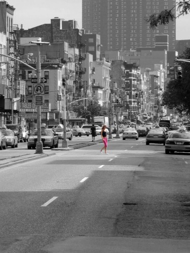
... this is a very cool street in New York near the Bowery district. The streetscape is vibrant and mixed with some architectural gems including a fashionable Herzog & de Meuron apartment building.
Design a house and find an appropriate context for it ...?
RMJM's New Zealand House in London.
Like the Commonwealth Institute it still generates controversy. The building is one of my favourites and a structure that we continue to have a relationship with from time to time. The penthouse on the very top commands great views and is a spectacular venue for a party.
Have been playing with a new tablet style PC ... trying different graphic packages.
Great fun.
An example of a mixed use urban building block that we have been working on in the middle east from our Glasgow studio. Would be great to think that we might begin to develop similar hybrid building types for UK city centre sites where provision can be made for loft office spaces, residential, lesuire, shopping and even light industrial use.
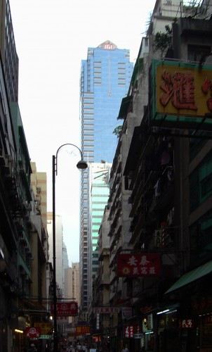
I took this photo when I visited our Hong Kong office. Our studio has been in this street for nearly 20 years although we have just recently moved to a similary busy location. The density of development and human activity is simply incredible.
This is a photo of a new apartment building in New York by Jean Nouvel which is nearing completion. The building is in the Meat Packing district and is very near the new Highline route. The client is a chap called Alf Naman a developer that has done a lot to raise the profile of this area and encourage other developers to embrace design led development. Alf has been a key figure in promoting the High Line park. We looked at an adjacent site for Alf which is currently on hold.
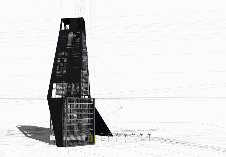
An early sketch of an office and residential tower project that we have been considering.
The office tower is essentially a monolith with the exception of a major flaw or crack that travels up the building. This sculptural feature allows us to incorporate skygardens spaces into what is a very simple vertically extruded square floorplate form.
The residential architecture as it has been developing is more complex expressing different living compartments around a central core.
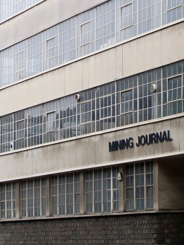
This is a photograph of the 'Mining Journal's' headquarters in London which is just behind behind Broadgate. The fact that there is a building for such a function struck me as unusual although the buildings aesthetic does seem somehow appropriate.
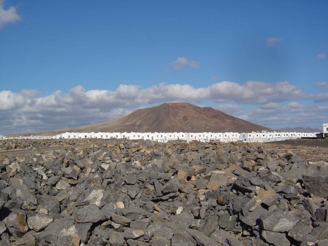
Black earth, white houses and a small volcano ... I took this photo of a residential settlement in Lanzarote.
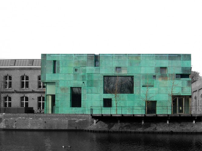
Interesting Steven Holl building I visited in Amsterdam ...
The perforated copper panelised facade is well detailed and looks especially good at night when it is back lit.
My colleague Adrian Boot and his team concieved of this new 6th Form building for Newcastle College. The project is still in development ... just love the humour in this proposal. The existing 60's campus and College location which we have been working on is unforgiving. Slowly the client team is addressing this environment through commisioning bold architecture that reaches its students and staff alike.
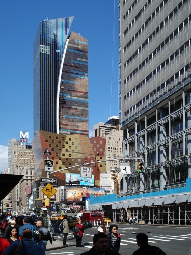
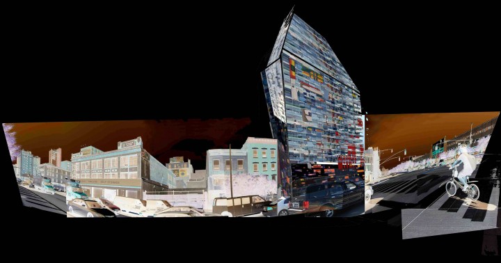
... stumbled apon this brillaint contrast between two adjacent towers in central manhattan ... one being Renzo Piano's new building for the New York Times and this rather colourful one by Architectonica. (Note you can just see Renzo's in the foreground right)
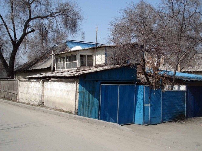
House builders as we know it don't exist in deepest central asia. Most people lucky enough to have a small plot of land build their own home from whatever they can salvage. I took this photo in Kazakhstan just prior to being chased by the owners big dog.
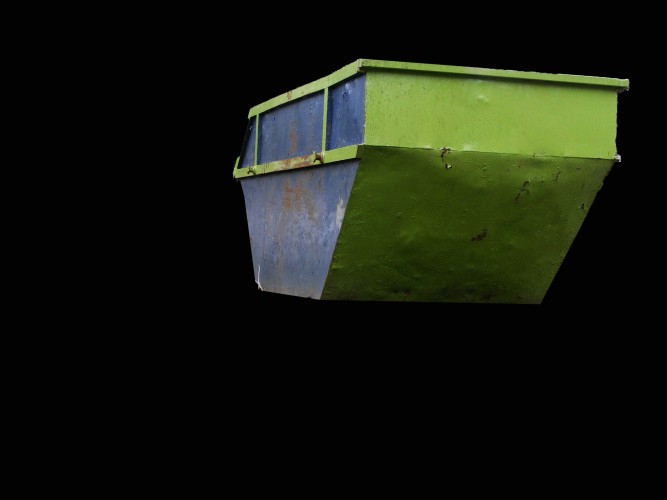
I love climbing in skips ... probably a hangover from my childhood playing in the bins
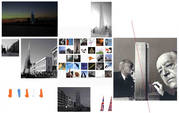
... conceptually the building is Mies van der Rohe's Seagram Building surgically cut in half across its diagonal axis.
... a selection of our design process and inspiration for a tower proposal on Brighton's Waterfront. The site is designated as an important strategic point within Brightons local plan and within the high buildings view corridor policy.
There is the potential to dine at the top of this tower and see all the way to France on a good day ...
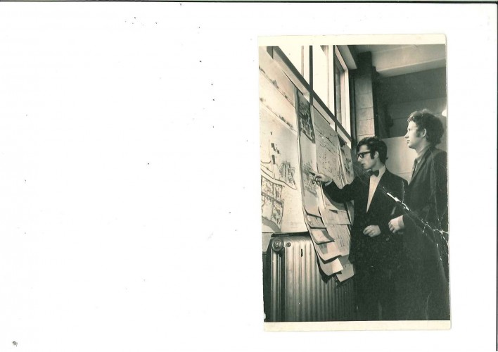
My friend and colleague Frank Timpson at the Glasgow School of Art in the 60's looking very smart ... changed days
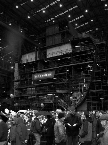
... photograph of a ships cross section taken in Govan ship yard earlier in the year.
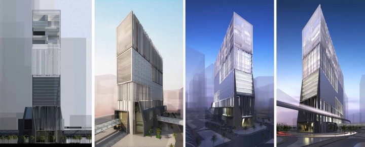
... a superblock slab building in the middle east that we are working on presently. The scheme is part of a much wider urban masterplan that is currently under construction.
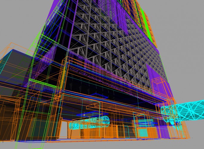
We have secured the project and are working with the contractor through the scheme design stages currently. The building although externally presented as a giant monolith in response to the extreme local climate does however incorporate massive arabic courtyard volumes within the buildings long section. The building is like a small city with vertical public spaces, mixed activity, skywalk connections, monorail links etc.
... my son said that it looked like the Java Sandcrawler from Star Wars however!
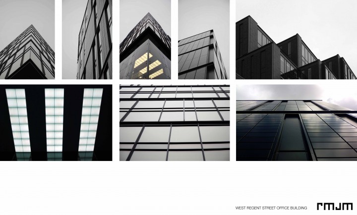
... my colleague Zafer took these photographs of our completed office building on West Regent Street. The building has just been completed and we think it is looking very cool in black. Neil McLean who led the project has a serious interest in facade systems ... I think it shows.
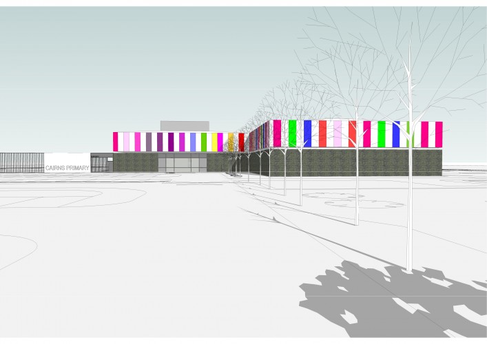
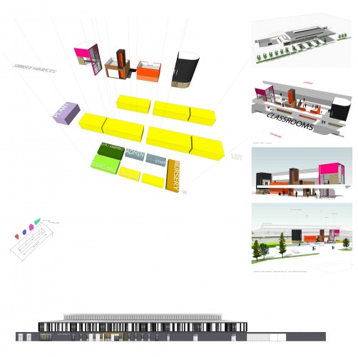
These are sketch diagrams that a very talented chap called Craig Gray in our schools team has drawn to explore the internal architecture of one of our primary school projects. The sketches examine how we are trying to detail a series of buildings within a building. The overall school architecture is very simple and relies on an extruded structural section. Internally though we are manipulating volume to accommodate 'play boxes' and other shared teaching activities.
On this project our team are commited to seeing how we can innovate even within what is a tight budget. We have made an effort to focus on providing spaces with 'increased potential' ... spaces that can be programmed in different ways to assist the dynamic and changing curriculm. In short the budget has not blocked our imagination and enthusiam.
Good design can happen regardless of the cost parameters and does in many cases save money!
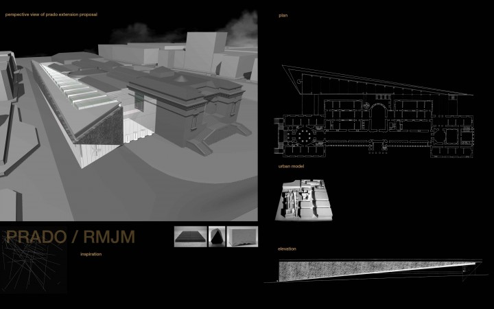
A sketch design we prepared for the Prado Museum extension competition which was won by Moneo. Our design tried to make a virtue of the the difficult wedge shaped site by developing a clear sculptural form that worked with the sites topograpghy. Like a long knife blade the black etched stone facade cuts open the existing Prado building to reveal a beautiful collection of historic art.
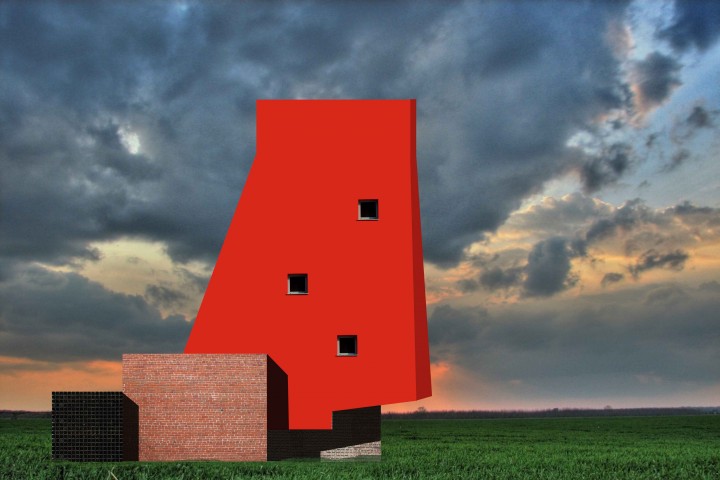
The Red Tower proposal we are currently exploring ...
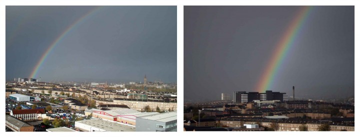
I took this photograph from my office of Yorkhill's Children's Hospital.
... like to think a beautiful baby appeared at the end of the rainbow.
I took these photographs of modern villas in Lanzarote. The intense light, the white walls, the shadows, the blue sky all as Le Corbusier imagined ... I am sure they wouldn't look quite the same in Bathgate however. Climate and your place on earth has a direct bearing on your reading of architecture.
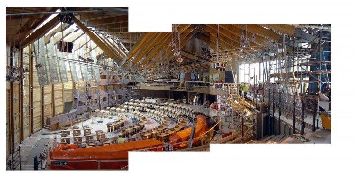
A photograph I took of the Scottish Parliament chamber whilst under construction ...
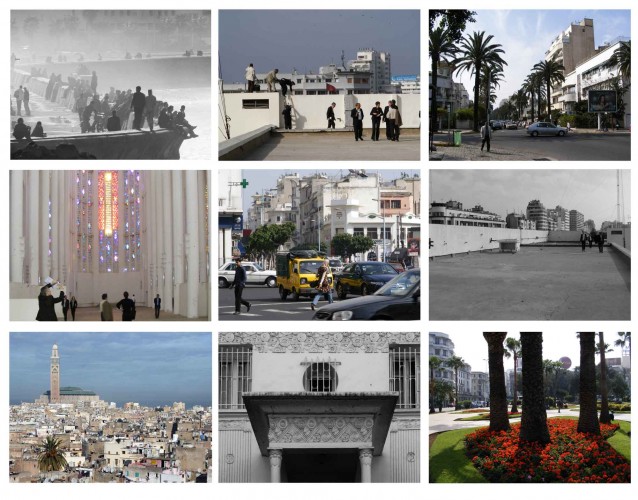
We recently agreed to support Frank Gehry on his submission for the Casablanca Theatre. Unfortunately Frank was unsuccessful ... the project being awarded to Christian Portzamparc. Enjoyed a few days in Casablanca however. It was a surreal trip ...
The local mayor organised a city tour for the participating teams ... Hadid, Koolhaas, Meccanno, Portzamparc and Gehry ... with me tagging along. There was a brilliant moment when we all climbed onto the roof of an empty office building to over look the site. We squeezed through a toilet ceiling hatch up onto the roof and then climbed onto a plant room roof for an even better view. We were 10 storeys up crowded onto a small roof with no handrail. I could have easily have pushed them all off to set Frank up nicely!
Casablanca is a stunning city ... a mixture of Arabic and Islamic vernacular, French Classicism, Art Deco and international modernism.
... some of my photos
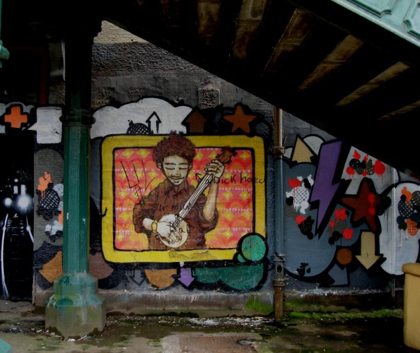
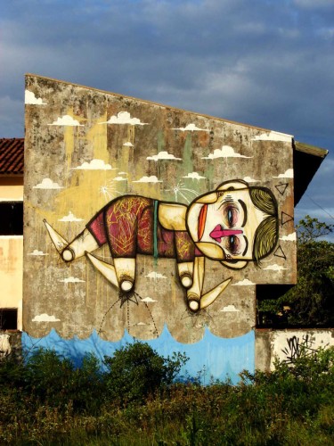
Portavadie Graffitti art ...
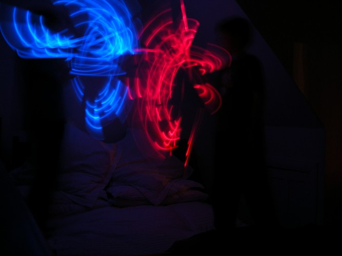
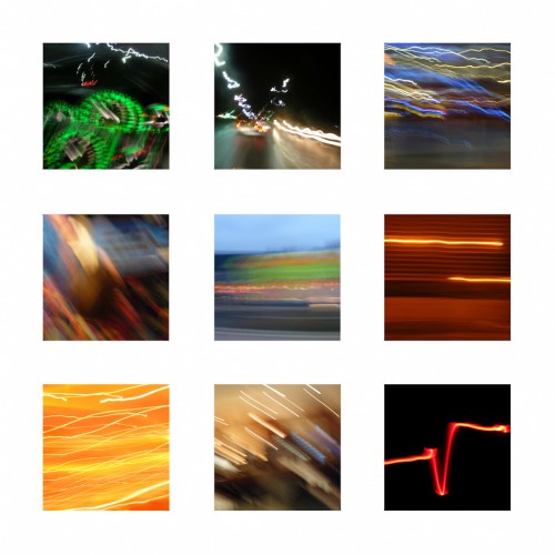
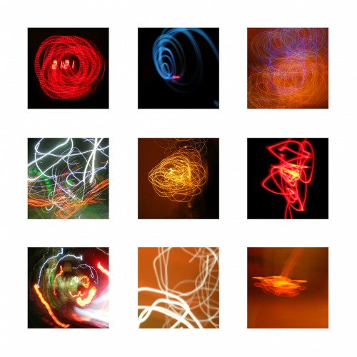
Leaving the camera shutter open on the drive home ...
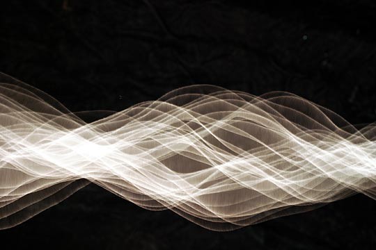
Simple images made by leaving my camera shutter open and doing daft things with a light source ...
... work in progress
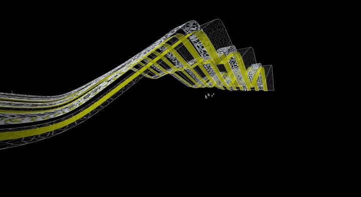
Idea is to continue a series of landscape strips up and over the building with each strip taking a slightly diferrent route. The folds would help to deconstruct the architectural mass of the building and provide the structure with a distinct signature ... still just an idea. We are however increasingly as a team exploring the potential of both Rhino and Gehry Technologies software in developing sketch designs to assess more complex geometries.
Sketch for office + residential mid-rise proposal ...
Just drawing sketching doddling in whatever medium I can ...
My view into a parking structure from my hotel room in NY ...
Two Tower Proposal
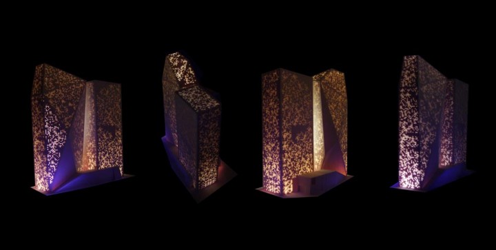
A design option for a twin tower project that I am working on in Riyadh. The image is of a 'rapid prototype printed' model ... still cannot believe that you can send to print a 3d model.
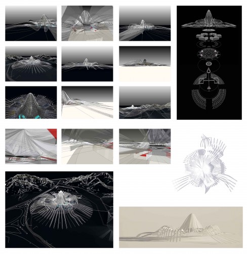
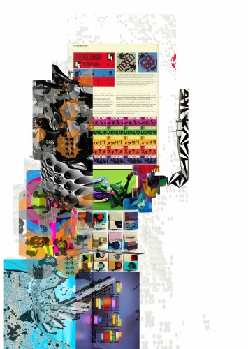
Kingdom of Saudi
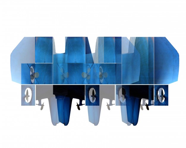
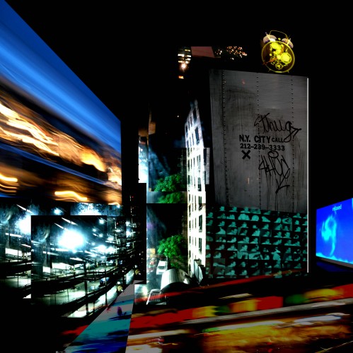
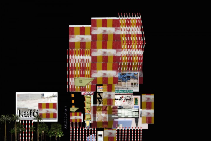
... like to cut up my photos when I return from somewhere as a kind of visual diary of the 'bits of a place'
Autobots Dancing ...
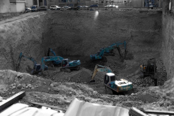
... came across these massive holes in Riyadh that the Saudi contractors dig for undground parking below their buildings. Some of the holes are 6 - 8 storeys deep without any shoring around perimeters that are adjacent to other buildings. I'm not an engineer but it looked risky to me.
... wondering around Riyadh taking photographs
... was moved on a few times by the police.
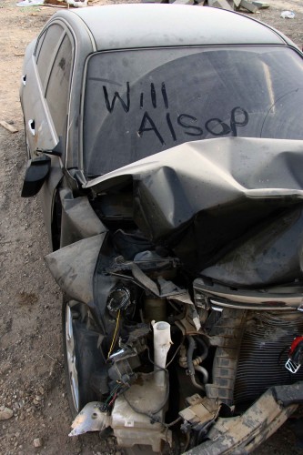
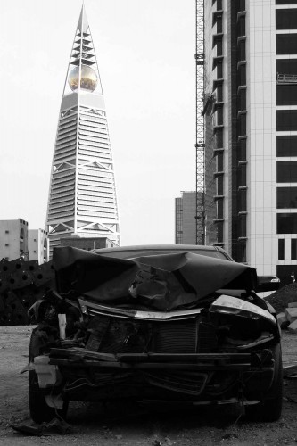
Understandably they thought it was odd me taking photographs of crashed cars.
Landmark ...
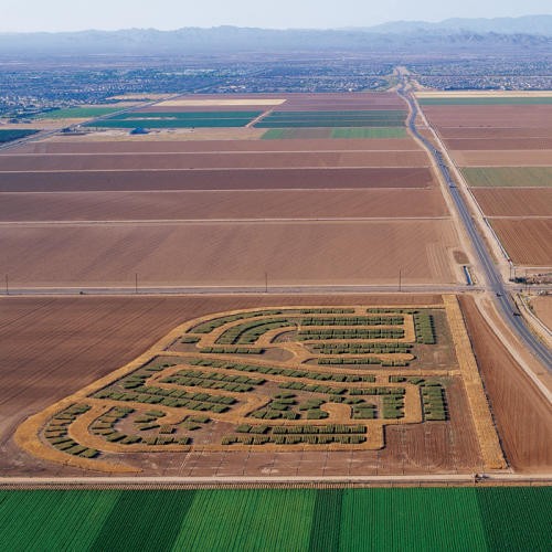
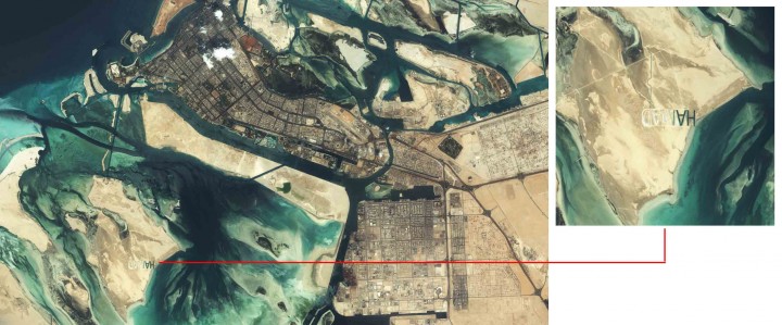
Chris in our visualisation team spotted this gigantic name 'HAMAD' carved into the desert landscape on the outskirts of Abu Dhabi. The team were working with this aerial photograph on a project in the Emirates when they spotted these letters. We thought it was a flaw in the image but the closer you go the more you can see that it is a huge landscape mark. A mystery ....
Public Art Commissioning ...
This is an image of Kenny Hunters work in progress for a project in Victoria Street in Rutherglen. The project is one of our arts commissioning projects with Clyde Gateway.
... I have always tried to encourage our team to collaborate with artists in our architecture.
e.g. ... I learned a great deal from Julia Radcliffe who was director of a company called Visual Arts Projects a small business that championed public art.
Visual Arts delivered the 5 Millennium Space projects which were the ambitious arts led public parks for the 1999 City of Architecture programme.
Supporting this type of arts consultancy initiative is hard and is reliant on continuous fund raising and good clients. To date I have successfully persuaded my colleagues to continue their commitment to this consultancy ... though the recession has certainly challenged our efforts.
Deborah Kell within our team has overseen this particular work with Kenny Hunter which promises to be a small but great art work for the East End. Deborah was previously involved in helping Kenny realise the Fireman sculpture which sits outside Central Station. A beautiful sculpture and one that incidentally took on a special significance post the 9-11 tragedy.
For Brian Hipkin ...
I worked on this project with a young design engineer called Brian Hipkin. At the time we were exploring a collaborative approach with Norman Foster. In hindsight this would never have worked ... however the Chinese contractor client who was promoting the project asked us both to consider the possibility. We attended a workshop at Fosters to discuss how we could work together. I was keen to involve Brian as he genuinely had an incredible design sense and unusually for an engineer could sketch and passionately communicate conceptual ideas. I thought that if this was to work then Brian could be the social glue with engineering being the common ground. We continued to discuss the possibility of the project for a while and liased with our client group. This was the last time I worked with Brian as not long after he actually went out to Hong Kong on the back of this opportunity and was encouraged to stay by my colleagues in the RMJM HK office. However not long after this time Brian was tragically killed in a traffic accident whilst riding a moped inVeitnam.
Brian was a star... our team have fond memoriesof him. He had boundless enthusiam and gave so much to the team when he was around. He was a young protege of Tony Hunt and someone who challenged our professional silo by thinking holistically. Brian was just 30, had a beautiful wife and 4 young children. Life is not fair sometimes.
... imagining a theatrical stage set design for a new play called the Colours of Urban
I took this photograph from the top studio of my London office ... surreal alignment
Took this photo in Beijing ... a young Chinese artists take on freedom ...
Canal Vernacular ...
Project in Port Dundas inspired by this beautiful swing bridge found locally ... or perhaps it is this shape because it is shaped like a bomb. Hard to explain to the planners ...
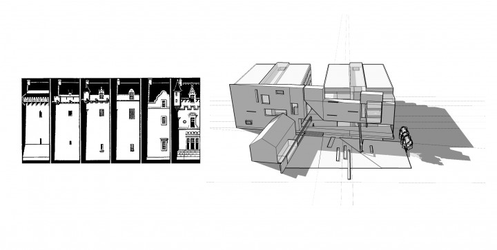
14th,15th,16th,17th,18th,19th ... 21st Century Scots Wall
The difference between a '21st Century Scottish wall' and the walls that enclosed space in bygone centuries in Scotland is that today walls need not be load bearing. This small fact has had massive repercussions on the character of Scotland’s cities. The challenge and opportunity is to consider 'hung facades' in our contemporary architecture. Opportunity to fold, cantilever and stack bond cladding is possible. The sculptural character of a Scottish wall mass is still something we might celebrate ... this is something we chose to do at Stirling. Here we took the primary facade of our development and developed a contemporary Scots wall. More solid than void... small openings then very large openings.
The diagram illustrated also captures a beautiful narrative of decreasing defensiveness in Scottish architecture. Early tower houses having massive thick walls and tiny windows. Towards the late nineteenth century the fanciful Scots baronial architecture forgets its past torment.
Rail Lines
Our Forthside scheme captures the lines of the former goods yard rail lines ...
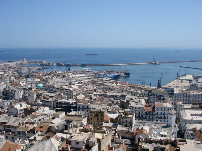
Plan to re-connect historic Casbah to sea ...
This is a photo that I took from our clients roof terrace. The terrace allows a view of the spectacular Algiers Harbour site that we have been working on. One of the central concepts driving our clients brief is the desire to re-connect the historic Casbah district with the sea. The French when they occupied the City in the 18th and 19th century built directly in front of this area to ensure that they controled this important trading gateway to North Africa.
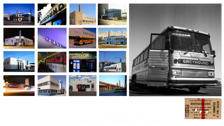
Greyhound
The entrepenurial Scottish company First Group supported by HBOS owns the iconic Greyhound Bus company (and all its sister companies like the Peter Pan bus brand). This together with the buses operated by the Stage Coach Group gives the Scots an interesting take on the public transport debate in the U.S.. (... given that this represents about 90% of the market share)
... just prior to the economic meltdown I was lucky enough to assist First Group in a very preliminary and high level assesment of the potential of a number of its bus stations. We selected a key site in Washington DC as a case study for how we might review a typical site; i.e. given that the group has a significant number of major (and minor) bus station sites in every major city across the States. The enormity of Greyhounds atrchitectural and urban legacy became quickly aparent.
Perhaps when the worlds economic situation improves we will return to the project ... in the meantime the potential of these urban and rural sites remains as does the Greyhound brand power.
Some images of historic Greyhound stations from across the U.S.
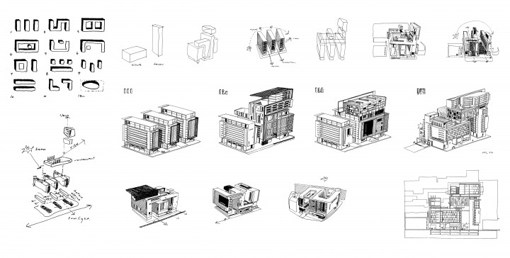
I obsessively sketch ... sometimes just random spaces or imaginery landscapes and forms. When I do have a project to think about I cannot rest till I think I have exhausted all the permutations or I fall over. This is a sketch series for a complex urban block in Edinburgh which is particulary challenging spatially.
What if?
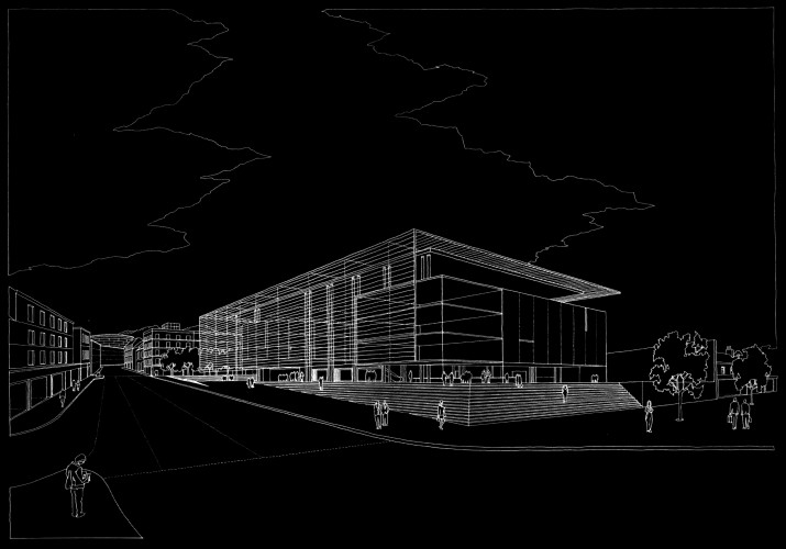
This drawing which is about 10 years old is a sketch design we prepared for the Scottish Parliament site on the Haymarket site ...
I enjoyed looking at this as a possible location with the team and asking myself what if?
Effectively Diane's Pool Hall across the road killed of the prospect of Haymarket though.
Our principal client developer for this ambitious project to expand the Almaty international airport hub is 23 years old ...
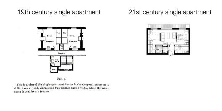
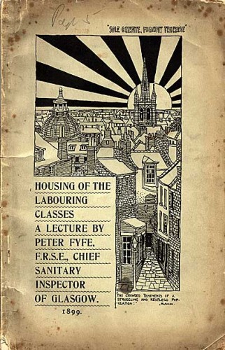
Housing the Labour Classes 1899
Armadale Midlothain
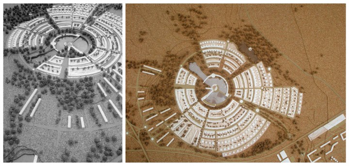
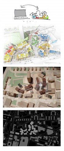
'Stellar evolution is the process by which a star undergoes a sequence of radical changes during its lifetime'... great premise for an evolving and expanding masterplan. ... early sketch of our settlement plan for the expansion of the Armadale community either side of the new rail station. Intention is to link the community north south by reinforcing a series of urban spaces between new and old. The radial plan to the south would work with the natural topography focusing around a new loch.
... Damien Hirst style.
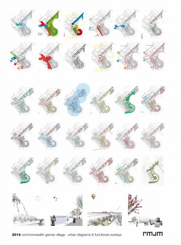
Dalmarnock 2014 & beyond
... our City Legacy team are continuing to invest in the richness of our 2014 'Games' masterplan for Dalmarnock. Hugely complex issues to resolve ... however all parties involved are determined to innovate and support the best possible legacy outcome for this existing and new community. The proposal integrates and overlays a significant number of functional and spatial requirements. Formally the plan is also developing a series of character zones of different scale and housing provision. We want the best ...
Cut me in half ...
This tower that I am working on is ... in part ... seceretly inspired by the work of Martin Boyce an artist that I have always referenced. I realise that sounds pretentious but Martins work cuts me in half. Aesthetically if I could design a building that had half the tension of Martins work I would be pleased.
Very Simple
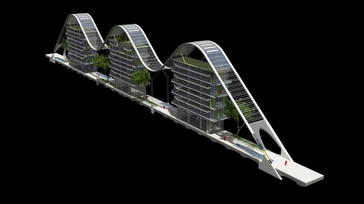
This is a roof design that we worked on for a project in the Middle East. The idea is to have a series of well organised buildings on a strict grid that can accomodate an overarching fabric roof. The roof radically assists in our environmental strategy in many ways. From the benefits of being completely in the shade through to the significantly reduced cooling loads for air conditioning the concept tackles the extreme desert climate head on. One incredible outcome that our Engineers devised was that the sites total water requirement including the irrigation of all the planting could be achieved through extracting purified water from the condensate in the air given the sheer humidity of the climate. A mixture of low tech and high tech ideas working to dramatically reduce the buildings cost in use.
Punk Like
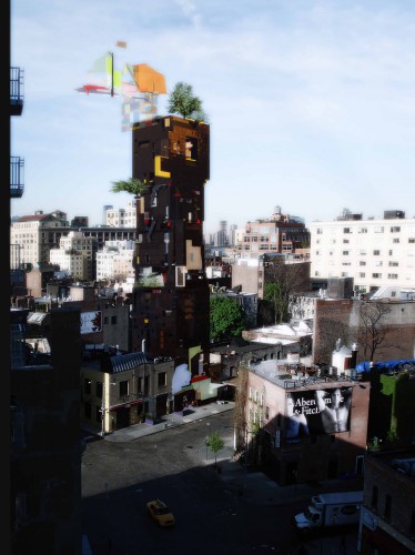
Not long after 9-11 we were asked by a young developer called Alf Naman to consider a design for a site in the Upper East Side in New York. Alf was a cool guy who had been a successful broker and who was now investing in high end residential. He had two projects under way when we got to know him. One project with was Neil Denari and the other by Jean Nouvel. Both are now nearing completion. We were looking at a third site he had.
Unfortunately the cruch happened and the project did not proceed however the experience was memorable. Interegating the New York planning codes was genuinely interesting for example; i.e. relative to our own in the U.K. In NY they are far more prescriptive but somehow it seems to support and liberate good work. The whole air rights issue makes the planning issues much more three dimensional in NY compared to here with development determined on volume rather than area and height.
Our site was between a Gehry building and Nouvel ... no pressure and 200 hundred yards down the road was a Meier apartment building. Anyway we wanted to bring some British punk to the party and some serious darkside. The proposal was to be depressing yet colourful ... ambiguous yet iconic. Less ship shape and optomistic like Meier rather under the water.
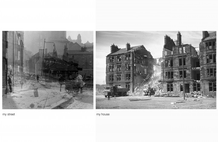
Attempting to capture the ghosts ...
An early sketch painting I did for an office proposal for Clydebank Rebuilt.
Standing Back
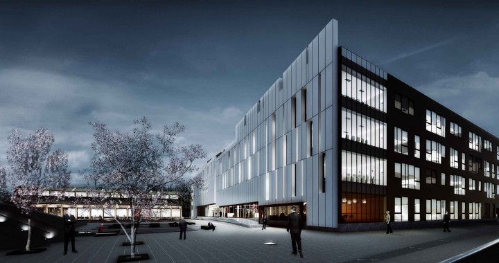
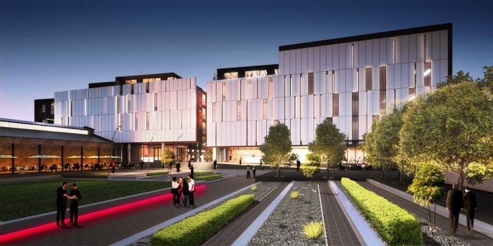
... work has started on the West of Scotlands new campus at Craigie Estate on the River Ayr. The architecture is restrained taking full of advantage of its beautiful setting. Our team are excited and enjoying the process of working with the contractor to deliver what will be an important educational asset for this community. My colleague Neil who is leading the team will not accept anything less than the best outcome.
Easy
Popped round to Dennis Hopper's house whilst in L.A. to score ...
In time ...
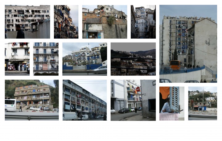
I took these photographs whilst hanging out the window of a speeding car that was travelling between the City of Algiers and our gated hotel. We had a police escort assigned to us for the duration of our the trip. Algiers although beautiful is still unfortunately unable to encourage tourism and inward investment due to the political unrest and insurgency in the region. Hopefully in time this will change.
Urban more Urban / Rural more Rural
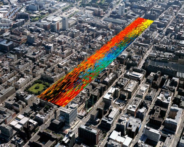
I dream one day that we will have a critical population density within Glasgow's City centre ... leaving the rest of Scotland green and wild. This was our recent proposal for a mixed use tower at Anderson Quay.
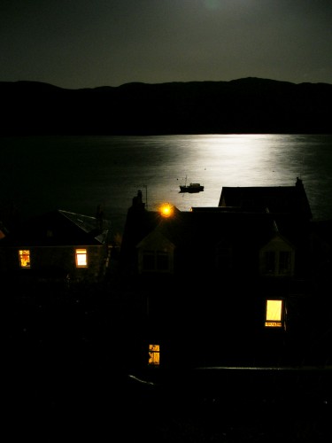
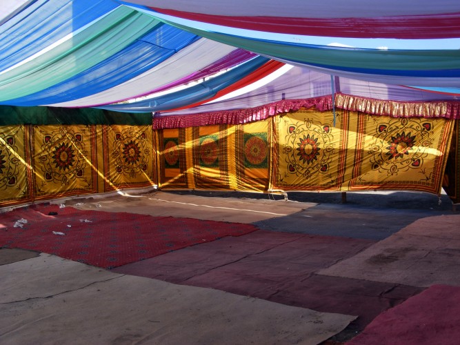
Coloured light & the gentle movement of silk was hypnotic...
Whilst wandering the back streets of Muscat in Oman I came apon this tented space that I think must have been created for a family celebration. It was the middle of the day and the heat from the sun directly overhead was extreme. I sat for a while in shade that the tent provided waiting to be moved along (although most sensible people were indoors). The combination of the coloured light within the tent and the gentle movement of the silk like sheets was hypnotic.
Sex in the City
This is a 'Love Hotel' that our Hong Kong Office is working on in China. The hotel has no corridors but rather access to your room is via your parking space which is directly under your room. The hotel encourages secret liaisons and allows couples to come and go without been seen. In China where most young couples still stay with their parents and privacy is difficult the love hotel offers the perfect solution. Alternatively it is ideal for that extra maritial affair.
Health Mirage
A conceptual design for a new healthcare campus and hospital on the edge of Abu Dhabi that we are working on. The desert site an inspiration.
By Chance
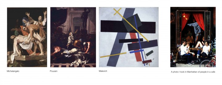
This is a photograph that I took of a group of students sitting at a cafe window in Manhattan.
On reflection I was struck by the pictures overall form and the parallels it has with a familar compositional structure that continually reappears in classical painting.
Beautiful
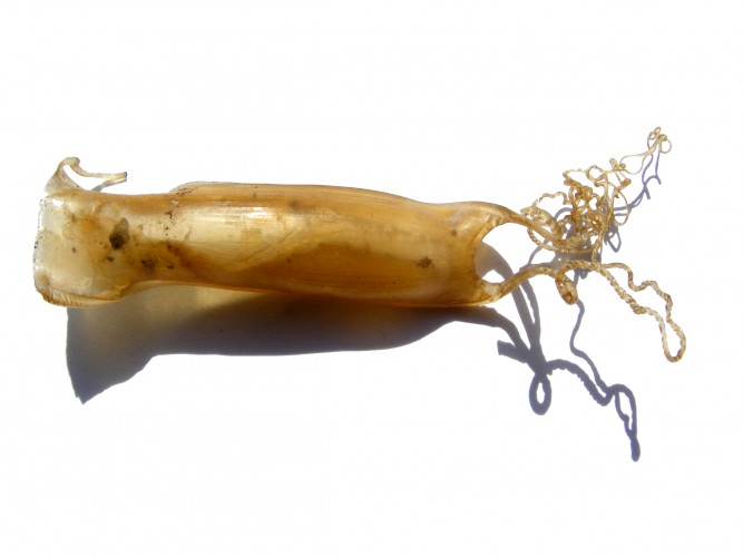
My kids told me this 'purse' is home to a baby dogfish ...
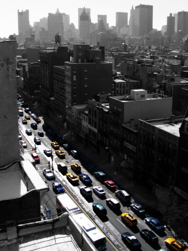
My New York View
The buildings appeared silver and grey that day but I remember the cars being colourful.
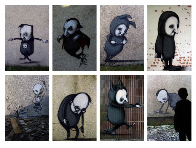
Urban Art in the Kyles of Bute
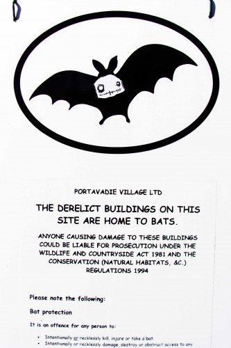
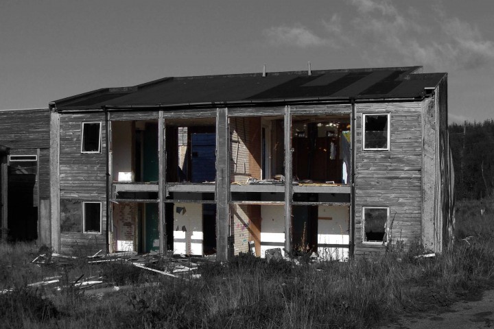
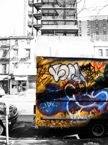
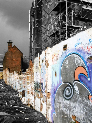
I broke into a derelict oil workers settlement near Portavadie that has been transformed by a group of urban artists called the Agents of Change. The structures which are scheduled for demolition have been used as a canvas for their graffiti art. Some of the sprayed imagery is both beautiful and poetic. The work is certainly unexpected within this remote Scottish context ... this together with the scene setting that the work stages amongst the ruined buildings makes it a whole lot of fun.
The best gallery space I have ever been in ... dangerous though.
Roman inspiration ...
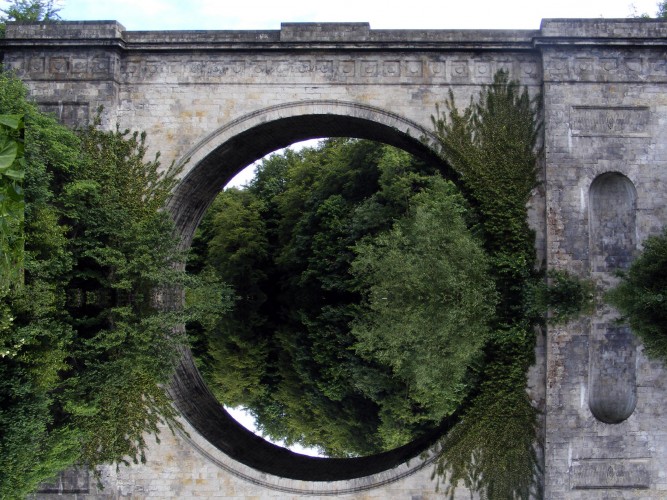
The beautiful Montagu Bridge was built in 1792 by Robert Adam and was one of the last structures to be designed by this hugely influential Scottish architect. The bridge is a magnificent structure of genuine beauty, an architectural form inspired by pure geometry and classical proportion. The formality of the architecture and its juxtaposition into the landscape is heroic. My understanding is that Adam studied under Piranesi at the Rome School ... it shows.
(Note; I mirrored the image at the high water line to see the bridge as it was drawn in Adams original drawings.)
Design Narrative
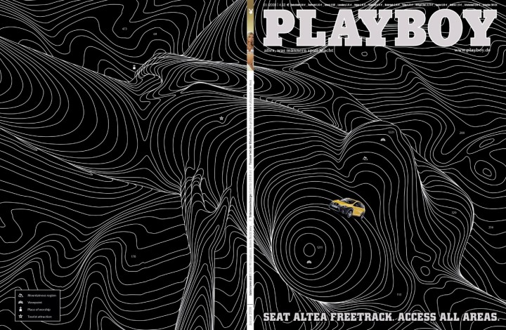
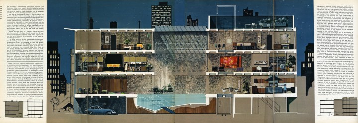
"... we enter the master bedroom through the sliding glass door. Here, dominating the room is without doubt the Town House's single most dramatic peice of furniture. Set in circular splendour midst the deep pile of our wall to wall handcrafted Afghaistan carpeting reigns the Playboy Rotating Bed. The bed is a marvel of mecganical ingenuity. The touch of a button can start the bed and headboard turning and stop them at the point of a full circle."
Playboy 1960
... Banksy style
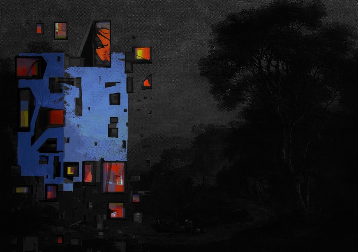
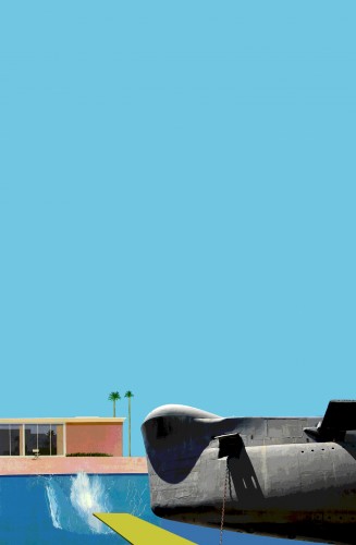
I overlayed one of my submarine tower paintings onto a Nasmyth landscape ... don't ask me why.
Why not a design collective?
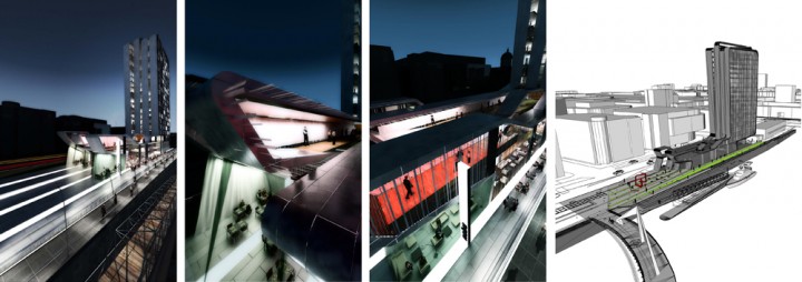
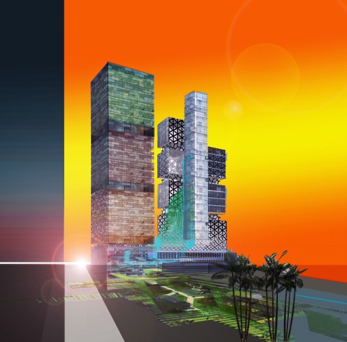
... this is one of the sketch collages I prepared for a mixed use project in Saudi Arabia. Working with our colleagues internationally we successfully secured this incredible project from our Glasgow Office. The process was intense and involved us developing a whole series of options and models at various scales. Our team are hugely excited about the commission not only because of the significant design challenges but also because we will be working alongside our new London team with Mr Will Alsop.
1.618034
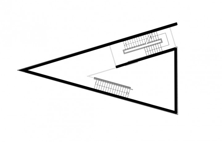
A studio house that I am working on ...
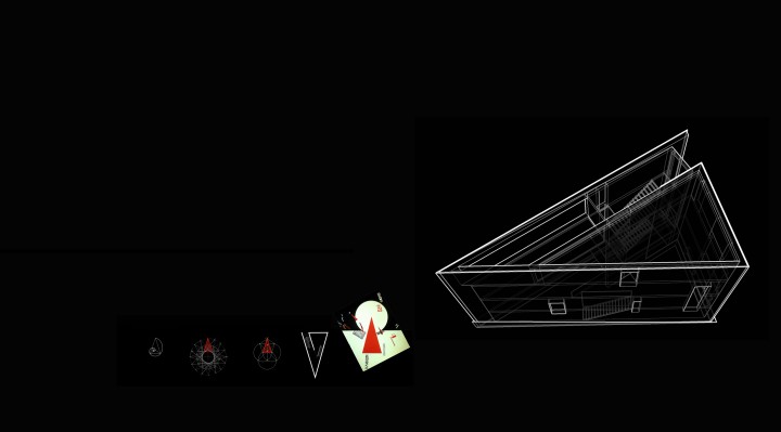
... inspired by the 'Golden Section'. The building in plan, cross section and elevation playfully explores proportion. The Golden Section (or Phi) proportional system is common to all natural things and has been explored extensively throughout art history. As a studio that I can paint and make things it seemed appropriate that the building celebrates fundametal form. (Also the site was a triangle!)
Note: ‘The Golden Section is a Law of Proportionality first developed by Vitruvius. It is a Law that occurs frequently in nature and is widely used by artists and scientist in their work. Essentially the law states that two unequal parts of a whole must be in relationship to each other to create a satisfactory image to the eye. Numerically Golden Section is approx. 1.618034 or 38% to 62%. This proportion reoccurs throughout our lives and can be said to create an ideal proportion between two objects or two parts of a whole.’
You do not need funny shapes ...
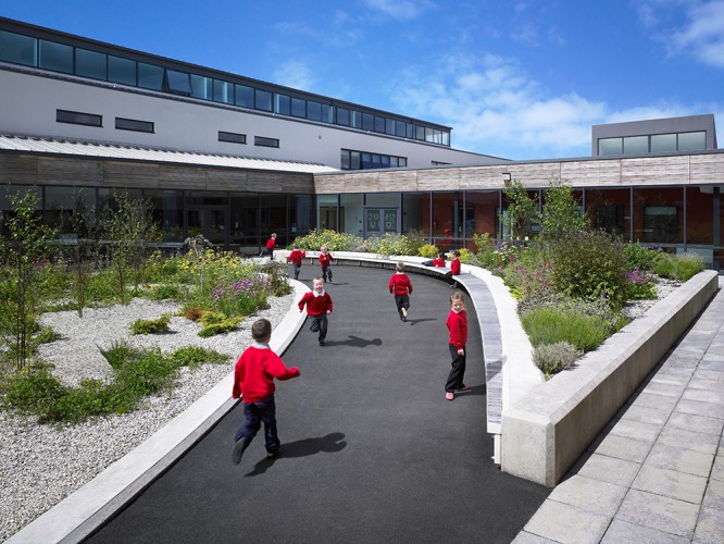
This is a design and build school project we delivered in Drumchapel. Everytime I look at this photo it reminds me that school architecture does not have to adopt funny shapes and have a hundred different types of external finish. Rather the architecture can be robust and simple. What we did here was succesfully resolve the essential building diagram to support the dynamic and evolving curriculum. We have created an environment here that is well lit and naturally ventilated and where opportunity exists for teachers to team teach, group work and externalise lessons as much as possible. We have on subsequent school projects, with the right client support, gone on to create even more flexible accomodation to assist this contempory learning rather than teaching model.
Through direct comparison with other schools in this local authority 'bundle' I am proud of what we achieved at Drumchapel. Our budget was extremely challenging! I am however very confident that by directing our design efforts and the project budget to support the important spatial and functional moves to help teachers and learners that we have good school.
A legible building that is well placed on its site where the architecture is simple; being finished in white render having punched windows, top lit circulation and through ventilation, good qulaity landscape and external play areas ... easy ... almost Scandinavian!
Magnetic
Glasgow is planned on a grid that is exactly 13 degrees of off the ordance north /south axis. I have speculated that the 13 degrees is because historically the city was set out by surveyors who used a traditional magnetic compass. Magnetic North is again exactly 13 degrees if you are taking a reading in Glasgow. (I.e. Sauchiehall Street, Buchanan Street, Argyle Street are all set out at this angle.)
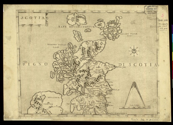
It was only when I was studying old sailing maps of the West of Scotland that I noticed that the compass rose diagrams on these maps changed direction as you proceeded up the coast due to the magnetic pull in that specific location.
I have checked other cities across the world for this potential connection and can confirm that it is a familar occurence ... if only the Victorians had used the stars.
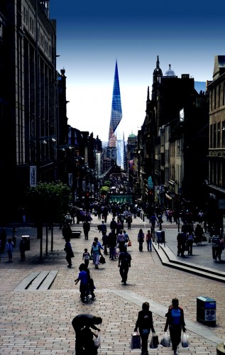
Anyway ... a recent tower proposal we prepared for Custom House Quay is understood as a vertical manifestation of this interplay between true north and magnetic north as well as being an absolute marker for people in Buchanan Street to continue down to the City's waterfront. Just an idea ...
Corporate Art & Architecture
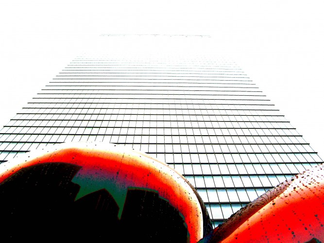
There are so many bad examples of this type of architecture and sculptural relationship in Cities across the world, however I love this composition in New York down at Ground Zero.
I took this photo on a very grey day in the middle of winter. The playfulness of the electric red balloon against the seriousness of the steel tower.
Zoo Performance Space
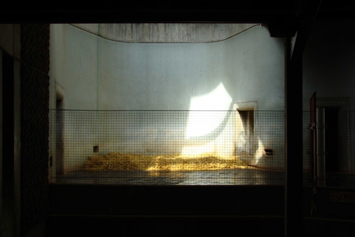
This is a photgraph of a space in Hugh Casson's Elephant House in London Zoo that I took recently.
I was immediately struck by the theatrical form of the space ... the lighting, the proscenium arch, stage right and left ... it was the atmosphere however that was magical ... a theatre directors dream.
Truth & Harmony
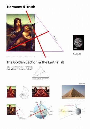
In the course of researching a project with the Duke of Buccleuch I could not help but study the Duke’s beautiful Da Vinci painting. As if to illustrate a point, or rather an approach that RMJM might take to interpreting the historic Dalkeith Estate and its architecture, I undertook to deconstruct his painting the Madonna of the Yarnwinder.
Over a long weekend I researched the painting and could not find any learned academic assessment of the painting that detailed its formal composition. With some tracing paper I decided to try to analyse the painting myself drawing and overdrawing on the painting to understand if there was any underlying diagram or rationale.
What I found genuinely excited me. My scribbles began in my humble opinion to crystallise. In summary the baby Jesus is looking at the cross on the yarnstick as if understanding his fate. The yarnstick has two diagonals though which set up a dynamic perspective across the painting focusing on a far away hill again significant relative to his future. Jesus is also set at 45 degrees to provide both movement and status. Mary is set within the composition in a very different manner with her bodily form outlining a perfect golden section isosceles triangle. Underlying the painting are lines of union that structure the image.
What is beautiful are the two overlapping grids, the dynamic grid and the static, beautifully developing a clear narrative and harmony.
The third order supporting the composition that I discovered is that the paintings has a 52 degrees diagonal if you draw from one corner to the other diagonally opposite corner. 52 degrees is the angle of incline on the Great Pyramid of Giza in Eygpt dating back to 2560 BC. If you hand the painting on its right side for example it describes the cross section of Giza. The yarnstick also features in this overlay of compositional lines capturing the angle of the earth’s ecliptic plane. The baby Jesus’ finger further confirms this narrative by pointing up at an angle of 23.5 degrees which is the exactly the angle of the earth’s tilt.
So in summary we have the two tenants of classicism represented in the painting ...
'Truth' represented by astronomy and the geometry of heaven the earth and the stars.
And ...
‘Harmony’ represented by the golden section and the proportional system that structures all natural form.
The attached image outlines some of the diagrams that I generated...
New Childrens Hospital
This is a plan diagram for a new childrens hospital that we are working on.
Just an Angel
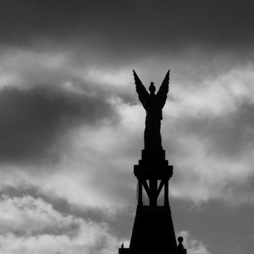
This angel that looks down Paisley Road West is so utterly beautiful ...
Cultural Vacuum
I made this image for Frank Gehry to try and explain in shorthand the cultural challenges of working in Scotland.
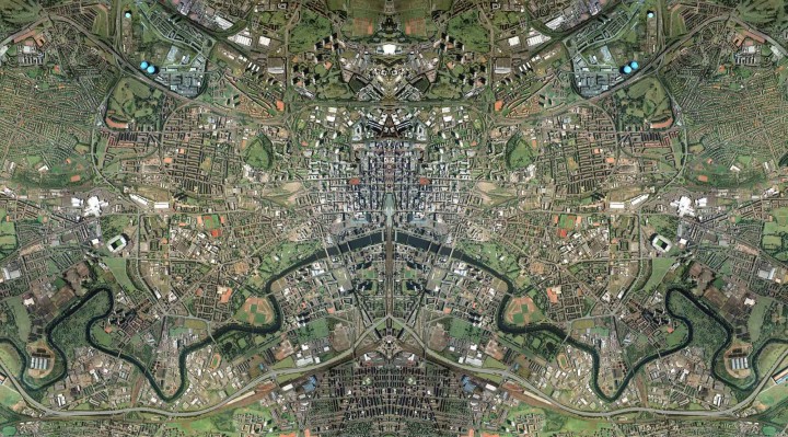
Symmetrical City
The East End regeneration effort is now doubly important.
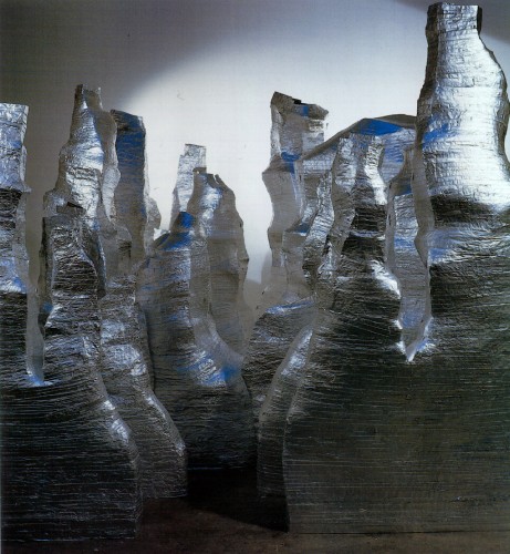
Moutain View
This is a sculptural installation that is housed in the meeting room within the Tron Theatre. As part the theatres renovation and Arts Lottery award back in 1999, the Tron were lucky enough to work with a number of visual artsist on their capital project.
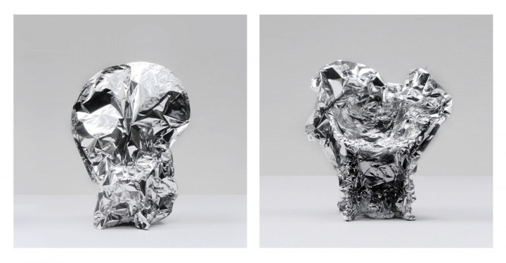
This is a scenic window by Daphne Wright an Irish artist who we worked with.
... Daphne's work is beautiful. This huge piece is made completely of folded tin foil. Given the rooms actual window was removed as part of a cost saving exercise during the project ... the fact that we had a 'scenic window' a mini stage set in effect definetely helped.
Before I built a wall ...
"Before I built a wall I'd ask to know what I was walling in or walling out and to whom I was like to give offence" Robert Frost 1875
A New Linear Park in Dalkeith
We recently developed a conceptual masterplan for Dalkeith Palace and Gardens in Midlothain. The proposal however extended way beyond our client the Duke of Buccleuch's land to incorporate the village of Dalkeith and the surrounding landscape and river corridor. The plan developed a narrative that linked many different activities and cultural initiatives.
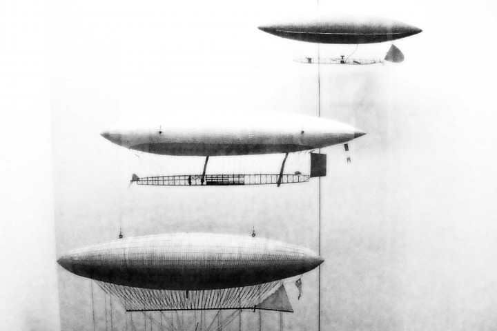
Lost Ships
... three of my Grans younger brothers died whilst at sea with the Royal Navy during world war 2.
I made this image and immediately thought of them.
Gordon Matta-Clark in a different context
"the reuse of pre-existing artistic elements in a new ensemble." Gordon Matta-Clark
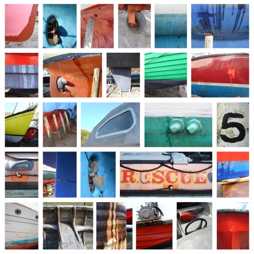
Visual Play
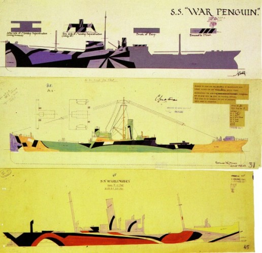
Looking at isolating 'details' from different boats to create a language of form and colour.
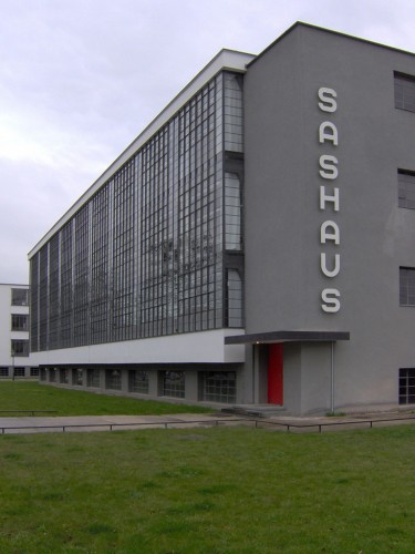
Another Glasgow School of Art
An orange logic curriculum is not dogma
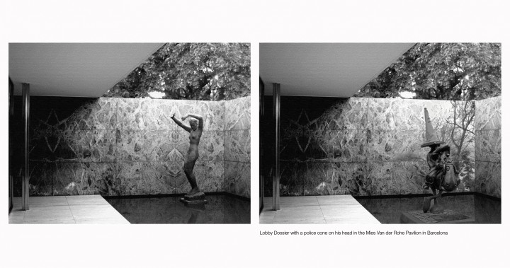
Lobey Dosser
A sculpture of Glasgow's famous cowboy on his two legged horse finds a new home in Barcelona's Mies van de Rohe pavilion. Bud Neil Lobey's creator would be proud.
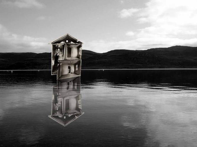
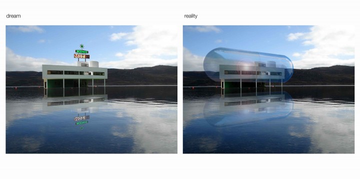
A wind and watertight 'shipshape' ...
A wind and watertight 'shipshape' motel that presents modern and hermetically sealed accomodation in a giant plastic pill coating.
Sublime > Landscapes & Gardens > Intro
Thomas Whately, in his 1770 Observations on Modern Gardening, praises sublime effects in landscape gardening, advising designers that:
"a little inclination towards melancholy is generally acceptable, at least to the exclusion of all gaiety,; and beyond that point, so far as to throw just a tinge of gloom upon the scene. For this purpose, the objects whose colour is obscure should be preferred; and those which are too bright may be thrown into shadow; the wood may be thickened, and the dark greens abound in it; if it is necessarily thin, yews and shabby firs should be scattered about it; and sometimes, to shew a withering or a dead tree, it may for a pace be cleared entirely away."
Landscape gardeners who wished to achieve sublime effects tried to heighten nature’s natural mystery by using extremes of height, shadow, steepness and distance in their work.
Democratic space energised
A radical proposal to expand George Square west towards Blythswood Hill.
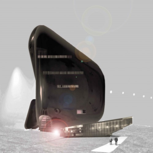
Introvert
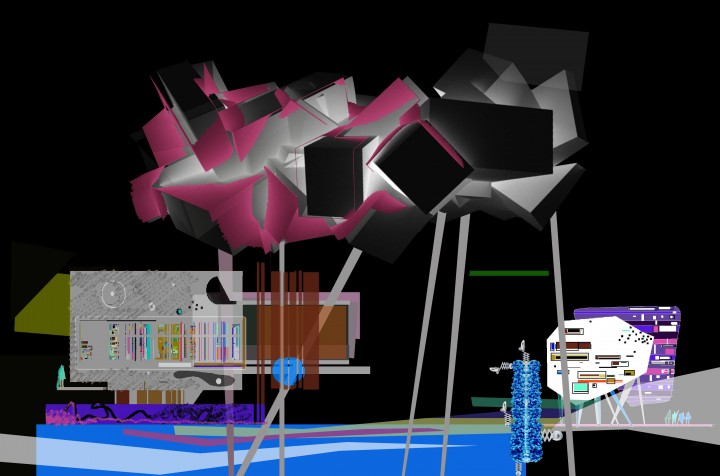
imagine being inside a cloud
an architecture that is more hermetic and introvert
an architecture that protects us from the cold and wet — more interior than exterior
coulourful and complex internally
washed smooth by the rain externally
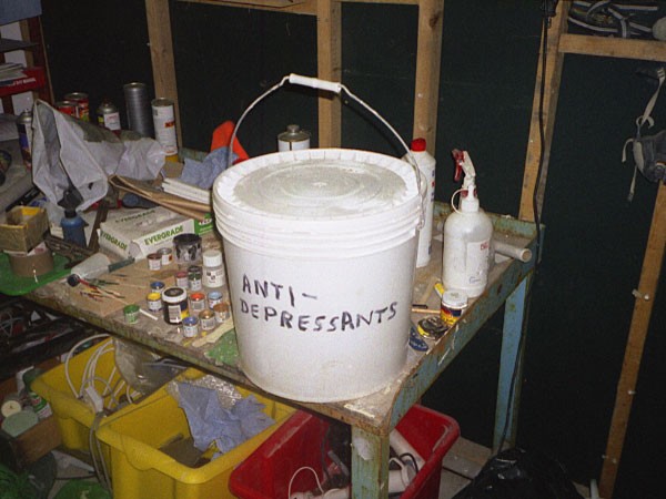
Heroin hideaway
A traditional Glasgow doocot might look bleak from the outside.
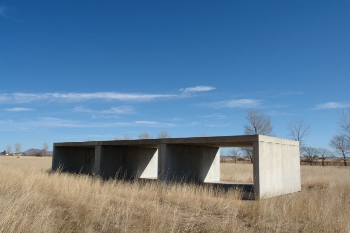
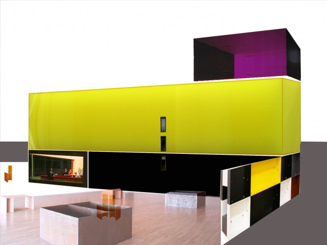
A homage to Donald Judd and the yellow submarine
Imagine combining the structural logic and rigourous composition of of Donald Judd's work with a yellow submarine.
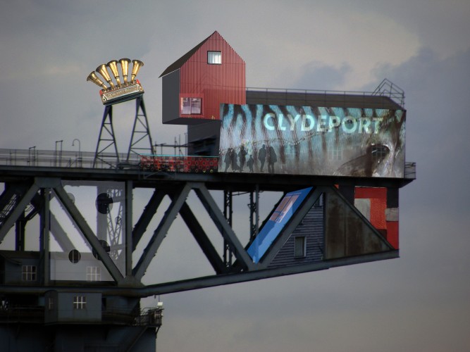
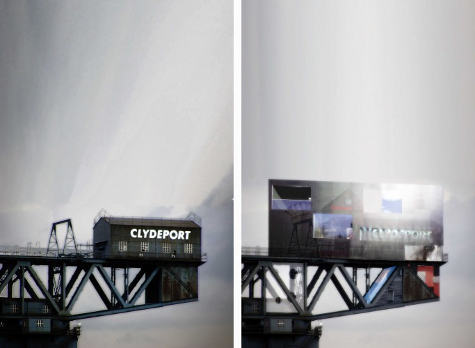
The mighty Finneston Crane on Glasgow's River Clyde before & after
There is a wee cabin on top of Glasgow's Finneston Crane has the potential to be converted into a great studio. The views would be absolutely stunning. Perhaps the crane might also turn as it used to do when loading ships and allow you to vary your view up and down the river.
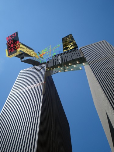
New York Flight
I imagined this structure between two New York towers. I think the towers if I recall are on 5th Avenue. The pure forms of these structures create a perfect foil for a more expressive addition.


