Yasmin Ali
Urbanism // Design
ESALA exhibition Saltcities
November 14th, 2013
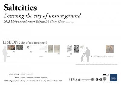
The 2012-2014 Masters Programme in Architecture at Edinburgh School of Architecture and Landscape Architecture focuses on Lisbon, and is part of the Saltcity studio series led by Suzanne Ewing. This associated exhibition of academic work, subtitled 'Drawing the City of Unsure Ground', speculates on the wider Lisbon-Tagus metropolitan area, and is part of the current Lisbon 2013 Architecture Triennale.
Themes such as materiality, spatiality, borderlands, morphology and topography are explored within drawn and cartographic media. Previous city studios led by Ewing, following the broad themes of the design thesis include Cadiz (2006-2008) and Marseille (2009-11).
// The exhibition runs in the Sculpture Court at Edinburgh College of Art until the 16th November, with an evening reception on the 14th.
Weblinks
Saltcity - here
Lisbon Architecture Triennale (English) - here
City Speculations - here
ESALA - here
Apple's Maps app leaves commuters unhappy
September 28th, 2012...Progress?
In synchrony with the timeous release of the iPhone 5, along came the update of OS6, also available for fellow iPhone 4 users. What it neglected to mention before the download was that this would replace the pre-loaded Google Maps app with a, sadly, much less well-executed Apple's own brand of Maps, which sees shadows obscure landmarks and whole areas shrouded under cloud, not to mention misnamed-and misplaced- towns. It is enough to make the average technocrat want to go back to paper, as this image from the London Underground aptly shows.

Crumpled City Maps by Emanuele Pizzolorusso for Palomar
May 17th, 2011Reviews / Mapping / Travel
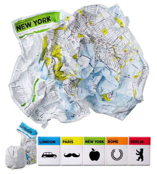
Italian designer Emanuele Pizzolorusso for Palomar has come up with an innovative new map product that displays fresh 'out-of-the-box' thinking. Trademarked as 'Crumpled City Maps' - the range refreshingly does, well, exactly-what-it-says-on-the-tin, so to speak.
The maps are printed on a special textile which is weatherproof, smudgeproof and light. As a designer, I'm also a fan of the clear, simple iconography and clean graphic design employed in the overall look of the product. Too often maps become overcrowded and muddled with over-designed typography and complicating coding - this map is the antidote to unneccessary complexity. It won't replace an OS map for a field expedition, but it serves its purpose well as an informative, accessible and durable travel map that rips up the rulebook on conventional -tearable- street maps.

Read on for product specifications, and cities available in the range.


