Merchant City student tower enjoys a growth spurt
December 6 2017
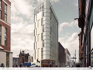
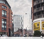
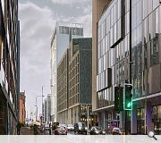
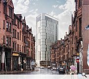
ADF Architects and Structured House have filed revised drawings for their Merchant Point student housing project on Glasgow’s High Street following discussions with the city council.This has seen the original tower element given a modest height extension, adding soar to the squat original with the prominent corner elevation rounded off for a softer view on the George Street junction.
Landscaping by Gillespies will see granite paving and setts laid on Nicholas Street with steel and timber benches.
Street facing ground floor levels will be activated by retail as before while a decked roof garden is now included above the Shuttle Street elevation.
|
|
29 Comments
#1 Posted by Sam on 6 Dec 2017 at 17:31 PM
It's inconceivable to think that this is the product of Architects who have presumably been through 5 years of Architecture School. What on earth gets taught in these places?
#2 Posted by StyleCouncil on 6 Dec 2017 at 17:55 PM
Crikey, that is one ugly building...
#3 Posted by Philip on 6 Dec 2017 at 19:26 PM
Complete dogs breakfast. Where to start, the nauseatingly odd, mis-aligned curved corner detail? The offensive blank gable end which soars up 5 storeys? the confused elevation composition?....the materials?
#4 Posted by Jaded on 6 Dec 2017 at 21:08 PM
L0L
I dread to think what the rear elevation of this monstrosity looks like.
I dread to think what the rear elevation of this monstrosity looks like.
#5 Posted by dave the detailer on 6 Dec 2017 at 22:19 PM
Reminds me of a hinge.....
#6 Posted by alibi on 6 Dec 2017 at 22:23 PM
How do these people sleep at night.
#7 Posted by Jamie J on 7 Dec 2017 at 08:26 AM
It's inoffensive which is the new offensive.I think if the panels were limestone blocks it might almost be ok but I'm guessing they are just cladding?
#8 Posted by corn on 7 Dec 2017 at 09:20 AM
it is certainly an improvement on the previous version, despite the extra height it is a lot more elegant and simplified, and not as blocky and intrusive as the earlier one.
The rounded corner is just so unpleasant though, fix that and you've got a winner.
.. And then maybe chop 10 storeys off it.
The rounded corner is just so unpleasant though, fix that and you've got a winner.
.. And then maybe chop 10 storeys off it.
#9 Posted by Mac Mac on 7 Dec 2017 at 09:37 AM
It is a little better than the previous effort, but way too tall and imposing, which smacks of greed. Whatever happened to context??
#10 Posted by PJ on 7 Dec 2017 at 10:12 AM
At 'Sam' (#1): 'Architecture School' teaches many things but not how to balance your client's commercial constraints, your structural engineer's technical restrictions, your M+E engineer's requirements, nor the myriad of limits imposed upon any given design by planning and building control. In an ideal world us architects wouldn't have to consider anything other than designing beautiful buildings but - sadly - it is a naive pipe dream to think that is the case.
Large, public buildings, and 'icons' can be beautiful and meet the requirements above, often at huge expense, and because they are designed to be showstoppers. Humble clients, humble architects, and humble buildings must do the best we can given the framework in which we operate.
This building might not be the best (far from it), and the curve has got to go, but I can guarantee the architect hasn't just thought 'screw it, I don't care, make it ugly'. They have tried.
#11 Posted by white van man on 7 Dec 2017 at 10:41 AM
Still using that white van in the drawing to hide the fate that awaits the collage bar.
#12 Posted by Sir Ano on 7 Dec 2017 at 10:42 AM
Well said PJ.
#13 Posted by MoFloBro on 7 Dec 2017 at 11:01 AM
So this is AFTER discussions with the council??? It needs to be at least 8 stories lower.
#14 Posted by David on 7 Dec 2017 at 11:03 AM
I have to admit, this is a big improvement, but the corner is killing it. Maybe squaring it off might work, but maybe the curve could possibly also work if the windows were arranged differently, but as it stands its the stand out issue for me.
#15 Posted by SS on 7 Dec 2017 at 11:05 AM
This area of the city will lose its character if these types of buildings continue to sprout up.
#16 Posted by CADMonkey on 7 Dec 2017 at 11:33 AM
Why does Glasgow persist in building eyesores of the future?
This hingey thing really will look awful and dated in a few years.
OOOH That gable!!! Someone has spent a good 3 minutes designing that.
This hingey thing really will look awful and dated in a few years.
OOOH That gable!!! Someone has spent a good 3 minutes designing that.
#17 Posted by 598 on 7 Dec 2017 at 13:05 PM
#15 - Whay character? It's a brownfield right next door to strict city centre. This site needs to be filled asap, however this monstrous building would make it an eyesore.
Just exactly how many more Chinese ant-houses do we need before it all breaks and these rubbish student houses will be converted back to slums. You never learn Glasgow, huh?
Just exactly how many more Chinese ant-houses do we need before it all breaks and these rubbish student houses will be converted back to slums. You never learn Glasgow, huh?
#18 Posted by M. Emmet Walsh on 7 Dec 2017 at 13:18 PM
SCENE 24
INSIDE SUPERINTENDENTS CORNER OFFICE FLOOR 12
K: WTF? - Corner office without a window onto the big wide world? A classic miss of 80's iconography there. Still, who needs daylight? Bugger the architectural condition. I keep forgetting its 2049.
INSIDE SUPERINTENDENTS CORNER OFFICE FLOOR 12
K: WTF? - Corner office without a window onto the big wide world? A classic miss of 80's iconography there. Still, who needs daylight? Bugger the architectural condition. I keep forgetting its 2049.
#19 Posted by MV on 7 Dec 2017 at 13:23 PM
Hinge towers, brilliant.
#20 Posted by David on 7 Dec 2017 at 15:53 PM
Any images of the south elevation UR? I suspect its a multi storey blank gable...
#21 Posted by UR on 7 Dec 2017 at 15:58 PM
Yes, I've added the perspective looking north from High Street
#22 Posted by Charlie_ on 7 Dec 2017 at 16:26 PM
I think this is much worse than the original iteration.
#23 Posted by Matt on 7 Dec 2017 at 16:54 PM
#10 PJ- balancing all of the complex project requirements and constraints can stil be achieved with a considered and positive architectural response. That's what good architects do..... with all of the demands of a commercially sensitive development. This is not good enough.......not by a long shot.
#24 Posted by Jimbob Tanktop on 7 Dec 2017 at 19:12 PM
This looks like they had a ring-binder lying on a desk, had a glance at it and thought, 'that'll do.'
Slightly O/T, but one has to assume that this bubble in student housing will end; what then? We'll be left with a bunch of mostly low-quality buildings, designed around hundreds of studio flats that can't be occupied by more than one person and a goldfish at a time. What use will these buildings be then? Or is that what passes for a plan? Build them to such a low standard that when the bubble bursts, it's cheaper just to knock them down and build something else anew than convert them?
Slightly O/T, but one has to assume that this bubble in student housing will end; what then? We'll be left with a bunch of mostly low-quality buildings, designed around hundreds of studio flats that can't be occupied by more than one person and a goldfish at a time. What use will these buildings be then? Or is that what passes for a plan? Build them to such a low standard that when the bubble bursts, it's cheaper just to knock them down and build something else anew than convert them?
#25 Posted by David Griffin on 8 Dec 2017 at 12:23 PM
Get a life, this has been an eye sore for decades and the height is needed to make it viable. Well done ADF and team
#26 Posted by Gandalf the Pink on 8 Dec 2017 at 15:24 PM
As long as Glasgow has a large student population, and that doesn't look like changing any time soon, the city will have a demand for student rents. One of the biggest issues with the property rental and sales market in the city centre and West End is the low availability of properties due to the high demand from students.
Glasgow is still several thousand student bed spaces short - and with the expansion of Glasgow Uni towards Byres Road/Dumbarton Road, the expansion of Glasgow City College, the expansion of Glasgow Nautical College and the continued expansion of Strathclyde Uni I don't see the bubble bursting any time soon.
This design, while perhaps not winning any awards, should be credited for looking skywards.
#27 Posted by StyleCouncil on 8 Dec 2017 at 16:41 PM
#26 I can't think that many of the above commentators have any issue with height or use.... Just the fact the architecture is utter mince.
#28 Posted by Sam on 21 Dec 2017 at 02:54 AM
In response to 'PJ' - 'Architecture school teaches many things but not how to balance your clients commercial constraints...'
Speaking from first hand experience as a current student: Architecture school is redundant. It's finished, it's as simple as that. The amount Neo-Bauhaus warriors that these places turn out every year will guarantee that we will be living in an eternal nightmare of ugliness for years to come. The root of all this is in the Architecture departments across the country. As a student, I believe they do more harm than good. It's time Architects trained on the job and missed the whole University thing out. That would also solve the problem of where to house the herd of sheep that make their annual pilgrimage to the hear the High Priests of Modern Architecture speak.
Sam
#29 Posted by Billy on 22 Dec 2017 at 07:28 AM
I like this. This building stands out from most of the glass boxes popping up all over the city. And a bit of height too.
Post your comments
Read next: Groundworks commence at Halo Kilmarnock
Read previous: Glenrothes paper mill makes way for 850 homes
Back to December 2017
Like us on Facebook
Become a fan and share
News Archive
Search News
Features & Reports
For more information from the industry visit our Features & Reports section.


