Glasgow School of Art showcase new School of Fine Art
April 14 2017
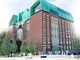
Glasgow School of Art have lifted the lid on an ambitious refresh of the former Stow College to create a new School of Fine Art.Led by BDP the conversion will see a new roof built on top of the 1930’s landmark to replace a later 1960s extension, enabling two new atria to flood the interior below with light.
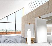
As part of this work the ground floor will be given over to specialist workshops with four floors of studio spaces and academic offices above. Two rooftop levels meanwhile will be custom built for the study of painting and printmaking.
This copper clad eyrie is intended to reflect the industrial heritage of the trades people who cut their cloth in the building before moving on to careers in industry.
Scott Mackenzie, BDP Scotland chair and architect principal commented: “This project not only brings new life to a cherished Glasgow landmark, but also provides the School of Fine Art with inspirational and truly world class teaching and learning spaces.”
The School of Fine Art is being project managed by Gardiner & Theobald and will open for the 2018/19 academic year.
|
|
10 Comments
#1 Posted by Sven on 14 Apr 2017 at 09:28 AM
The design of the new roof extension jars with the colour, form and context of the original and it is plain ugly.
#2 Posted by boaby wan on 14 Apr 2017 at 10:47 AM
not sure what it is about these visuals but I think it looks cracking, big improvement on what's there, although I have seen an alternative with brown (presumably copper) cladding on top?
#3 Posted by Barry evans on 14 Apr 2017 at 11:06 AM
Considering Gsoa is a "great" institution of art and design, the artistic impressions look like a child's been let loose on sketch up. Hopefully the building will look better when completed.
#4 Posted by wonky on 14 Apr 2017 at 11:15 AM
Very impressive design, it does look fantastic, & of course is a welcome addition to the area. Nonetheless a little disappointing there is a neglect of the negative space on the corner of Scott & West Graham Street. Really thought this was an opportunity to reinstate an urban edge at this junction in order to attract people to/open up Shamrock Street & New City Road. Also what is happening with the awful car park at the back of the college? Is it being landscaped? I must say I would like to see the area around the old Savings Bank, old dundas vale teachers centre & Chinatown transformed into a pedestrianized public square of sorts. To make these buildings a prominent feature & for somewhere people might congregate for lunch etc- maybe with the addition of some sculptures or public art & enticed there by really making the steps leading down from West Graham St into something visually alluring. It just feels like this part of the city is neglected & forgotten.
#5 Posted by RJB on 16 Apr 2017 at 13:22 PM
Hopefully this could be a great catalyst for improvement to the area. I think copper clad eyrie could do with a more prominent set back or a less in your face patination to make the scheme top notch.
#6 Posted by Egbert on 18 Apr 2017 at 12:08 PM
#4 Completely agree Wonky with your points re public realm and reinstatement of urban edge. I think the 'Low Line' proposals for reinstating (to some degree) the course of New City Road would address some of the neglect and blight affecting the area as it stands, but I don't know what commitment there actually is at present from GCC to taking them forward - perhaps other commenters can advise?
#7 Posted by Sven on 21 Apr 2017 at 10:41 AM
I suppose the green roof matches that of the old bank building down the road from it. We should remember that these buildings are landmarks, seen by thousands each day as they drive on the M8. The only reason I have heard of Stow College is because you saw it from the motorway. It is sad to see the fine old bank building turn green with neglect, as the rest of the buildings in that area are utilitarian and nondescript. Does the advert for Abercrombie and Fitch need to be put on the building? Has rendering or attractive brickwork gone out of fashion and replaced with this? What is a half naked man got to do with a college? Is real life the college motto? Naff comes to mind.
#8 Posted by Designer on 21 Apr 2017 at 14:54 PM
Is that the transport museum plonked on top of that building ?
#9 Posted by Billy on 21 Apr 2017 at 19:12 PM
#8. You could be right. How did they get it up there?
#10 Posted by Wee James on 9 Nov 2018 at 14:44 PM
At the rate the contractor is going this should be ready for the fresh intake of students in 2050
Post your comments
Back to April 2017
Like us on Facebook
Become a fan and share
News Archive
Search News
Features & Reports
For more information from the industry visit our Features & Reports section.


