Mosaic lead Blythswood office to hotel conversion
October 18 2016
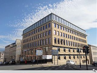
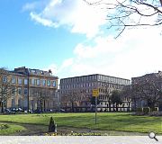
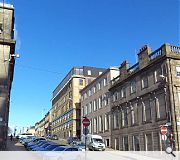
Mosaic Architecture acting on behalf of Carrigmay have drawn up plans to convert a former office block at 249 West George Street, Glasgow, to form a 100-bed hotel.To accommodate the Adina 4* aparthotel existing stone cladding will be removed and replaced with new sandstone rainscreen panels, together with the addition of a sixth-floor extension finished in cement fibre panels and a private external courtyard terrace.
In their design statement Mosaic remarked: “The bedroom accommodation fills the existing U shaped plan which reinforces the existing street pattern and continues over the same footprint at the new upper level.
“New Sandstone rainscreen panels have been selected as the primary material to replace the existing panels to provide a high-quality finish. The new sixth floor has curtain walling to the north and south elevations and cement fibre panels provide a contrasting panel to the south and east.”
As part of the work parking spaces will be reduced from 17 to four.
|
|
8 Comments
#1 Posted by RJB on 18 Oct 2016 at 22:09 PM
'Enhanced scale' is a nice bit of obtuse architecture language, surely 'bigger' would have got the point across!
#2 Posted by David on 19 Oct 2016 at 08:43 AM
The existing building is truly awful. The horizontal split in elevation treatment being unfortunate to say the least.
I can't help thinking that whatever you do to add to the existing building it's always going to be a dog's breakfast, which is obviously frustrating on such a key site. I guess without the prospect of real height demolition was never going to be an option, but surely stripping the existing facade off would have been the real opportunity to create a 'new' building.
Instead what we have in the above proposals is a confused mish mash.
#3 Posted by Bill S on 19 Oct 2016 at 11:26 AM
I do wonder if Architects / Designers understand the true purpose of brise soleil instead of this example where it is used as a device to hide a potentially messy junction?
#4 Posted by Mungo Park on 20 Oct 2016 at 08:48 AM
Dear David and Bill S,
This has always been a building of its time (60's-70's?) (apologies for not looking up the architects but time is pressing) .
I have always liked its modern interpretation of its context with the rusticated base and floating Georgian proportioned windows with ceiling heights to match. Its existing quirky copper-clad dentilled cornice (not a brise soleil) gives it a decent top.
i have not had the time to look at the proposed drawings or perhaps the real reason is i suspect i am fearful of what i'll find. mibbes at lunchtime.
the images are at odds with the text
tally-ho.
#5 Posted by David on 20 Oct 2016 at 08:50 AM
The brise soleil is an existing feature Bill, although perhaps it should be removed as part of these proposals.
#6 Posted by Bill S on 20 Oct 2016 at 13:27 PM
Dear all,
I stand corrected in the fact that that the "cornice" is not proposed, but existing. However my point remains; it looks a little at odds with the rest of the scheme both and existing and proposed, and feel it looks more akin to a tacked on brise soleil rather than a cornice. However, that perhaps just highlights my lack of understanding of the building more than anything!
I stand corrected in the fact that that the "cornice" is not proposed, but existing. However my point remains; it looks a little at odds with the rest of the scheme both and existing and proposed, and feel it looks more akin to a tacked on brise soleil rather than a cornice. However, that perhaps just highlights my lack of understanding of the building more than anything!
#7 Posted by mungo park on 20 Oct 2016 at 14:00 PM
I also stand corrected. I read now that the sandstone rainscreen will replicate the existing sandstone wall/ window arrangement so all will be as is currently.
- thought there might be some 'orrible modern thing happening.
grateful its not.
- thought there might be some 'orrible modern thing happening.
grateful its not.
#8 Posted by STW on 20 Oct 2016 at 20:24 PM
I like it. The existing building is not the worst of the brutalist buildings of its time and we all know that just because something is new doesn't mean it's good... just have a look at some of the other articles on here of what's being proposed for the city. I think this is a nice addition to the building.
Post your comments
Read previous: £23.5m East Renfrewshire City Deal trio progress
Back to October 2016
Like us on Facebook
Become a fan and share
News Archive
Search News
Features & Reports
For more information from the industry visit our Features & Reports section.


