Glasgow subway station in-line for makeover
November 26 2015
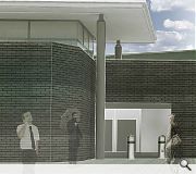
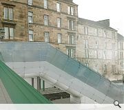
Glasgow’s Kelvinbridge underground station is set to become the latest stop on the network to be given a makeover with Austin-Smith:Lord architects submitting plans to upgrade the station; including the installation of a new cupola and the application of new escalator cladding.New material finishes and clerestory glazing on a lightweight steel roof deck is designed to draw more light into the existing ticket hall and improve access to Great Western Road.
The work forms part of a wider upgrade of the network, most recently evidenced by the installation of new canopy entrances at St Enoch subway station.
The work is being delivered on behalf of Strathclyde Passenger Transport.
|
|
8 Comments
#1 Posted by Geewhizz on 26 Nov 2015 at 10:09 AM
Such a missed opportunity with this one as the site has great potential. The current escalator is grim, and the proposals seem to be putting a bit of lipstick on a pig here.
#2 Posted by David on 26 Nov 2015 at 11:31 AM
I totally agree, completely missed opportunity on a great site. If the existing escalator canpoy was rebuilt in a style similar to St Enoch Square station that would be a much more provocative design for a highly visible site. Ideally the existing station would be demolished and rebuilt as a two or three storey structure to have a flat level entrance at street/bridge level, with deeper internal escalators to take people down to the plaforms
#3 Posted by stephen on 26 Nov 2015 at 14:03 PM
I'm not clear on the benefits of branding subway stations to the extent that SPT seems to want to. Why is it a good thing that the network (including station interiors) is covered in this white and orange livery? The effect is a generic 'futuristic', Total Recall style blandness that befits the slightly dystopian name of Passenger Transport.
There's great affection for our old circle already. Couldn't this be harnessed and couldn't it engender greater pride and love of the old subway to allow each station to have an identity specific to its location within Glasgow and the history of the system? Would love to imagine what NORD or similar might have done with this brief.
That being said I think the clue is in the name: 'makeover'. i.e. cheap modernisation.
Afraid I'm also of the opinion that the new St Enoch canopies are awful, but that's another story.
#4 Posted by Fraser on 26 Nov 2015 at 15:10 PM
I would do as far as saying this is lazy. Completely agree with Everything said above, at the very least they could of made the escalator canopy a fresh new feature instead of this. It is extremely unsustainable of them to keep recladding all of there property; it'll just get pulled down in 20/30 years. Crying shame
#5 Posted by the sultan of brooneye on 26 Nov 2015 at 17:01 PM
Yep, agree. Identi-kit branding of stations do nothing to help locals or visitors create congnitive maps of the city. What a shame, take the tram stops in Hannover around the Expo site. Every one of them gives people a clear understanding of where they are or where they are going to alight: "look out for the tram stop covered in wood - you're the stop after that" or in Glasgow "look out for the stop with the 50ft high super graphic of a beardy guy with a banjo (BC) - that's where to get off".
Pretty simple stuff, and fun too. In a city known for it's humour, these are all a little banal.
Pretty simple stuff, and fun too. In a city known for it's humour, these are all a little banal.
#6 Posted by Artist on 27 Nov 2015 at 12:01 PM
I'm curious as to why there's no more artworks in the Subway stations. The first 2 renovations had artworks by Alasdair Gray and Paul Buchanan. Are none of the other stations going to get similar treatment?
#7 Posted by robert lokat on 1 Apr 2016 at 02:58 AM
Given the ugliness of the subway station almost anything would be an improvement upon its current look. The escalator, of course, is hideous. Both constructions have little, if anything, to do with architectural imagination, local empathy or really anything beyond the basic and the mundane
#8 Posted by robert lokat on 1 Apr 2016 at 03:33 AM
Have you seen the state of the old, cobbled street surface (South Woodside Road) outside the station? For decades it has been repeatedly dug up by all the utility companies - Water; Gas; Electricity; BT; the Council. All the cobbles removed have been disappeared. You ask the question! Come and take a look at how there's crookedness afoot. A few years ago an ornamental tree in an ornamental wooden tub, prettified round its base by pansies, appeared outside the entrance to the station. Wasn't there long. But the theft of the cobbles (mentioned in the Council's own literature as of historical importance pertinent to the area's designation as a conservation area) continued. No councillor I have contacted has, despite assurances, done anything to have the situation resolved and the setts replaced. This is theft and there ought to be an investigation but there won't be - it's just a few hundred cobbles, after all, and think of all the money, time and effort being put into the revamp of the brick wart that is the station. I would like to establish the Woodside Cobble(r)s, dedicated to respecting the historical integrity (see above) of this unique little street.
Post your comments
Read previous: 12 Edinburgh closes in line for illuminating makeover
Back to November 2015
Like us on Facebook
Become a fan and share
News Archive
Search News
Features & Reports
For more information from the industry visit our Features & Reports section.


