Mosaic files plans for Cowcaddens student flats
November 19 2015
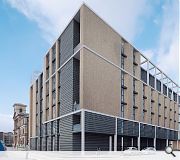
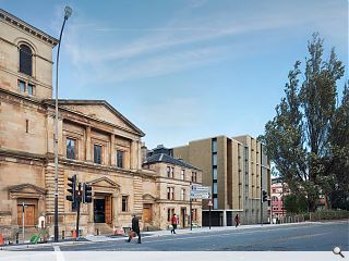
Mosaic Architecture + Design have submitted plans for 280 student bedrooms and amenity space on the site of a disused warehouse in Cowcaddens, Glasgow.Designed on behalf of the Royal Conservatoire of Scotland and Soller One the Dunblane Street project will be faced with blonde multi brick, dark grey aluminium and buff reconstituted stone banding.
In their design statement the architects said: “Our proposals will re-enforce the urban edge to the primary facades with the depth of the city block affording the opportunity to replicate a traditional tenemental form which will also include a private courtyard.”
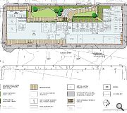
Tiered landscaping to the rear will be divided by a sloping divide and seating to create a small amphitheatre as well as lawns, paths and seating.
Mosaic added: “The courtyard garden spaces will be enclosed by a new brick wall running along the length of Larbert Street with gates at each end, to provide a barrier free access from the street into the building at each level. The wall will be constructed in brick to match the material utilised in the building elevations and will step down along Larbert Street as it falls to the north-west from McPhater Street. It will be punctuated at intervals with metalwork railing panels designed to reflect the simple 1950s style of the former bus depot windows as a reference to the site’s former occupant.”

Recent public realm enhamcements have uplifted the area following completion of the Theatre Royal extension
|
7 Comments
#1 Posted by John on 19 Nov 2015 at 13:32 PM
Where is the street connection here? The warehouse probably added more to the urban realm. More blank brick facades. What level is the raised landscaped deck on? It would need to be roof level to get any light at all. Another rotten building for Glasgow.
#2 Posted by Ian Alexander on 19 Nov 2015 at 14:04 PM
I agree with John. We need some type of interaction at ground level and not just blank street walls
#3 Posted by The Bairn on 19 Nov 2015 at 16:53 PM
Previous comments a tad harsh don't you think lads?
First impressions to my trained eye was a most pleasing aesthetic.
Scale and massing also fine.
Use of a high spec material pallet most certainly will enhance the project.
First impressions to my trained eye was a most pleasing aesthetic.
Scale and massing also fine.
Use of a high spec material pallet most certainly will enhance the project.
#4 Posted by kevin toner on 19 Nov 2015 at 18:48 PM
1) Remember to reorient the east wall window splays towards the Orient Buildings
, not merely to improve upon the users’ visual amenity..., but particularly to offer their rooms as much sun as possible rather than almost blot it out altogether; and
http://www.architectureglasgow.co.uk/oldcity.orient.html
2) Ditto applying to the rear rooms on the west wall window splays, which will catch not merely much needed sun, but views of the Keppie/Mackintosh drawn tenement at 307–335 Hope Street; and opposite that, the recent Theatre Royal adaptation; & all relative to the wider urban realm improvements offered by the piping centre and its immediate surroundings.
Waiting for anything as worthwhile to happen facing north may take quite a few decades.
Masonry is a good choice - as sympathetic to the Piping Centre block as opposed to the Matrix block. However, I’d let the forms and modelling do the talking as opposed to relying on the unnecessary [high contrast] two-tone approach, which doesn’t belong on this particular block contextually.
A “...pleasing aesthetic. Scale and massing..., spec...” etc. is all very well, architecturally, but useless without necessary programmatic; scientific; and contextual acumen (notwithstanding the aspiring choice of the court to complete the block in part*), which all completes the architectural equation.
We should have nothing short of architecture from an architectural practice, especially for here in Glasgow!
*If it weren’t for this particular block being so ideally canted off the grid axis in the way it is, I wouldn’t have bothered commenting. Hopefully the design will finish off the dialogue it’s started.
Good work so far!
#5 Posted by Stephen on 20 Nov 2015 at 14:10 PM
Don't like this at all. No nuance to the massing, no reference to context (especially historical).
Feels like a crude extrusion of a plot to whatever height planners will allow, followed by pasting elevations on in AutoCAD until something 'looks good'. Result: big crude system-built alien shoebox.
I see no proper architectural process in this.
Feels like a crude extrusion of a plot to whatever height planners will allow, followed by pasting elevations on in AutoCAD until something 'looks good'. Result: big crude system-built alien shoebox.
I see no proper architectural process in this.
#6 Posted by shabbadoo on 23 Nov 2015 at 14:20 PM
Surely the external arcade could be made into a glazed cafe unit at street level? A double height arcade too!
#7 Posted by CADMonkey on 23 Nov 2015 at 14:53 PM
The plan indicates that the ground floor corner is a "common room". This surely presents opportunities for expression in the design of the corner which will resolve the problem.
NEXT.
NEXT.
Post your comments
Read previous: Scott Brownrigg submit plan for modular Edinburgh classrooms
Back to November 2015
Like us on Facebook
Become a fan and share
News Archive
Search News
Features & Reports
For more information from the industry visit our Features & Reports section.


