ICA finalise plans for Old Town hotel
October 6 2015
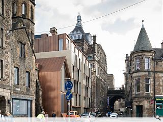
ICA Architects have submitted a planning application for the construction of a four-star hotel in Edinburgh’s Old Town as part of a £65m regeneration push for the A-listed India Buildings on Victoria Street.Drawn up on behalf of Jansons Property the scheme would have the 235-bed hotel at its heart, surrounded by a new entertainment destination of bars, restaurants, cafes and public space.
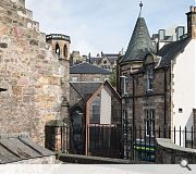
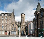
The plans call for extensive renovations to the historic buildings, including a spectacular three-tier domed rotunda, as well as renovations to the neighbouring B-listed Cowgatehead Church (including construction of a new build symmetrical wing) and the repair and extension of a C-listed building.
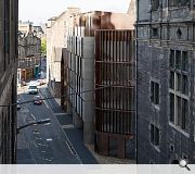
These would be interlinked by new build elements spanning a gap site on Cowgatehead faced in secondary printed glass skin, sandstone panels and standing seam bronze cladding.
In their design statement ICA observed: “The proposed new build element steps up from a tenemental datum of five storeys on Cowgate upwards towards the India Buildings.
“This is manifested in the form of south facing dual pitched gables. These start above the Cowgate elevation and stop short of the roofscape of the India Buildings itself in keeping with the Old Town character of changing roof topography.”
Assuming approval is forthcoming work could commence by the summer for completion at the tail end of 2017.
|
|
14 Comments
#1 Posted by Ella h on 6 Oct 2015 at 12:59 PM
Can Edinburgh just grow some balls and build something that isn't bland? While this design is perfectly lovely, it would be SO nice to see something properly contemporary in the city. I'm fed up of seeing sandstone cladding interspersed with tall glazed Panels. Like the old Missioni hotel has been cloned again and again. Should rename it World Homogeneity Site.
#2 Posted by Rabbie on 6 Oct 2015 at 13:06 PM
This looks pretty great.
#3 Posted by Jimbob Tanktop on 6 Oct 2015 at 14:55 PM
^I concur, #2 ^
#4 Posted by Bill S on 6 Oct 2015 at 15:15 PM
I like this scheme. The use of standing seam bronze panels and printed glass certainly is different from the usual sandstone cladding found elsewhere in new builds (as noted by post #1 ironically...), and the scheme makes a really good attempt at filling in the back-land site, which is quite cluttered at the moment.
I like the idea that the former Warburton Gallery is retained for public use, and the reintroduction of the narrow closes that link Victoria Street with the Cowgate is great - something that is uniquely Edinburgh in their "feel" while emphasising the level changes over the site.
I like the idea that the former Warburton Gallery is retained for public use, and the reintroduction of the narrow closes that link Victoria Street with the Cowgate is great - something that is uniquely Edinburgh in their "feel" while emphasising the level changes over the site.
#5 Posted by jim craig's wee sister on 6 Oct 2015 at 15:17 PM
#1 While i get your point, I would have thought that Edinburgh IS arguably homogenous. If you want 'properly contemporary' (whatever that is) then look no further than the golden turd. Personally, I'd take my chances with the 'bland' contextualism being offered here any day.
(By the way, what happens if you don't have balls? Will they be provided?)
(By the way, what happens if you don't have balls? Will they be provided?)
#6 Posted by ian Alexander on 6 Oct 2015 at 15:52 PM
There are many things I really like about this plan as indicated in the above comments. My main concern is that this will be yet another hotel in the city centre. Maybe this is a positive sign for the city in providing jobs and attracting more tourists, but there are two hotels now being built close by as part of the Caltongate project. Then there is the proposal for a hotel in the gap site beside the City Art Centre, which again will redevelop an area so badly in need of development. Finally the proposal for a hotel in the former Royal High School. Can a city complain about having too many hotels? I am not sure about this.
#7 Posted by Big Chantelle on 6 Oct 2015 at 16:23 PM
Mare blocky, panelled 'modernity' posing as architecture. Wit is this aw aboot?
Look at the stanes ae the existing buildings an the intricate windae details and slate roofs. And then look at the lego-esque intrusion.
And you guy like this stuff? Why, dae ya hink the blocky nothingness of this is edgy an liberal an cool? Does it make ya feel aw cultured to be so disrespectful ae yer environment?
So sad Edinburgh.
#8 Posted by Fraser on 6 Oct 2015 at 17:34 PM
I like this scheme, it looks as though the massing is respectful and as long as the materiality is carried out successfully then all should be good. However it might be nice to see some more intricate detailing along the facades.
#9 Posted by the sultan of brooneye on 7 Oct 2015 at 09:53 AM
What is it they say?
"even a blind squirrel finds the occasional nut"
The respectful dual pitched element of the design works very nicely, and is the aforementioned metaphorical 'nut'.
The remainder, unfortunately.....well, I guess that is also the work of a blind squirrel.
"even a blind squirrel finds the occasional nut"
The respectful dual pitched element of the design works very nicely, and is the aforementioned metaphorical 'nut'.
The remainder, unfortunately.....well, I guess that is also the work of a blind squirrel.
#10 Posted by D to the R on 7 Oct 2015 at 21:46 PM
Eh? Whits that mock gable all about? Oh ... Yer mirroring the existing gable - seems lazy ... or the Part 1 got hold of it? Its too literal - like the other corner though - Mangado?
#11 Posted by rankbadyin on 8 Oct 2015 at 11:04 AM
@#10 Lazy, or respectful of its surroundings?
I am happy to see a well thought out modern design that respects its location and tries to fit into the grain of the street rather than scream 'look at me'. It might be 'too literal' for you but maybe it isn't trying to play to the architectural crowd.
I am happy to see a well thought out modern design that respects its location and tries to fit into the grain of the street rather than scream 'look at me'. It might be 'too literal' for you but maybe it isn't trying to play to the architectural crowd.
#12 Posted by boaby wan on 8 Oct 2015 at 11:57 AM
D to the R - whit exactly is a mock gable??
looks like a real gable to me... too literal having a sloping roof and needing a gable end? aye right ye are then
looks like a real gable to me... too literal having a sloping roof and needing a gable end? aye right ye are then
#13 Posted by town planner on 8 Oct 2015 at 13:12 PM
Mmm... not sure, has some good points to it but the pitched gable doesn't look quite right, material-wise, specifically the white material between the glass on the gable frontage looks plastic-y and naff. Is it supposed to be sandstone? Hope it's just a poor image.
Always think wood looks great in this part of the Old Town why not use it?
Agree with Fraser that some intricate detailing, or even ye olde writing along the side facades of the bronze cladding might look good, poem anyone?
Always think wood looks great in this part of the Old Town why not use it?
Agree with Fraser that some intricate detailing, or even ye olde writing along the side facades of the bronze cladding might look good, poem anyone?
#14 Posted by Bonvivant on 8 Oct 2015 at 13:30 PM
It makes me yearn for Benson and Forsyth's library extension; not just as a design, but as a statement of what a cultural capital city centre should be about. Instead we get more tourists coming to look at tourists.
Post your comments
Read next: Stranraer Gateway opens up town’s waterfront
Read previous: Falkirk Council press ahead with new HQ
Back to October 2015
Like us on Facebook
Become a fan and share
News Archive
Search News
Features & Reports
For more information from the industry visit our Features & Reports section.


