Speculative Glasgow office build placed on the market
April 24 2015
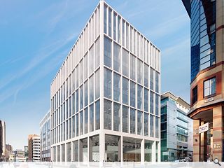
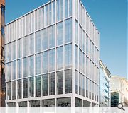
Titan Investors are reportedly seeking to offload a 95,000sq/ft office scheme on Glasgow’s Cadogan Street following approval of designs for an office block on the site in the second quarter of 2014.New Exchange would see two blocks demolished and replaced by a Cooper Cromar designed block on the corner plot valued at £55m, built to BREEAM ‘Very Good’ and EPC ‘A’ standards.
A report in Property Week suggests that Titan has instructed Cushman & Wakefield to find a buyer for the unrealised scheme to cash in on renewed confidence in the city’s commercial office market.
Previous tenants, including Glasgow City Council’s land and environmental services department, have already vacated the buildings.
|
|
3 Comments
#2 Posted by Billy on 25 Apr 2015 at 09:08 AM
Yawn. Another box. I am exasperated about the blandness of new Glasgow buildings. Put them on one street it would be difficult to tell where one starts and another finishes. I understand the buildings have to be functional but they should also be visually appealing. Sadly the latter is not the case. It seems it's imagination R.I.P.
#3 Posted by james on 25 Apr 2015 at 12:30 PM
At first glance, this appears to be just a big and fairly banal design, but then on reflection I thought that description doesn't quite do it, as it does appear to have some lingering redemptive quality. Maybe it's the colour white I might be attracted to, the cheerful blue of the reflected sky, the simple pseudo-structural deterministic grid (though those corner fire escape exits do muck up the platonic grid) and so on. They are fairly pleasant and innocuous visuals. They do their job, but behind that veneer, I do believe there is a more insidious influence at play, whether or not it is conscious or sub-conscious.
Leaving the above aside, in the end, I concluded that the design is faceless, stripped down, devoid of meaning, devoid of anything we would call 'human', Jim.
In comparison to CC's proposal for Atlantic Quay (Feb4 2015), which has rich articulation, modulation and a genuine aesthetic, this design is simply reductionist; a commercial hive for us, the drones, no more.
It is like a face without any features, which brought to mind O'Brien interrogating Winston, '...If you want a picture of the future, imagine a boot stamping on a human face – for ever.'
Architects could perhaps do well to heed and examine more closely the corporate world that it serves and that what they design ultimately reflects the clients' ethos they work for. In short, I believe what we are looking at here are the aesthetics of corporate 'fear'.
I wonder what CC think of it?
Post your comments
Read previous: St Vincent Plaza reaches practical completion
Back to April 2015
Like us on Facebook
Become a fan and share
News Archive
Search News
Features & Reports
For more information from the industry visit our Features & Reports section.


Top left, Ropey