Land Securities release updated Buchanan Quarter visualisations
February 27 2015
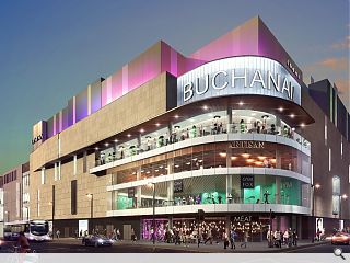
Land Securities have released fresh detail on their vision for Glasgow’s Buchanan Quarter by illustrating the effect that an expanded footprint is likely to have on North Hannover Street and Killermont Street.Visualisations depict a curving block hosting a new leisure destination at the junction, overlooking the city’s main bus station, intended to integrate the road into the city centre by creating an appropriately scaled built environment.
In their site appraisal BDP noted: “North Hanover Street currently suffers from both a lack of quality built enclosure to both sides of the road and a width and openness not normally found within city centre pedestrian streets.
“The proposals seek to reintegrate North Hanover Street into the city centre district by creating an appropriately scaled built environment that acts as a framework for future development to the south and east.
“Whilst the building overall is higher than the John Lewis elevation immediately to the west, the stone cladding aims to relate in scale to the eaves line of the adjacent building. The junction between the new building and its neighbour is articulated by the full height glazed screen. In addition, this signals the entrance off Killermont Street, providing access to the mall and to the cinema and restaurants above.
“The cinema sits as a distinct element above the masonry façade. A second glazed light box signals the cinema and leisure from the western approach.”
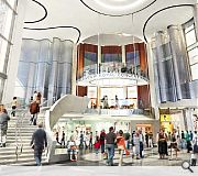
A separate component of the masterplan will entail enclosure of the top end of Buchanan Street with a glass atrium.
|
|
18 Comments
#2 Posted by D to the R on 27 Feb 2015 at 13:03 PM
Whits gonnae happen to the wee Chippy?
#3 Posted by Jon on 27 Feb 2015 at 13:05 PM
All other arguments aside pro vs against the rotunda - is it actually even needed? What does it actually add to the scheme? Apart from some pretty dingy shop entrances, it seems to be largely dead space...
#4 Posted by james on 27 Feb 2015 at 13:15 PM
1. Little did that usherette know, WW2 would just be around the corner.
2. Feel the Love.
3. 'You shall go to the ball!'
2. Feel the Love.
3. 'You shall go to the ball!'
#5 Posted by mies van der rover on 27 Feb 2015 at 13:53 PM
MEAT
#6 Posted by Sir Ano on 27 Feb 2015 at 14:02 PM
MEEEEATTTT!!!!!
#7 Posted by Geeeezo on 27 Feb 2015 at 16:08 PM
Fuckin' hell that's grim in all sorts of ways....
#8 Posted by Roddy on 27 Feb 2015 at 16:15 PM
These visualisations do not do the scheme any favours.
As the caption under image three has pointed out and as I have pointed out in the previous article's comments thread, the amount of non-active frontage in this scheme is almost more alarming than the intended excising of the Buchanan St steps.
All the photoshopped entourage cannot disguise the service yard aesthetic that the majority of the ground level will have.
As for the atrium image-it looks like something from the AJ's Retail Special circa 1979. Kitschy.
PS Mr developer
Can we have some enhanced 3d's of the car park? . One from George Square, one looking along up along north Hanover St at eye level, and one of the north elevation to the car park on Cathedral St.
#9 Posted by Wevo on 27 Feb 2015 at 16:39 PM
Are these people for real? this is a most disgusting attempt at trying to make any of these streets, visually enticing at pedestrian level! yes! PEDESTRIAN!!!!
#10 Posted by Partick Bateman on 27 Feb 2015 at 17:39 PM
Artisan Gym Fox Meat sums this up.
#11 Posted by Tony Two Times on 28 Feb 2015 at 09:28 AM
I thought post #1 makes a valid point. North Hanover street, heading down towards Bath street looks A LOT like the back of the Savoy. The glazed corner itself doesn't look so bad.
#12 Posted by Charlie_ on 28 Feb 2015 at 12:49 PM
The lip service chatter about street interaction while it leaves nearly all of North Hannover & Killermont streets fronted by blank walls is pretty galling. This is considerably worse than id anticipated.
#13 Posted by Roddy on 28 Feb 2015 at 12:59 PM
@#12
This will not look anything like the back of the Savoy. You could be forgiven for thinking that based on the visualisation. However, the developer has not had the good grace to provide an up to date image .
The design has changed from that depicted in the visualisation .The fins you see were meant to be metal fins, but the latest design includes a hideous jumble of grey powder coated panels, Jura limestone panels and acid etched concrete fins. A better and more apt comparison would be the car park at Collegelands. Replace in your minds eye the brick and render panel/fins with the above melange of materials, retain the over-engineered/ value-engineered structure lurking in-between the open elements of the façade and I think we're close.
#14 Posted by Roddy on 28 Feb 2015 at 13:58 PM
@#13
Sorry Charlie, my post was directed # 11. We must have been posting simultaneously as your post was not on screen as I was typing.
Sorry Charlie, my post was directed # 11. We must have been posting simultaneously as your post was not on screen as I was typing.
#15 Posted by Tom Manley on 4 Mar 2015 at 10:55 AM
The poor entrance to the Glasgow Royal Concert Hall does not look happy surrounded by all that frivolity... but it is funny how the visualisation shows people kicking back and chilling on the steps as if people will be encouraged to take time out there... hope they don't get accused of loitering by security guards...
#16 Posted by Graeme on 6 Mar 2015 at 02:31 AM
I don't understand why anyone would want to access a concert hall via a soulless drum within a shopping centre?
#17 Posted by QMDer on 6 Mar 2015 at 17:16 PM
It took two hands to clap. So the concert hall people agreed for the demolition of the stairs too?
#18 Posted by Billy on 5 Apr 2015 at 08:16 AM
Mmm? Do we need another cinema? Is it sustainable? Would a ten pin bowling alley/golf lounge/ climbing wall not be more fun and sustainable and healthier too..... Getting us more active, hungrier and ready to hit the proposed new restaurants. The exterior needs spiced up a little. Verging on bland. We need something that says...'come on in, join the party!'
Post your comments
Read previous: George Square hotel revamp looks set for approval
Back to February 2015
Like us on Facebook
Become a fan and share
News Archive
Search News
Features & Reports
For more information from the industry visit our Features & Reports section.


2. The back of the Savoy.
3. 'Look at those cavemen go'.