Millenium Hotel expansion faces headwinds as Network Rail object
February 25 2015
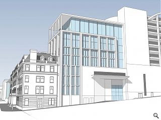
Hamiltons Architects have fleshed out their proposals to remodel and extend the Millenium Hotel on George Square, Glasgow, to take advantage of planned development work to the north as part of the Buchanan Galleries overhaul.This will see the business lose around half of its rooms to make way for an expansion of the Queen Street Station concourse, necessitating the need to find a means of replacing this lost accommodation.
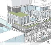
To that end Millenium and Copthorne Hotels have filed revised plans for a limestone and polished concrete clad extension to the rear including a covered courtyard and roof terrace.
In a supporting statement outlining their approach Hamiltons said: “The redevelopment of the station will have a major impact on George Square – but, it will be the bulk of the proposed multi-storey car park that will be most detrimental.
“It is proposed to mask the bulk of the car park with elements that mediate between the two. The masking elements will be treated architecturally to mediate between the historic hotel building and the contemporary car park building.”
The scheme faces headwinds however in the form of a formal objection from Network Rail on the grounds that a through route from the hotel to the station via the approved Buchanan Partnership retail concourse has not been flow modelled and thus may impact safe operation of the station.
Further objections include the implications for ventilation and fire safety at the MSCP which cannot be resolved without commercial agreements with both Network Rail and the Buchanan Partnership.
|
|
22 Comments
#2 Posted by George on 25 Feb 2015 at 12:40 PM
Seems a bit poor that Network Rail can steal half their bedrooms for the Queen Street station expansion and then complain when they try to build an extenstion to compensate!
Actually think that it looks OK and not least that it hides the proposed new carpark.
Actually think that it looks OK and not least that it hides the proposed new carpark.
#3 Posted by David on 25 Feb 2015 at 13:13 PM
Interesting. And way better than their initial 'double teired' approach, which made the existing building look swamped. I suspect public opinion on this will be positively affected given that it is essentially going to mask the disgraceful 'George Square Multi Storey CarPark'.
Lets see more views...
Lets see more views...
#4 Posted by Methilated Spirits on 25 Feb 2015 at 23:24 PM
Help ma boab!!! Grossly out of scale and should be thrown out along with the even more hideous development behind. I despair! As said above, the only saving grace is that it would hide the Buchanan Galleries extension if we have to have it ... and the 'polished concrete' - sounds great!
#5 Posted by Big Chantelle on 26 Feb 2015 at 08:22 AM
The ideology that fuels the concrete modernist brigade can be perfectly seen here.
In a civic square, a carpark is being built to overlook it.A square whose character is largely classical. Yep, let's insert and UGLY, cheap, tacky modern carpark overlooking it. That'll bring the punters in...............
The contempt being shown to people, architecture, class and decency is disgusting.But it's par the course for you lot.
But hey, all you aboard the concrete modernist choo choo train will have somewhere to park your car so you can go and peruse Greggs the bakers and Clinton Cards.
The rest of us will have to endure this tumour of a structure.
#6 Posted by ooctopus on 26 Feb 2015 at 09:22 AM
Street level glass boxes to George Sq being removed? They giveth and taketh away.
#7 Posted by james on 26 Feb 2015 at 10:28 AM
#5 - Dear BC, on this matter i am in agreement with you, but for differing reasons.
1. There is no ideology at work here, other than that of capital. Architects, in the main, are only interested in how the deck chairs are arranged and look on the Titanic. Their services can be bought as in any other dutch auction. They were only following orders, they will say. The trouble is...
2. However, your use of the word, tumour, is appropriate. Worth is the tumour. Value, the cure. Currently, this society is void of the latter.
#8 Posted by The Flâneur on 26 Feb 2015 at 13:47 PM
It might actually be worth having a look at the revised planning drawings that have been submitted for the Millennium Hotel extension as they are actually rather different to the original proposals submitted in December 2014.
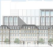
The key difference is the massing. Hamiltons are now proposing an asymmetrical extension to a symmetrical neoclassical palace facade with the massing of the new extension rising by an extra two storeys towards the east with the eastern pavilion having an additional bay to that of the west. I’ve read the revised design statement and, for the life of me, cannot figure out why they have done this as there is no explanation. It seems a curious, even bad mannered, thing to do when faced with a symmetrical neoclassical facade and will conceal less of the monstrously scaled car park behind.
Perhaps Urban Realm would be so kind as to add to additional images to this article so as to reveal these changes?
#9 Posted by urbanrealm on 26 Feb 2015 at 14:12 PM
Sure, I've pulled together some additional perspectives.
#10 Posted by The Flâneur on 26 Feb 2015 at 14:44 PM
Thanks for taking the time to do that Urban Realm.
I think these two new images prove my point – rather than respecting the symmetrical proportions of the Georgian / Edwardian hotel building the extension now looks lopsided. I imagine this has come about because it makes life easier for them on plan but unfortunately Glasgow will be stuck with this ungainly composition overlooking George Square for some time and I suspect it will be one of those things that gnaw away at you. That said, in fairness, it is still better than the inexcusably awful and excruciating mass it is trying to conceal.
I think these two new images prove my point – rather than respecting the symmetrical proportions of the Georgian / Edwardian hotel building the extension now looks lopsided. I imagine this has come about because it makes life easier for them on plan but unfortunately Glasgow will be stuck with this ungainly composition overlooking George Square for some time and I suspect it will be one of those things that gnaw away at you. That said, in fairness, it is still better than the inexcusably awful and excruciating mass it is trying to conceal.
#11 Posted by Roddy on 26 Feb 2015 at 23:22 PM
@#10
I agree about the lopsidedness of the revised scheme. It is not especially clear from the design statement as to why this asymmetrical iteration has happened. There may be a wee clue in the Glasgow Urban Panel report in which the "symmetrical , stepped massing and mix of styles" was questioned and which "appeared to 'swamp' the existing B listed hotel building. Maybe.
I agree about the lopsidedness of the revised scheme. It is not especially clear from the design statement as to why this asymmetrical iteration has happened. There may be a wee clue in the Glasgow Urban Panel report in which the "symmetrical , stepped massing and mix of styles" was questioned and which "appeared to 'swamp' the existing B listed hotel building. Maybe.
#12 Posted by David on 27 Feb 2015 at 08:47 AM
Very disappointed in the lack of symmetry. Doesn't really work in my opinion. Shame as I was getting my hopes up for some sort of ultra crisp contemprary classical approach a la chipperfield or fretton...
#13 Posted by james on 27 Feb 2015 at 09:32 AM
I do wish that the architects here would be more honest in the portrayal of their design so that a grown-up conversation can be had.
In this instance, why is there this apologetic faint representation of mass, bulk, impact etc.? Why is this proposal shown as being 'there', but not 'quite' there, as if its future materiality is beneath a beam in the Star Trek transporter room? I do wish they'd just bloody well draw the thing as it is.
Look at this proposal. Why is it not drawn with the same actual visual impact of other recently completed office buildings within the grid?
This type of dressed-up-to-be-something-its-not-portrayal treats the viewer of the proposals as no more than a child, not wanting to eat its food. I just find it plain patronising.
Both the language and discussion of the evolving city is being re-framed. Some degree of honesty should be the least requirement.
As facade retention goes, it'll be richer than the one-liner Reichstag over the road. Maybe the assymetry acknowledges the context of the City Chambers?
#14 Posted by kevin toner on 27 Feb 2015 at 11:12 AM
#11,
Where are you seeing these if it's the Glasgow Urban [Design] Panel that you're referring to?
Having been an actual GUDP panellist, I’d be amazed if the public have had access and I haven’t after a certain point (Nov 2012).
Despite requests to Design Leader/chairs to see minutes after November 2012, as a contributing panellist giving worthwhile guidance up until August 2014, I have been told they’re being uploaded online, but not where. Not that I’d want to see them as previous minutes rarely expressed any of my input.
Please reveal and I will give a free critique on this block and the schemes thereto.
Oh, or do I detect that that very same ‘behind closed doors’ beholders/family of planning review that have also besieged the Royal High School site.
“Song of the Dawn”
Scotland, please have a look at what the Farrell Review has conjured for DCMS in England & Wales. From it comes the concept of PLACE an acronym of things that we mustn’t ignore/disjoin/silo for the want of a better Urban Realm and urban design to be proud of....
Posted 11:34
#15 Posted by David on 27 Feb 2015 at 11:21 AM
Very disappointed in the lack of symmetry. Doesn't really work in my opinion. Shame as I was getting my hopes up for some sort of ultra crisp contemprary classical approach a la chipperfield or fretton...
#16 Posted by George on 27 Feb 2015 at 12:32 PM
Likewise, the lack of symmetry looks terrible considering this is overlooking the main civic square in Glasgow.
Take back my earlier comment that it looked OK, after seeing these new drawings.
Take back my earlier comment that it looked OK, after seeing these new drawings.
#17 Posted by George on 27 Feb 2015 at 12:33 PM
Likewise, the lack of symmetry looks terrible considering this is overlooking the main civic square in Glasgow.
Take back my earlier comment that it looked OK, after seeing these new drawings.
Take back my earlier comment that it looked OK, after seeing these new drawings.
#18 Posted by Roddy on 27 Feb 2015 at 12:33 PM
@#14
The Urban Design Panel report is freely available at the GCC's planning portal as part of the amended planning submission. The report is dated Thursday 11th December 2014.
The Urban Design Panel report is freely available at the GCC's planning portal as part of the amended planning submission. The report is dated Thursday 11th December 2014.
#19 Posted by kevin toner on 27 Feb 2015 at 13:04 PM
says it all Roddy #18, design review panels being publicised by clients when suits!
Correct again, I had an inclining that such reports &/or minutes weren’t public or transparent up until a certain date, and that date was sometime in 2011, as the current GIA website will show.
What's the reference No. so that those commenting can have a look from the same hymn sheet?
Posted 13:26
Correct again, I had an inclining that such reports &/or minutes weren’t public or transparent up until a certain date, and that date was sometime in 2011, as the current GIA website will show.
What's the reference No. so that those commenting can have a look from the same hymn sheet?
Posted 13:26
#20 Posted by D to the R on 27 Feb 2015 at 13:10 PM
The Great George Square debacle set the tone for the council's agenda for this part of the city. Running a design competition and then deciding just to tart it up with new benches and a lick 'a paint sent the wrong message to developers with usually ignored commercial proposals - GCC had no room to argue for better .... hence this tosh
#21 Posted by Roddy on 27 Feb 2015 at 15:49 PM
@#19
14/02814/DC
Looks to be all academic based on the recent reports that GCC are minded to approve.
14/02814/DC
Looks to be all academic based on the recent reports that GCC are minded to approve.
#22 Posted by J Wilson on 1 Mar 2015 at 20:48 PM
What a mess - the extension on roof of the old Post Office building / G1 building on South side of George Square seems much more in keeping - this one just does not work - the old building is swamped by the new one. Money talks ?!?
Post your comments
Read next: V&A at Dundee to move on site next month
Read previous: Lews castle museum & archive takes shape
Back to February 2015
Like us on Facebook
Become a fan and share
News Archive
Search News
Features & Reports
For more information from the industry visit our Features & Reports section.


The proposed building looks to be sited on what is currently the access to the adjacent car park which looks like NR property. Further , the images suggest this scheme directly abutting that of the new BG car park. Strange.
Where do the land ownership demarcations lie? Can anyone elucidate?