Muse Developments refine Marischal Square proposals
December 17 2013
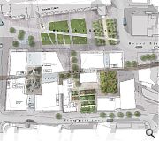
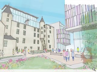
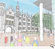
Representatives from Muse Developments and Halliday Fraser Munro have staged a second public consultation into their plans for the transformation of Aberdeen’s St Nicholas House.As the name suggests Marischal Square will incorporate a new pedestrian space at the foot of Marischal College, this will be connected visually and physically to Provost Skene’s House which is slowly emerging from the shadow of Aberdeen City Council’s former offices to serve as a new focal point for the area.
Muse were selected to deliver the £100m mixed use development of office, hotel, restaurant, leisure and civic space back in April and Marriott Residence Inn already signed up as preferred hotel operator.
Stephen Barker, director at Halliday Fraser Munro, said: “The design isn’t complete, we’re only halfway through that process, and we are changing that design as we go along.
For the past fifty years St Nicholas House has hidden Provost Skene’s House so we’re looking to bring the heights down and open up views.
“We’re looking very closely at the materials and granite is going to be a big part of it however many people have asked us to add some colour to the scheme through the architecture and green spaces.”
A planning application is scheduled to be filed at the end of February.

The plans entail recreation of Guestrow, one of a number of historic streets which once criss-crossed the site
|
11 Comments
#2 Posted by Bill on 18 Dec 2013 at 12:26 PM
Oh come on Jon,
It's not as if the Architect's have a reputation of producing soulless, turgid and boringly repetitive buildings in Aberdeen is it now? I mean, the images and accompanying text above show a clear architectural response to the consultation process by integrating colour into the development! That has now resulted in, quite clearly and unequivocally, the best design I have ever seen in Aberdeen since that recent hotel on Justice Mill lane, perhaps even in the world.
It's not as if the Architect's have a reputation of producing soulless, turgid and boringly repetitive buildings in Aberdeen is it now? I mean, the images and accompanying text above show a clear architectural response to the consultation process by integrating colour into the development! That has now resulted in, quite clearly and unequivocally, the best design I have ever seen in Aberdeen since that recent hotel on Justice Mill lane, perhaps even in the world.
#3 Posted by egbert on 18 Dec 2013 at 17:25 PM
Reintroducing Guestrow is a nice idea but given the scale, massing and footprint of the new buildings it seems pretty disingenuous. If this is really to be reintegrated into the townscape and street pattern surely the site needs to be broken down further - this is still essentially one large building, mixed-use or not.
#4 Posted by steve brown on 19 Dec 2013 at 09:12 AM
Aberdeen city continues to know the cost of everything and the value of nothing. Aberdeen was one of the most architecturally beautiful cities anywhere in Europe but gradually it is being replaced with poorly designed concrete and steel monstrosities that are not in scale with the surroundings and clash with the design of the historic buildings. It is deeply depressing! We are consulted and then ignored which makes it worse.
#5 Posted by Colin on 19 Dec 2013 at 17:47 PM
Contemporary, stunning, sympathetic, sustainable, long term, visionary, well considered... Some of the things that seem to have been missed with this one.
#6 Posted by william smith on 2 Jan 2014 at 21:57 PM
You say that this is a refined design? i am afraid that it is still failing....a very poor design response to the opportunities presented by this site. What you have produced to date, lacks creativity and shows a complete insensitivity to the adjacent listed buildings.
This design proposal is repeating the mistakes of of the 60's/70's. We have come a long way since then in our understanding and management of scale, relationship, materials etc.
The architectural solution on this site should be an iconic building which reflects the dynamic nature of the city not some bland compromise which fails to excite.
Stop "refining " your original concept for the site. Scrap it and start again. Employ an outside creative architectural design agency if your in-house people cannot respond to the requirements of this brief .
The people of Aberdeen want an exciting aesthetic solution.
#7 Posted by debra storr on 27 Jan 2014 at 20:14 PM
WTF is that 'thing' looming over and in one view seemingly attached to Provost Skens' House? This is a much abused gem of a building that should be visible from all four side - not attached to a glass and concrete (with some facadism of granite) block. Almost bring back St Nics - and it takes a lot for that thought to occur long enough to type.
Main assets: Provost Skenes House, Marishall College and view along eixsting Broad St to some lovely buildings at corner of Schoolhill. Build from these assets, please.
Least successful feature of St Nic - pends. Large feature of this 'design' - pends.
Main assets: Provost Skenes House, Marishall College and view along eixsting Broad St to some lovely buildings at corner of Schoolhill. Build from these assets, please.
Least successful feature of St Nic - pends. Large feature of this 'design' - pends.
#8 Posted by Keith Middleton on 29 Jan 2014 at 10:08 AM
Yet more vandalism sanctioned by the gypes at Aberdeen Council.
#9 Posted by sandy on 30 Jan 2014 at 12:50 PM
gee, this is just awful. But at the same time not surprising.
ps don't mention to an architect you don't want to see more glass boxes (triple kirks, St Nicholas etc) as they just look at you with 'you wouldn't understand' disdain.
ps don't mention to an architect you don't want to see more glass boxes (triple kirks, St Nicholas etc) as they just look at you with 'you wouldn't understand' disdain.
#10 Posted by Ian Hunter on 17 Apr 2014 at 17:00 PM
As I said at each display in the Art Gallery, horrible slabs of glass are being replaced by other horrible slabs of glass. I forecast that, in another 30-50 years, they will al be knocked down and at last replaced with an attractive open square. Sadly, a golden opportunity has been lost.
#11 Posted by parkingman on 13 Feb 2015 at 18:31 PM
Where will everyone who works shops there park all their cars or is everyone getting the bus now?
Post your comments
Read previous: Sauchiehall Street firms back entertainment district plan
Back to December 2013
Like us on Facebook
Become a fan and share
News Archive
Search News
Features & Reports
For more information from the industry visit our Features & Reports section.


And are you seriously proposing to knock a chunk out of the back of Provost Skenes house? Are you mad (perhaps thats self evident).
Yet again, nice one Aberdeen.