Duke Street student residential plan submitted
September 27 2013
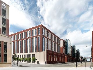
Plans to erect a £10m student accommodation block hosting 257 bedrooms in Glasgow’s east end have been submitted by Legacy Student Living.Part of Page\Park’s Collegelands masterplan the ICA Architects designed scheme fills a gap in the streetscape between a multi storey car park and new office space and is situated behind the retained brick wall of a former railway goods yard.
The L-shaped block turns the corner from Duke Street onto New Station Road and will front onto a new public square.
Composed of red brick and precast concrete the scheme will incorporate a basement gym and games room, landscaped courtyard and private terrace.
6 Comments
#1 Posted by Sven on 1 Oct 2013 at 09:52 AM
For what is one of the most historic parts of Glasgow, why does it look like any town anywhere? I appreciate that the area became derelict for decades but why ignore the past of the area? Blackfriars and the University of Glasgow stood on the site, could no reflection of the past be cast on new buildings? Red brick is also very un-Scottish.
#2 Posted by Andy on 1 Oct 2013 at 12:24 PM
Compared to the rest of the Collegelands development, I like the more restrained elevations on this building. The others give me a headache. Don't like the red brick either, but I guess that is part of the Masterplan design?
#3 Posted by wonky on 1 Oct 2013 at 15:08 PM
The old College goods yard was a very un-Scottish red brick- to be honest I can't see much sandstone ( if that's what Scottish is?) buildings erected on a 40 year gap sight on the east side of city. Maybe I'm wrong. Personally I like the fact they retained the old red brick facade and think the new build compliments it very well. Its a new streetscape, bulks up Duke Street, adding symmetry, strengthening the urban edge and increases density with decent standard finish- what's not to like?
Or do folk prefer what was there before? Are some folk ever happy? As a wiser man than me once said: yae canny please aw the people aw the time...so if a completely different design had been built some would be on here saying it was just one big "pile of steaming hot s*%!"
In this life you can never completely win.
#4 Posted by Egbert on 2 Oct 2013 at 09:37 AM
I'm with Wonky on this one. You can't just dismiss red brick as 'un-Scottish' - pretty trite as comments go - we need more of a critical approach to materials and vernacular or else we risk getting stuck in a jimmy-hat theme park timewarp. Brick may be less widespread up here than other, older materials but there are plenty of precedents, particularly associated with industrial and transportation typologies from the recent past. This development clearly builds on the site's own material legacy - with it comes a degree of solidity and sense of place lacking from too many recent developments.
#5 Posted by Sven on 2 Oct 2013 at 10:25 AM
Concordantly Wonky and Egbert. my view is that this is the historic heart of Glasgow and the architecture should reflect that. The sandstone tenements running up High Street are clearly very late Victorian but retains some vernacular traditions with the odd crow step gables etc that one characterized the street. I can think of several examples from 'old town' developments around the world that reflect their historic areas but are thoroughly modern. If I look at the picture above I would guess it was London or Guildford. I also think the 'jimmy-hat theme park timewarp' is trite as so little of old Glasgow still exists - talking about 20 buildings or so from before 1850 in the old Glasgow area.
#6 Posted by Egbert on 2 Oct 2013 at 14:10 PM
Sven - the '"jimmy-hat themepark timewarp" comment wasn't aimed at old Glasgow - I agree that there is (scandalously) little left of the pre-modern city - but at Scottish architecture in general if we are led to believe that the only way to embody a sense of place or national identity is through slavish adherence to a narrow palette of supposedly historic materials and details. In my view the use of brick here is consistent with the scale and form of the development as a response to the site condition 'as found', ie. as an open and levelled former goods yard, rather than its previous history as a finely-grained portion of a mediaeval burgh. I'd love to see some of the density, character and life of the old High Street restored - its present condition as a largely-ignored and neglected backwater is utterly tragic - but it would be disingenuous to attempt this by simply pasting sandstone and gables onto large-floorplate commercial development. Some sort of critical reconstruction process, breaking down the larger gap sites into appropriately-scaled plots and with the involvement of multiple architects to achieve the sort of variegated streetscape that once existed, might produce soemthing more meaningful. Examples are few but the work done at Holyrood North in Edinburgh has been fairly successful, urbanistically at least, at reintegrating a large consolidated industrial site back into the historic heart of a city.
Post your comments
Read next: George Square re-opens following facelift
Read previous: Ardrossan Medical Centre moves on site
Back to September 2013
Like us on Facebook
Become a fan and share
News Archive
Search News
Features & Reports
For more information from the industry visit our Features & Reports section.


