Muse named preferred bidder for Aberdeen’s St Nicholas House
May 2 2013
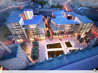
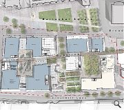
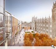
Muse Developments have seen off competition from three other shortlisted schemes to be named as preferred bidder for the redevelopment of Aberdeen City Council’s former St Nicholas House HQ.Designed by Halliday Fraser Munro the project comprises two linked buildings, the taller of which stretches to 10 storeys, and incorporates a mix of hotel, offices, restaurants and retail space in addition to a new civic square.
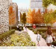
Commenting on the plans council leader Barney Crockett said: "We promised a modest civic square and this exciting development will deliver that and more, creating a lively new public space in the heart of the city."
A 12 week public consultation on the plans will now commence, preparing the ground for a planning application to be submitted later in the year.
Assuming all goes well Muse intends to unwrap the completed development during 2016.
|
|
15 Comments
#1 Posted by Archie Simpson on 2 May 2013 at 12:19 PM
What's with all the smoke and mirrors in this visual? Are they trying to hide something? Views at street level might be more useful in explaining how this respects the existing historic fabric, or not.
#2 Posted by Nik on 2 May 2013 at 13:14 PM
@#1 - Archie, it looks pretty much as you'd expect from the ground level visuals. Bog standard office/hotel block with a bit of a square in front of it.
Doesn't respect the existing fabric, other than show how nice Marischal College looks in comparison.
Ugly office block replaced with slightly less ugly office block. Is all modern architecture rubbish or just the stuff they build in Scotland?
Doesn't respect the existing fabric, other than show how nice Marischal College looks in comparison.
Ugly office block replaced with slightly less ugly office block. Is all modern architecture rubbish or just the stuff they build in Scotland?
#3 Posted by monkey9000 on 2 May 2013 at 13:19 PM
10 Storeys the same height as Marischal College? hmmmm....
#4 Posted by urban designer on 2 May 2013 at 13:38 PM
Aberdeen just loves HFM architects lol.
#5 Posted by David on 2 May 2013 at 16:03 PM
The only positive thing I can say about this is that the existing building is demolished. I cannot grasp what the cosy relationship ACC has with HFM, mind you the other shortlisted schemes weren't much better.
This just isn't architecture, not even close. It looks like it has been designed by massing to reach a number then clad in 'build me anywhere' faceless steriotypical office facade.
Actually, the more I think about it, the more merit I can see in the existing building. It at least keeps its height tucked below Marischal's granite facade (with the exception of the tower of course).
Another opportunity missed. UR can we have more images please?
#6 Posted by cosa nostra on 2 May 2013 at 16:47 PM
Attento a quello che dici HFM, sono un buon amico di famiglia ;-)
#7 Posted by Cadmonkey on 2 May 2013 at 20:16 PM
I like the way the proposal sensitively relates to the listed building that had to be retained. You can just see it waving at the back, between the new buildings.
#8 Posted by David on 3 May 2013 at 10:51 AM
It's an interesting point, Cadmonkey. Provost Skene's House was originally part of a very dense fabric where all buildings sat cheek by jowl with each other separated by no more than a narrow vennel. With all of the original fabric now gone, it could be argued that the remaining house is of far more importance now, being a treasured remain of what was there before. I think for this reason it needs to be celebrated properly. Not squished between these two office blocks (or at least that is what it looks like from this image).
This scheme also seems to completely ignore the relationship between the entrance of Marischal and the spire of the Kirk to the west (which you can see top centre of the render).
This scheme also seems to completely ignore the relationship between the entrance of Marischal and the spire of the Kirk to the west (which you can see top centre of the render).
#9 Posted by urbanrealm on 3 May 2013 at 11:35 AM
I've posted additional visuals for this scheme which give a clearer idea of what the final form could be.
#10 Posted by scott on 3 May 2013 at 13:04 PM
@archie smoke and mirrors? come on man pull another one of your stock phrases out of the bag for us
#11 Posted by CADMONKEY on 3 May 2013 at 15:45 PM
I actually quite like this.
There...I said it.
Mild reservation about the entire block below the text "Guest Row" but you gotta make a dollar.
There...I said it.
Mild reservation about the entire block below the text "Guest Row" but you gotta make a dollar.
#12 Posted by Cadmonkey on 3 May 2013 at 20:51 PM
Interesting that there is no rooftop plant though. Where is it?
#13 Posted by Egbert on 7 May 2013 at 10:18 AM
There's something very wrong when millions of pounds of public money and an international architectural competition is lavished on a needless private vanity project to redevelop a perfectly good existing public space, while a vital piece of urban repair to the city's civic heart is treated as a lowest-common-denominator commercial development. Imagine if the architectural talent (and critical attention) wasted on Union Terrace Gardens had been focused here instead - we might have a carefully-considered and meaningful architectural and urban solution to genuinely re-stitch the city centre, rather than a bland exercise in commercial floorspace dressed up by the usual corporate suspects.
#14 Posted by CADMonkey on 14 May 2013 at 14:06 PM
I think there is a legitimate debate to be had about whether design competition images should illustrate a deliverable building, or if material factors such as rooftop plant can selectively be ommitted. I'm assuming the jury on this were lay people who knew no better than believe the image.
#15 Posted by superjim on 15 May 2013 at 09:12 AM
I also think the reporting of these competitions needs to be quite carefully considered. This competition was not merely a design competition and to suggest that this was selected due to being "the best design" is erroneous. A significant factor was the developers financial bid and having looked at the 4 schemes, the winning bid appears to have upwards of 50% more "building mass" than some of the others, suggesting a much higher financial bid would have been submitted. No surprise to see the mysterious Halliday Fraser Munro hoovering up another council-related big job in Aberdeen, their ability to win these jobs is matched only by their ability to consistently deliver dreadful, dull and insipid architecture.
Miserablist Regards,
A depressed Aberdonian.
Miserablist Regards,
A depressed Aberdonian.
Post your comments
Read next: Ryder Architecture launch Glasgow exhibition
Read previous: Commonwealth Games retail & leisure park put on ice
Back to May 2013
Like us on Facebook
Become a fan and share
News Archive
Search News
Features & Reports
For more information from the industry visit our Features & Reports section.


