Cooper Cromar submit Glasgow Motel One plans
May 21 2012
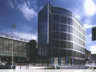
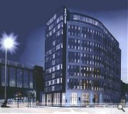
Cooper Cromar has revised a previously consented nine storey office development for Buccleugh Property on Glasgow’s Argyle Street to accommodate a Motel One.Rising to 13 storeys (including a double height foyer and two setback penthouse levels) The huge 374 room hotel would terminate the Hope Street vista at a key city centre junction and will incorporate upgraded public realm and an active frontage incorporating foyer, reception and bar areas.
Clad in limestone a curved treatment would be adopted carrying the mass round the corner and into Oswald Street with a glazed tower element addressing Hope Street. Separate service access will be provided along Midland Lane.
The £18.8m scheme could commence immediately if approved.
14 Comments
#2 Posted by E=mc2 on 21 May 2012 at 19:13 PM
Is that not just half of GM+AD's Sentinel building bolted onto the original scheme? Something really freaky happening with the scale too
#3 Posted by Sven on 21 May 2012 at 19:59 PM
What happened to the old building that used to be there? I recall a tudoresque pub then a modern building with a doughnut shop underneath.
#4 Posted by Robert on 21 May 2012 at 23:21 PM
Sven- wrong corner mate! You're thinking of the junction of Argyle Street and Union Street.
#5 Posted by Ross on 22 May 2012 at 09:13 AM
I think it looks great. Slowly the regeneration of that area is picking back up again and about time too.
#6 Posted by David on 22 May 2012 at 10:52 AM
Is it just me or does it not bear a strong resemblance to the Westergate offices diagonally across the road. I think they are / were BT offices?
Not the greatest contextual reference to use, to say the least!
Not the greatest contextual reference to use, to say the least!
#7 Posted by Rem Koolbag on 22 May 2012 at 11:27 AM
e=mc² - the scale issue comes from them using the window openings to span 2 floors. This then makes us think the building has half the number of floors (apparently) and it fits perefctly in it's context! Huzzah!
Pretty poor effort at cramming in as much accomodation as possible. Not exactly contributing much to the public realm at this important corner either.
Pretty poor effort at cramming in as much accomodation as possible. Not exactly contributing much to the public realm at this important corner either.
#8 Posted by dial-a-lama on 22 May 2012 at 13:16 PM
From the image attached (not being a local) - the 'double order' glazing on the proposal could be intended to relate to the glazing on the station - which spans quite a height - perhaps not intended to deceive. For me; the design is quite ordinary (but one mans trash is another mans treasure). I am, however, concerned about how 'paper thin' the facade appears above street level; very little depth, articulation or consideration beyond the 2 dimensional elevation...
#9 Posted by kevin toner on 23 May 2012 at 11:13 AM
e=mc2 - another scale issue is that CC's CGIs appear reluctantly to reduce the upper reaches [storey heights] of their images to make their proposals proudly more pronounced than they’d otherwise be as true perspectives.
Why not?
This delivers a greater impression of the two-dimensional elevation aspect whilst exploring imagery.
Approval granted!, i.e CGI technique approval.
Why not?
This delivers a greater impression of the two-dimensional elevation aspect whilst exploring imagery.
Approval granted!, i.e CGI technique approval.
#10 Posted by kevin toner on 23 May 2012 at 11:25 AM
Look here:
http://www.urbanrealm.com/news/3344/110_Queen_Street_plans_approved.html
Same policy on the CGIs!
http://www.urbanrealm.com/news/3344/110_Queen_Street_plans_approved.html
Same policy on the CGIs!
#11 Posted by kevin toner on 23 May 2012 at 12:17 PM
Perhaps one might call it "a new form of axonometric"
#12 Posted by sultan of brooneye on 23 May 2012 at 14:13 PM
Setting the upper level or levels of medium rise buildings back is nothing new really. It's the same old trick used for lots of clients who are scared stiff of 'over-development' objections being launched at them - could an architect suggest a positive approach? and design something that celebrates the additional height of the building. Or is it just par for the course and the architect has given up the opportunity without even asking the question.....
#13 Posted by A. Local on 3 Aug 2012 at 13:48 PM
Why have I not seen more of this scheme until now?
Looks fantastic. Materially sophisticated, nice massing. Would be good to see plans of how it works internally.
Nice one - thanks.
Looks fantastic. Materially sophisticated, nice massing. Would be good to see plans of how it works internally.
Nice one - thanks.
#14 Posted by Rem Koolbag on 3 Aug 2012 at 14:18 PM
== This comment was removed for being unconstructive ==
Post your comments
Read next: Broughty Ferry flats plan declared ‘invalid’
Read previous: Retail survey finds shoppers deserting the High Street
Back to May 2012
Like us on Facebook
Become a fan and share
News Archive
Search News
Features & Reports
For more information from the industry visit our Features & Reports section.


Cant wait to see this happen