Golspie Street housing officially unveiled
April 27 2012
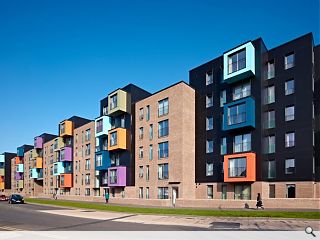
Govan Housing Association has held an open day at their Golspie Street residential development, a colourful insert into the local streetscape designed by Do Architecture.Built by Cruden Homes the scheme is distinguished by a series of coloured ‘pods’ projecting out onto the surrounding streetscape, distinguishing it from a wave of redevelopment that has taken place in the area.
It also marks the gateway to the central Govan conservation area and is intended to heal the fractured landscape that exists in the vicinity.
Costed at £13m the scheme provides 102 apartments, 42 of which are being made available as low cost housing for sale and 60 which will be put forward for rent.
The scheme was officially unveiled by former A+DS chair Raymond Young who praised the striking tenemental design and quality brickwork.
Photography by Andrew Lee.
10 Comments
#1 Posted by Katie on 27 Apr 2012 at 16:09 PM
I really like this. It's nice to see something that stands out from the usual housing association stuff.
#2 Posted by Big Charlene fae the gorbals on 27 Apr 2012 at 21:44 PM
@Katie
I agree. I think these housing units looks pretty smart and cut a nice figure as part of the wider built environment.
I agree. I think these housing units looks pretty smart and cut a nice figure as part of the wider built environment.
#3 Posted by Eric on 28 Apr 2012 at 08:17 AM
Yes i also like them.different funky cheeky.
#4 Posted by iain on 29 Apr 2012 at 19:41 PM
I really like it as well
Although its nearly £128k build cost per unit.
Wich is nearly £40k a unit more expensive than the "usual housing association stuff"
Although its nearly £128k build cost per unit.
Wich is nearly £40k a unit more expensive than the "usual housing association stuff"
#5 Posted by Neale Smith on 29 Apr 2012 at 21:07 PM
Been watching it go up, refreshing to see some effort being made, the photography is superb as usual from Andrew!
#6 Posted by Neil on 30 Apr 2012 at 09:54 AM
A massive improvement, and much needed. The Shaw Street front, while more muted, might actually be the more successful urbanistically... I do like the stair towers on the courtyard side though, and the Smarties coloured pods are good fun. Nice work.
#7 Posted by Jimbob Tanktop on 30 Apr 2012 at 11:36 AM
This is very good indeed, both front and back. It is more expensive, but possibly worth it, if people cherish it and are willing to pay a little extra to live there.
#8 Posted by BM on 30 Apr 2012 at 13:08 PM
I'm not a huge fan of the colourful boxy sticky outie bits (to use the technical term) but these are fantastic, the brick is lovely and the whole thing looks very sharp. Congrats to Do Arch.
#9 Posted by Ross on 30 Apr 2012 at 13:55 PM
This looks great. Great to see a modern interpretation of the tenement done with flair but integrated in it's context too. Pleasingly no sign of 'grubby in a flash' render either.
#10 Posted by Jonathan on 2 May 2012 at 10:29 AM
Fantastic scheme well done. i love the colour play against the black panel background. The most successful thing is the integration into the streetscapes, it sits very comfortably against the old tenement blocks.
Post your comments
Read previous: Mansell commence work on Rowling Neurology Clinic
Back to April 2012
Like us on Facebook
Become a fan and share
News Archive
Search News
Features & Reports
For more information from the industry visit our Features & Reports section.


