BDP detail Technology and Innovation Centre plans
February 27 2012
Approval of BDPs Technology and Innovation Centre (TIC) and Industry Engagement Building (IEB) marks one of the most ambitious city centre regeneration projects Glasgow has seen this side of the credit crunch - prompting Urban Realm to take a closer look at the latest iteration of the scheme.Strathclyde University intend for the £89m facility to bolster their reputation as a leading international institution and to that end have hired architects BDP to design a landmark facility which befits those aims.
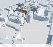
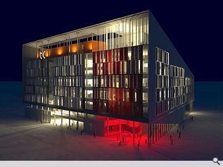
Its architects have adopted a triangular plan to exploit available site area and incorporated a ground floor ‘shop window’ which encourages pedestrians into a central ‘forum space’ beneath a central atrium.
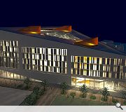
East and west facades of the 25,000sq/m facility are cloaked in a solid skin of ‘hit and miss’ stone panels whilst the George Street façade sports a predominantly glazed façade to maximise northerly light.
In their design statement BDP state: “The TIC building has a deliberately expressive form, but rather than form making for its own sake, the building massing is a result of consideration of the brief and the site context. TIC is higher along the north frontage (rising to eight storeys) to take best advantage of diffuse natural light and to create a civic presence on George Street.”
The IEB meanwhile is intended to relate to the TIC whilst being distinct from it. Housing five levels of flexible office accommodation the design deliberately steps back from George Street to allow the TiC building and a neighbouring residential to act as book ends, providing a landscaped buffer and civic space in the process.
A diagonal pedestrian link from here, dubbed New Street, will connect a series of outdoor spaces to improve city centre connections with the campus.
Site works are scheduled to commence shortly with completion expected around March 2014.

The scheme forms a key component of the wider Scottish Enterprise backed International Technology and Renewable Energy Zone
|
9 Comments
#1 Posted by Arthur Brown on 27 Feb 2012 at 15:04 PM
Clearly the Architects have been inspired over their lunch break and have modelled the design on the "Laughing Cow" cheese wedge they spread on their lunchtime sandwiches - IMHO a wasted opportunity - "Hit and Miss" stone cladding? Well it's a very definite "MISS" as far as I'm concerned
#2 Posted by GS on 27 Feb 2012 at 15:14 PM
“The TIC building has a deliberately expressive form, but rather than form making for its own sake, the building massing is a result of consideration of the brief and the site context."
=
"the site is a triangle so...we made the building a triangle"
=
"the site is a triangle so...we made the building a triangle"
#3 Posted by Neil C on 27 Feb 2012 at 15:43 PM
I think the above comments are unneccessarily curmudgeonly. This has been an ugly gap site in the heart of our city for many years, and now a striking eight-storey triangular building has been revealed, to encourage technological progress at one of our big universities and create a focal point for traffic along one of the main city centre thoroughfares. And yet all anyone can say is it shares a geometric shape with soft cheese. If it was square, would people say it looked like a slab of cheddar? If the building was round, would they dismiss it as a Babybel rip-off? Be glad something decent (and fairly original) is being built here (especially given the economic situation), and if you want to complain about things that look like cheese, the Broomielaw currently resembles Jarlsberg with massive holes along its length. Now that's an area fully deserving of ire and condemnation...
#4 Posted by Arthur Brown on 27 Feb 2012 at 17:49 PM
"the site is a triangle so...we made the building a triangle" - An interesting application of a creative design process? Just slavishly follow the shape of the site. Thank heavens the site wasn't a split toroid or something more exotic!!
I personally would welcome a more innovative approach to the design of a building for what is and has long since been, a gap site in the heart of a historic part of the city. Should this design not "shout" Technology and Innovation? Does it challenge the architecture of the surrounding buildings or merely reflect the same bland nature of their facades?
I personally would welcome a more innovative approach to the design of a building for what is and has long since been, a gap site in the heart of a historic part of the city. Should this design not "shout" Technology and Innovation? Does it challenge the architecture of the surrounding buildings or merely reflect the same bland nature of their facades?
#5 Posted by E=mc2 on 27 Feb 2012 at 21:26 PM
C'mon the 'TIC
#6 Posted by Egbert on 28 Feb 2012 at 09:26 AM
On balance I'm with Neil C here - while the 'hit-and-miss' facade treatment is rather weak and dated, the overall proposal is confidently scaled and modelled and will make a positive difference to this end of the city. Let's not stifle all the criticism though, as it's quite entertaining to read.
#7 Posted by g on 28 Feb 2012 at 12:09 PM
I like the triangular form. The scheme has much potenial. This is not just another big lump that has landed from space unlike some of the recent inner city centre developments.
#8 Posted by dmg on 28 Feb 2012 at 13:25 PM
I agree. The triangle is not whimsicle, its a clear response to Glasgow's established street pattern, i.e. a bold, strong building built right to the pavement edge, helping to redefine city blocks and streets in an area that needs it.
#9 Posted by noah murney on 29 Feb 2012 at 20:46 PM
@ Arther Brown: I Camembert your cheesy references to this design.
I agree with other commenters that BDP have enhanced and reinforced the local street pattern - and the roofscape, which in this overlooked situation is very appropriate - with a bold and dynamic design.
Yes, the Rafael Moneo hit-and-miss fenestration trope may have been copied a bit overmuch by unskilled architects who neglect any drawing scale above 1:500, but Glasgow city centre's most successful architecture consists of elevations with windows of a strong vertical emphasis.
In the right hands, and with the right materials and attention to detail it is a perfectly acceptable and suitable elevational treatment for tall buildings which demand varied and flexible internal arrangements within emphatically urban contexts.
If you're not convinced by this argument I suggest you check out Strathclyde University's woeful collection of 70s modrenist 'flexible' layer-cake-elevation buildings around Cathedral Street (which they don't even align with).
This design has the potential to make a positive contribution to its neighbourhood and to the university's campus.
To suggest otherwise is a pizza nonsense.
Post your comments
Read previous: Construction to commence at Alexandria Centre
Back to February 2012
Like us on Facebook
Become a fan and share
News Archive
Search News
Features & Reports
For more information from the industry visit our Features & Reports section.


