Maggie's Lanarkshire: Carefully Does It
29 Oct 2014
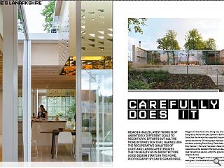
Reiach & Hall’s latest work is of an entirely different scale to recent civic efforts but all the more intimate for that. Harnessing the recuperative qualities of light and landscape it proves that in health as in architecture good design starts in the home. Photography by David Grandorge.
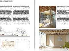
Maggie’s Centres have come a long way since the first unit designed by Richard Murphy opened in Edinburgh in 1996. Since then the network has expanded massively with ten other centres around the UK having been delivered by renowned architects including Frank Gehry, Zaha Hadid and Rogers Stirk Harbour + Partners. The latest is Reiach & Hall’s Maggie’s Lanarkshire at the Elizabeth Montgomerie Building, a low slung steel framed brick pavilion within the grounds of Monklands Hospital, Airdrie.Though all Maggie’s share a similar brief the architects were given considerable latitude to create striking solutions and Reiach & Hall are no different having opted for a series of hierarchial spaces arranged around two central courts and four smaller peripheral courts (sitooteries) for quiet contemplation. Interior spaces are configured by means of timber partitions, allowing the creation of smaller, more private spaces or, conversely, for public rooms to be opened up for special occasions.
The new centre battles valiantly to hold back a rising tide of car parking, sheltering behind a belt of mature lime trees and a protective, finely articulated, brick wall. On a visit to the centre project architect Laura Kinnaird explained that, at its heart, the scheme was based on the traditional walled garden and was more about landscape than architecture: “It was about a little burn and a lochan; beginnings and endings. The beginning is at the entrance with the burn, taking you on a sense of progression and a journey to the garden. Gardens and nature are such similar briefs but people tackle them in different ways, gardens are a lot more intricate.”
That journey begins at an arrival court defined by a linear rill animating the space with sound and movement. Engraved upon it are the words ‘alt beag’, Gaelic for little burn, taken from a poem by Thomas A. Clark, one of three artists brought on board who influenced the design. It succeeds in transporting visitors from a chaotic tarmacadam expanse to a space more akin to a secluded forest glade with impressively few steps. Kinnaird said: “It does a great job of making people aware of the garden and dulls out the noise of the car park a little. As the garden starts to develop a bit more a wee bit of colour will come in to it.”
Kinnaird said: “Someone should be able to come into the building and the staff should see them. If this is their first time they’ll be shown where the kettle is and given a little tour, next time they come back they’ll know their way around. They have a really clear way through.”
At the other end of the journey sits a large walled garden with what was supposed to have been a sheltered lochan at the far end, sadly budget restrictions mean the space has been filled in until the necessary funding can be raised to complete the vision although all the necessary infrastructure has been put in place for its eventual arrival.
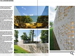
Wrapped around this garden and the centre as a whole is a latticework of handmade Danish ‘Petersen Tegl’ bricks, which meet the competing need of providing a sense of enclosure whilst permitting passage of sunlight through its piercings. Brickwork is arranged in a Flemish bond pattern of header and stretcher coursing that has been spiced up with the addition of longer Kolumba bricks for a more complex pattern. Reflecting the building grid stretcher bricks are laid in multiples of 3,2,4,2,5, each separated by a Kolumba, with subtle vertical shifts that introduce an element of randomness.
This ensures that a continually changing pattern of dappled light flits across the walls, a feature particularly evident in the late summer sun. Proud of the finish Kinnaird observed: “I drew every single brick and printed it out once at a scale of 1:20, it was 5m long for the whole garden wall! The material palette will last 50 years, the timber inside is all sustainable. We’re conscious that Maggie’s is supported by donations so we wanted to make it as reliable and efficient as possible for the best cost.” This cost consciousness sees no shirking on quality however with blonde Finnish birch walls, lined oak floors and stained pine ceilings.
Designed around a central kitchen area, which serves as the heart of the build, are arranged a number of ancillary rooms for quiet family sessions or alternative therapy as well as office space. Toilets are oversized so people can have moments of quiet grief whilst rooms to the front, accentuated by a library/family area and wood burning stove, have a completely different feel as they open out onto the garden terrace.
Spaces are further enriched by the presence of works by artists Alan Johnston and Steven Aalders who each contributed paintings which carry echoes of the built form in which they hang. Commenting on Aalders work Kinnaird said: “We imagined the strips of colour as the courtyards in the plan but Steven saw them as the white spaces. In our eyes we had columns and courts, it’s a beautiful piece.”
The centre is powered by two air source heat pumps that run the underfloor heating and hot water systems, “there are other sustainable items that give you more payback for your money but in terms of what we had we were fighting a financial battle”, observed Kinnaird. “The building was already on a sloping site and we were going down too deep. It all added to the costs.”
Pointing to perhaps the builds signature feature Kinnaird continued: “When we started our Maggie’s Jonathan Speirs of Speirs and Major had just been diagnosed with cancer and he approached Neil Gillespie (Reiach & Hall’s design director) and asked if they could help us with this project as lighting consultants. Neil, I and Jonathan would have conversations about the plan and the journey from one garden to the other and getting as much daylight as possible into what is a very low building. Jonathan’s theory was that light doesn’t pass straight through, and you’ll get darker patches unless you include something for the light to hit against. So we started a conversation about a geode which would sit at the centre of the building, I think we had four originally, but we dropped two to save costs. They’re really special because you don’t know they’re here from the outside, it’s a lovely Maggie’s secret.”
These ‘geodes’ take the form of highly polished perforated gold light catchers which reflect the light and the surrounding scenery to cast images around the centre in a dynamic display with calming qualities. Akin to a chandelier or crown suspended from the roof, they consist of 6mm of polished stainless steel, powder coated on the outside, polished on the inside, with triangular holes punched through continuing the same geometric pattern as the brickwork.
Kinnaird singled out Rankin Fraser for praise for their intuitive grasp for extending the garden rooms into the building but other contractors also played their part; including K J Tait engineers, construction services specialist SKM and CBA quantity surveyors. Furnishings were selected through the course of conversations with Maggie’s chief executive Laura Lee.
Tucked away in an incongruous corner of a monolithic hospital nestles a modest pavilion of brick and wood which seeks to depart from the institutional approach of modern medicine to invoke a simpler age of personal contact and homely dimensions. Harking back to the philanthropic legacy of Sir John Wilson, who bequeathed his Airdrie House estate to the people of Airdrie in 1919, it is a fitting end to a legacy sullied by the homes demolition in 1964.
|
|
Read next: Engineering survey 2014
Read previous: Biological Design: Brain Boxes
Back to October 2014
Browse Features Archive
Search
News
For more news from the industry visit our News section.
Features & Reports
For more information from the industry visit our Features & Reports section.


