Noreen & Kenneth Murray Library
30 Jan 2013
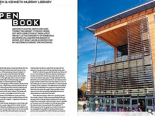
Architects Austin-Smith:Lord have turned the library typology inside out with completion of their latest project, at the University of Edinburgh. Delivered on a wafer thin budget it shows just what can be achieved even in chastened economic circumstances.
If libraries are traditionally places of quiet and solitude then the University of Edinburgh’s Noreen & Kenneth Murray Library, named in honour of the pioneering molecular biologists, is set to shake things up with a bold intervention that belies their stuffy stereotype. The resulting creation shows Austin-Smith:Lord are on the right page when it comes to campus development, revitalising an incoherent hodge-podge of outmoded facilities on a shoestring £4.05m budget.One of the most egregious of these facilities was the former Robertson Library, a single storey converted canteen that was the insalubrious former guise of the University’s teaching and learning environment. Now, thankfully, consigned to history the site plays host to its 21st century reboot. The Noreen and Kenneth Murray Library is envisaged as the first of a multi-phase redevelopment of the Robertson Library and King’s Buildings and is intended to create a suitable interface with the retained building (which is adjoins) - a significant constraint on the new build element.
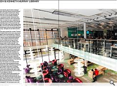
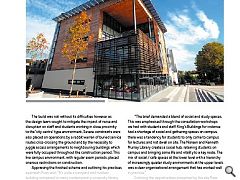
The library itself has been developed as a larch timber clad cube that adopts a square, deep plan form (similar to that of the Robertson). Naturally ventilated using cross ventilation and a stack effect from two stairwells it follows on from the recently refurbished James Clerk Maxwell building (also overseen by Austin-Smith:Lord). Designed as a two storey ‘podium hub’ on the lower levels, incorporating a café, soft study spaces and meeting areas, the library’s upper floors are reserved for a sequence of quieter and acoustically separated study areas.
What first catches the eye when facing the new library isn’t so much the building, but rather the absence of building as a dramatic second floor void has been eaten into the volume to act as an outdoor study space. Though sheltered from the elements by the roof above the terrace it was locked up when project architect Graham Ross took Urban Realm on a tour of the building but its inclusion is emblematic of a wider approach to setting, as Ross explained: “The relationship to the external spaces was fundamental to the project and important to the client from the outset. We sought, where possible, to allow views from and into the building enabling the library to be characterised by its external environment.”
Those views encompass, when it isn’t chucking it down, the romantic Liberton Castle, picturesque Pentland Hills and dramatic Arthur’s Seat, providing inspiration for those within.Indeed Ross’s only regret is that more wasn’t done to capitalise on this asset, such as the creation of a roof top space where the views are even more spectacular. Ross explained: “In direct response to the Jisc guidance on study environments we investigated the possibility of enabling external study environments accessible from within the library and beyond the book security line. This resulted in the second floor study terrace which creates the striking landmark corner element. This was the most emphatic gesture towards creating an interface between internal and external study environments.”
Austin-Smith:Lord’s scheme is borne out of a campus masterplan penned by RMJM for the King’s Buildings, the first such exercise to set out the possibility of creating a campus green; a pedestrian focussed environment which could create a spatial and social focus which had previously been sorely absent. It is toward this space, implemented by Ironside Farrer, that the new library presents its front facade, imparting considerable presence to the principal east-west and ‘processional’ north-south routes which have been driven between the library and the James Clerk Maxwell building. To this end the southerly aspect overlooks the landscaped green with a catered study / café space that can extend outside in good weather.
Explaining the projects genesis Ross, recalled: “The ethos was to create a shared facility for all the various departments within the College of Science and Engineering. Locating the building with a front door on the principal routes overlooking the main open space on campus reinforced that objective.”
The Library is just the latest example of the trend for Universities to turn to architecture as a means to boost academic attainment and acquire wider prestige to draw in lucrative overseas students. As Ross observed: “In an increasingly competitive and mobile marketplace academic institutions have to consistently enhance their estate, as well as their educational programmes, to attract and retain the best students, researchers and academic staff. The investment at King’s Buildings is part of an ongoing programme of works to maintain the University of Edinburgh’s reputation as a world renowned institution. The lack of a central library at King’s Buildings had been recognised as a shortcoming. The Noreen and Kenneth Murray Library project realises that aspiration, combining disparate collections on the same site and overcoming the lack of a central library at King’s Buildings which had been recognised as a shortcoming.
“Jisc guidance, the University’s own student and staff survey data and the client’s informed judgement all point toward a link between the quality of the learning and teaching environments and academic performance. The Noreen and Kenneth Murray Library project is one of several that the University have recently undertaken that seek to create learning and teaching environments that respond and adapt to developing and new pedagogic methods.
“The new and emerging methods being applied by the College of Science and Engineering directly informed the design and layout of the Noreen and Kenneth Murray Library, as well as the Learning and Teaching Cluster we designed for them in the nearby JCMB refurbishment. There is a very wide array of teaching and study environments; from traditional silent study to bookable ICT / AV rich seminar rooms, soft / informal study environments and the catered study provision of the ground floor café / social hub.”
The build was not without its difficulties however as the design team sought to mitigate the impact of noise and disruption on staff and students working in close proximity to the ‘city centre’ type environment, Severe constraints were also placed on operations by a rabbit warren of buried service routes criss-crossing the ground and by the necessity to juggle access arrangements to neighbouring buildings which were fully occupied throughout the construction period. This live campus environment, with regular exam periods, placed onerous restrictions on construction.
Appraising the finished scheme and outlining his practices approach Ross said: “It’s quite a compact and modest building compared to many contemporary university library projects (it’s a tenth of the size of the George Square Main Library that the University of Edinburgh were refurbishing around the same time). From the inception of the project we amassed a database of exemplar projects with input from the client.
This catalogue of approximately 50 (mainly University) libraries was a fabulous resource in developing the brief with the client. The process was informed by expert opinion and advice from various senior members of staff throughout the University together with experiences and peer advice from other institutions throughout the world (there was very useful advice from the University of Melbourne, for example).
“The brief demanded a blend of social and study spaces. This was emphasised through the consultation workshops we had with students and staff. King’s Buildings for instance had a shortage of social and gathering spaces on campus, there was a tendency for students to only come to campus for lectures and not dwell on site. The Noreen and Kenneth Murray Library creates a social hub, retaining students on campus and bringing some life and vitality to a key node. The mix of social / café spaces at the lower level with a hierarchy of increasingly quieter study environments at the upper levels was a clear organisational arrangement that has worked well in practice.”
Outlining the opportunities presented by the site Ross singled out the ‘hub’ location and setting as well as an informed and enthusiastic client, noting that the location is conveniently situated adjacent to the campus CHP plant room which creates excess, low grade heat which can be reused in the library, helping the completed structure to secure a BREEAM ‘Excellent’ in a site not predisposed to securing credits using BREEAM assessment. The library shows that a lot can be done with relatively little, even on a site with severe restrictions placed on what can be done and how. Ultimately however the University of Edinburgh has got its heart back and didn’t break the bank in the process, in today’s climate that is surely as great a compliment as any.
|
|
Read next: Balornock
Read previous: Sir Duncan Rice Library
Back to January 2013
Browse Features Archive
Search
News
For more news from the industry visit our News section.
Features & Reports
For more information from the industry visit our Features & Reports section.


