Leijser House
Our clients, a Dutch/Scottish couple with a young family who had spent most of their married life together living in African returned to Scotland and rather unexpectedly purchased a site to build a house. We were among several architects they interviewed and in due course were commissioned to design a new family home on a site of considerable beauty in Balfron, overlooking the Campsie Fells.
Initial discussions with the client uncovered several key priorities. Firstly, that this was first and foremost to be a family home. Secondly (and prompted by their experiences in Africa), the design was to encourage and support a certain informality in how they would live maximising the changing quality of the Scottish daylight. With their own direct experience of Dutch architecture, they were also comfortable with the notion of contemporary design being both familiar and non-controversial, and they had a real ambition that the house be as energy-saving and sustainable as possible. The dynamic of developing the design with them was facilitated by their own close relationship and we actively encouraged their involvement with the development of our ideas.
The site is a south-facing, steeply-sloping piece of ground with long views south towards the Campsie Fells on one side while more contained by forested ground above to the north. It is located between two existing houses and is accessed directly from the main road. While affording convenient access, we felt that the approach towards a new house, with one’s back to the view only to turn around again when inside, was potentially problematic and ran the danger of reducing the view to the Campsies to a sort of TV experience. We therefore set out to create a journey to and through the house, almost deliberately frustrating the most obvious impulse whilst exploiting views in all directions, exploring how light entered in different ways and also refreshing that main view (the view being the raison d’etre for being there in the first place). The planning authorities were supportive of our initial design and it developed without major reconsideration.
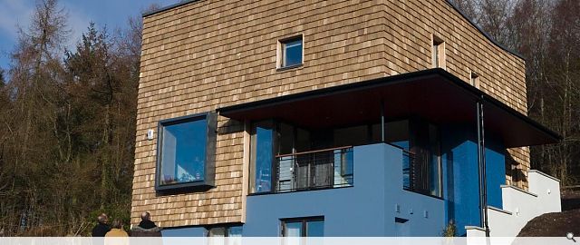
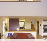
The limited budget of £280,000 and site characteristics suggested a simple form and early on a parti of two storey box on one storey plinth built into the hillside emerged. Vertically arranged into mid-floor (entry level) accommodating family/social spaces of kitchen, dining and living; upper floor accommodating bedrooms, bathrooms and a study overlooking the living area and lower floor accommodating guest bedroom suite, hobby room and storage (with a structural arrangement which could accommodate a garage in a future conversion (if desired). The entrance sequence involves the ‘effort’ of climbing one storey of steps and ‘discovering’ the entrance hidden behind the kitchen bay, beneath the great canopy. An entrance lobby leads into the main reception space, the heart of the plan and from here all the main family activities take place. Also from here, views to the south from the living space, north from the stairs and dining as well as diagonal views to the south/east through the kitchen and covered terrace are immediately apparent. A stair from the lower ground acts as a freestanding dividing element in the open plan between dining and living. The kitchen is open to this area but contained in a discreet space both overlooking the entrance and the sheltered terrace. The double height living space is washed with daylight from a continuous roof light slot and is the spatial climax of the composition.
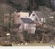
The specifics of this client brief and subsequent solution offer wider lessons. Firstly, our design is site-specific (a particular building in a particular location) and continues a tradition of simple geometric forms in the Scottish Landscape. Though aesthetically different from its immediate neighbours, it sits comfortably in its ‘loose-fit’ setting of ad hoc structures and landscape. Untypical for ‘one-off’ houses, this is a solution tailored to a modest budget. Its simple form exploited internally creates a variety of open and closed spaces suitable for the different demands of the private and public activities of family life generally.
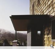
The clients researched a Scandinavian timber frame system which both afforded exceptional thermal properties, a heat recovery system and high quality triple glazed windows. We employed this system to form the two storey element and ‘sat’ this upon a more conventional rendered block plinth. The construction phase was complicated by the client entering into two separate contracts; one with the timber kit supplier and another with a local contractor responsible for ground works and internal and external finishing. The initial contract timescale of 7 months was extended to 11 months by delays in the kit and window deliveries (we later discovered the company had financial difficulties and has since gone into liquidation). By employing a hybrid structure of high performance timber frame and traditional construction, a genuinely energy-efficient building is created which also offered the designers volumetric opportunities. The two storey element was clad in cedar shakes both to make some connection to the leafy surroundings and their feathery tenants. The simple composition of block-and-plinth is offset by the cantilevered canopy which both shelters the terrace and intensifies views while also encouraging and inviting the journey up to the main entrance. Externally, materials have been chosen both to respond to the surroundings while considering the often conflicting demands of aesthetics and weathering. This building is designed to look good now and in the distant future.
Back to Housing
- Buildings Archive 2024
- Buildings Archive 2023
- Buildings Archive 2022
- Buildings Archive 2021
- Buildings Archive 2020
- Buildings Archive 2019
- Buildings Archive 2018
- Buildings Archive 2017
- Buildings Archive 2016
- Buildings Archive 2015
- Buildings Archive 2014
- Buildings Archive 2013
- Buildings Archive 2012
- Buildings Archive 2011
- Buildings Archive 2010
- Buildings Archive 2009
- Buildings Archive 2008
- Buildings Archive 2007
- Buildings Archive 2006


